(5 years and 3351 days ago)

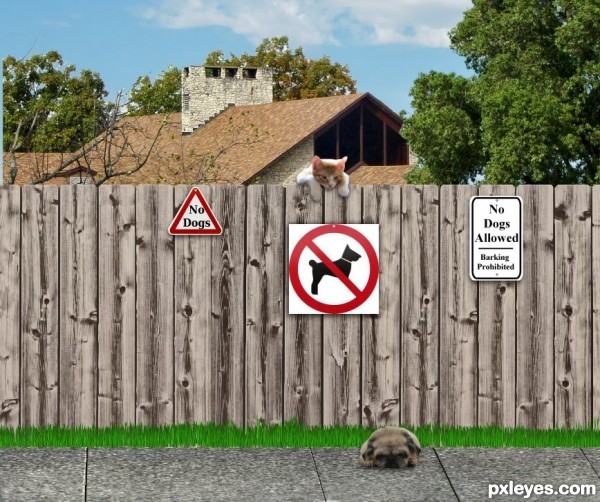
The epic struggle between cats and dogs has gone on for centuries. So it goes here, this puppy wants to play, but it can't play here. I altered the photo to show the required sign and I also made a sign to add balance on the other side of the. I apologize for my blockheaded error. (5 years and 3350 days ago)

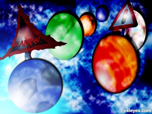
I did not use any other resources here aside from the given image above.. I started making the planets using the marquee tool.. fill it with colors.. make a new layer for the effects using the black and white gradients.. changing layer styles to overlay and so on... making clouds and other effects using different kind of filters like gaussian blur and difference clouds... applying some shadows.. i use the original image for the background.. use the clone stamp tool to remove the sign and make clouds filters... lighting effects is same as what i did in the planets... I make a new layer... fill it with black and white gradient.. change the layer style to overlay... and so on... (5 years and 3349 days ago)
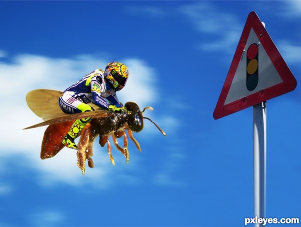
Fun image, but the wing should be outside of the rider's leg.
Made me laugh, fix the wing thing it would make the entry killer. Great idea.
Harsh lighting from the top of the rider would create a strong shadow on ride. A little more work will make this look finished. Good luck!
Thats funny
thanks
super funny entry...maybe u could duplicate bee layer and create some illusion of movement....motion blur could be good for that...any how this is cool entry and i wish u best of luck author...
Funny! I thought well done, a "clean" image.
Cool idea, like it a lot! Only point that I notice is the motion blur. Motion blur is stronger on nearer subjects than on farther ones. So to me it looks a bit awkward seeing motion blur on the sky but not any on the sign. Good luck!
Howdie stranger!
If you want to rate this picture or participate in this contest, just:
LOGIN HERE or REGISTER FOR FREE