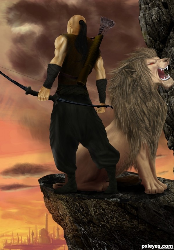
City Guardian
Source image and digital painting only, No textures or ready made brushes were used except for Guardian's hair, all details have been painted by Photoshop CS and CS3, I used some tutorials and one reference to make lion's face and anatomy, shading and details are all mine way.
I was inspired by events those have broken out lately in my country, the demonstrations and protestations of wide mass of people made government disregard security of the country which made up a huge mess and unsecured position, people had to assume the security themselves but it went far wrong, in that case we were extremely in need of a City Guardian, because I know he does not exist so I drew it myself.
Overcast clouds represents the danger that lurks for the city, the sunset view portend for the end of the day when danger takes place which is the time that City Guardian launches the state of emergency and start up his duty, the lion represents for the power and superiority of the Guardian over outlaws since he could train a lion he could defeat the outlaws, crossing pose means lion is covering Guardian's back and watching the opposite gateway of the city and that Guardian is keeping the eye on the city.
(5 years and 3433 days ago)


 Great depth and convincing, soft shading
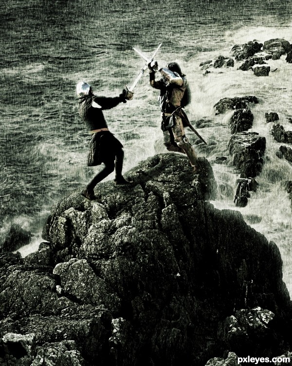



Well done image indeed, but very minimal use of the source. You basically could have used any image of a rock for this.
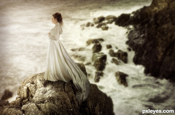
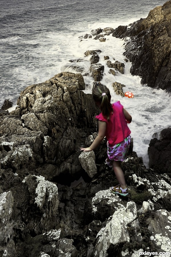
thanks CMYK, all steps has been added now, nearly 65% of the sourceimage has been used, for clarification and further info please see my sbs.
Sorry, I'm only seeing minimal use of the source (some rocks) . The rocks could have come from anywhere.
It's nice, but more suited to the drawing section than Photoshop, to my eyes. Your "subject" is not the source image, and the majority of your image is painted, not photoshopped. Had you used source images for the lion and the person, it would be a chopped image. This is more a painting with a wee bit of the source image added as accent...
Mixed manipulations would even be a better category for this type of work.
great work author, dont worry about comments from people with only 1/2 your skill

WOWZA...YOU ARE THE SMUDGE TOOL MASTER!!!!! Hours and hours of great work, wonderful SBS.. good luck author.. (it's kinda funny you used that one itsy bitsy hair brush ) really made me smile!!!
thanks alot insanewayneOO, sometimes i feel discouraged by some people's comments but u gave me my confidence back
wow!!!! nice to see u author!!

great effort with great result, good luck!
Skill level has little to do with the ability to see...
 that feel they have to insult others for voicing their opinions...
You needn't "worry" about ANY comments, it's whether you can learn to see and improve from other opinions that is the purpose of comments...
It's only the petty minded (and "insane"
Beautiful illustration work, author! You have the light clearly in front of the human figure but it seems the lion's head is a bit too bright. If you were able to darken the lion's face and front it would solidify the lighting a bit more. Really nice work!
Lovely concept and drawing. A little low on the original source but your work and expressiveness adds so much it is hard to fault you for that. Lovely work about a difficult and troubling situation. I hope you are safe throughout this hard time and hugs!
Nice work....minimal use of source, great illustrative work...agree with MossyB
Thanks a lot guys for you comments and for giving my entry some of your time and concern, special thank to my old buddy pixelkid for his comment.

well pixelkid, the face of the lion is brighter for some reason, you may noticed that the back of the guardian and the side of the lion are being lightened by the secondary source light which is the sky in that situation, the body of the guardian is dropping a heavy shadow on the lion's back legs because he is standing right above them and totally covering them, then i made the shadow fading away in it's way to the head of the lion, because the shadow of guardian's body is not extended except to forelegs of the lion, that's the why you see it's face lighter, hope i'm not wrong
wonderful drawing skills.., great.., I agree with you that some comments may have discouraged you.., But we can't blame the other members for pointing out that you have used minimal source. I am trying to say that, with this kind of skills you should have used the rock textures for making the lion or the costume the guardian. ''just a suggestion, may be for your future works.., I think i am not hurting you, my friend.., good luck
Congratulations amazing work
CONGRATS!!!
congratulations...
Congrats Author Loved the SBS by the way
Congrats!!
congratulations...
thank you guys for congrats
Howdie stranger!
If you want to rate this picture or participate in this contest, just:
LOGIN HERE or REGISTER FOR FREE