(5 years and 3340 days ago)

Howdie stranger!
If you want to participate in this contest, just:
LOGIN HERE or REGISTER FOR FREE
Hope you like my new entry!
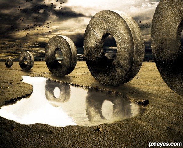
Basic Masking and Cloning for some parts, the reflections were done in Liquefy
Note that the mountains in the background were made using the pen tool to make a selection and then bevel and emboss and a texture (5 years and 3341 days ago)
love the color mood author very well composed! good luck!
Very good, great job on those reflections
It would be awesome if you could add some ground displacement, they sure look heavy and would make an impact or a groove so something! Id be totally convinced then!
oh wow!!!its beautiful
well shuck my corn and call me grits... very well done (though I do want a Masquerade mask to show up).. just kidding.. wonderful and creative.. good luck
nice mood
c00l!
Pretty cool concept with excellent mood.
Really nice composition.
I am always amazed with images like that... Great colors and mood!
very very powerful image...love the mood and the reflection in the water is master piece....best of luck author
I like the mood there  ...good luck author!
Without doubt, my favorite! Wonderful work, loved the color and the atmosphere.
Incredible work and very original use of the source! Love the mood and overall feel of this piece and your reflection in the water just puts it over the top! Definite fav!!!
Wow..worked well on Lighting, Shadows, Reflection and Mood. Good luck buddy.
I soooo like this one.
i love the mood..fantastic..
Beautiful image....the perspective is just perfect.... a perfect win.....GL
Wonderful piece. Keeping it monotone adds in the beauty of how the wheels are focused on their mundane travel. The blackbirds are a wonderful addition.
Stone exodus through the desert  Great idea
nice , and congrats on second
Congrats!
Congrats!!
congratulation...
Howdie stranger!
If you want to rate this picture or participate in this contest, just:
LOGIN HERE or REGISTER FOR FREE
(5 years and 3341 days ago)
Well done!
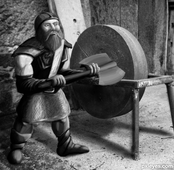
Fantastic drawing, though the background seems too blurred compared to viking imo. 
Thanks ladies and gents -
Kid - how do you decide how blurry to make a pic like that - I'm still learning
Nice. Works well. As for the blurring it's really a judgment call. A little sharper background might be good since the drawing is fairly sharp and he's not that far from the wheel for it to lose focus.
I wasn't sure - that control 'f' is easy to use. thanks for the advise though, I'll see what I can do
Very nice entry and in such a short time, well done = )
love this, good luck!!!!
Nice Work...gl
Very very nice work author...gl
Nice work !
Great work!
Love what you have done here and great drawing on the viking! He is an ideal figure for the source image!!!
As for the blur you can create a (sort of) false depth-of-field by duplicating the background layer, blurring it (maybe even a bit more than you already have), then you can add a layer mask and use it to "paint" out the blurred image close to the figure allowing more of the blur to show the further away from it you get. (I hope that makes sense ... let me know if you can't figure out what I am saying and I can try and explain better) 
The blend is excellent here. Very well done. Follow ARCA's suggestions about adding depth to this image, it will help to make an already great image even better!
I used 3 layers + masks lowered the opacity of the brush ...
Thanks for all nice word 
Very Nice
Congrats!
Congrats!!
congratulation...
Howdie stranger!
If you want to rate this picture or participate in this contest, just:
LOGIN HERE or REGISTER FOR FREE
nothimg but the source (5 years and 3336 days ago)
Creative.. well done
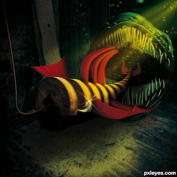
Super duper chop.. but in all honesty.. I think you blurred it too much.. (your steps show a very awesome clear image.. but that's just me.. excellent creation and super fav.. good luck.. but I don't really think you need it) Reminds me of the scene under water in Star Wars Episode 1.. hehehe with all the fish eating the bigger fish.. LOL.. good luck
all IMHO.. of course.. I love this whole concept.. and the work on the teeth is exhausting.. you owe me lots of Starbucks Espresso.. LOL
I agree - awesome pic. your sbs doesn't really explain how the teeth were done - could you give a better explaination?
Really creative use of source! Not sure I'd want to mess with that fish once I 'lured' it. 
Great work.
@Drivenslush: I think the blur is indicative of submersion.
great image, only the line for the lure ... i think it should be light gray and a bit transparent , not brownish
Come on; we all know that species of Anguilliformes prefers metalic blue lures... lol
Nice work!
Too dark. It's hard to see and appreciate exactly what's going on. Underwater light wouldn't be such a tightly focused yellow beam from the upper corner.
I love your work! Something surreal, like a dream!
Fantastic piece of work author...There is few great elements fitted perfectly with the overall mood...well done
Thanks for the comment James P. The back teeth were made by creating one tooth. Step and repeat, then warp and add shape. The front teeth were simply brushed and smudged.
Thanks MossyB. a light source can be very tightly focused. I left no indication what created the light.
If you want Realism...take a picture.
Great and creepy creature work!!! Love what you have done and the colours and composition are excellent!
Brilliant work! To all who question the blur - IMHO it's MOVING! being sucked down the throat of that beast in the back. Great cleanup job, author, and really creative work. 
Thanks all.
Pearlie and Mr. Big, thanks for explaining the movement in water. Movement in water diffuses all, kicks up sediment and all that schtuff. Even the the cleanest waters change appearance.
Howdie stranger!
If you want to rate this picture or participate in this contest, just:
LOGIN HERE or REGISTER FOR FREE
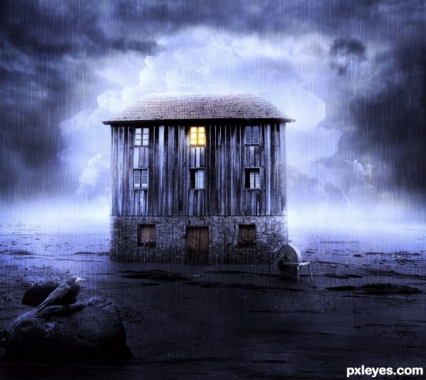
Special thanks to:
Michaela (for sky): http://www.sxc.hu/profile/michaelaw
Cinnamoncandy (for sand/beach):
http://cinnamoncandy-stock.deviantart.com/
Spiritsighs-stock
OLD HOUSE IS MY OWN STOCK
(5 years and 3337 days ago)
Wow, very beautiful mood and colors! 
Adoro seu estilo!!! 
Thank you, dear!
Obrigada querida, bom te ver por aqui!
Lovely work ... very moody image ... just a thought about composition, have you considered not centering the house? It might add some more tension to the image and enhance the already great mood ... check this out if you are interested http://www.jakegarn.com/the-rule-of-thirds/
Great work Author and GL!
Very nice , especially I like the mood  ...good luck author !
Thank you Mario and Arc!
Thank you for your comment and hint, Arc, I changed the perspective of the house to distinguish it from my original stock, but it was a good idea that you gave me, it has not changed! I should have thought more! I saw the site now, very interesting! Thank you!
wow what an amazingly composed image author..stunning rather
love the atmosphere.
great mood. Love it.
Thank you guys!!! Always!
Beautifull!! Tah ótimo o resultado, mto loko assim como todas suas montagens, só acho que a pedra ficou de terceiro plano na montagem...mas esta muito loka a imagem parabéns!!
GL author!!
Pretty stuff! I liked what you did with all of the sources. Nice composition. 
Love the composition, keeps the eyes moving to take it in. Looks great!
Thank you, thank you guys!!!! \o/
Perfect work and a bit spooky mood...great transition between light and dark and nice maintained rain...best of luck author
Impressive! Good work!
Awesome mood! Well done! GL! 
Howdie stranger!
If you want to rate this picture or participate in this contest, just:
LOGIN HERE or REGISTER FOR FREE
Photography and photoshop contests
We are a community of people with
a passion for photography, graphics and art in general.
Every day new photoshop
and photography contests are posted to compete in. We also have one weekly drawing contest
and one weekly 3D contest!
Participation is 100% free!
Just
register and get
started!
Good luck!
© 2015 Pxleyes.com. All rights reserved.

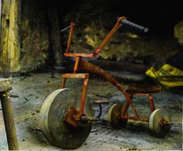
very nicely done
i was thinking about the same idea for this contest, so i guess ill find something else to do
good luck
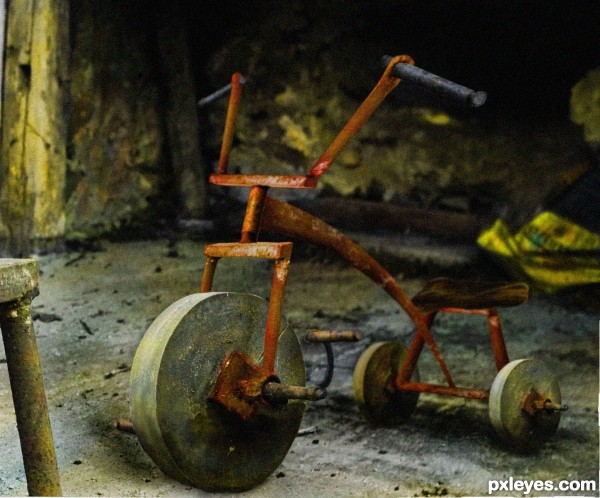
Very nice indeed.. tricycle fits perfect in this rustic environment imo. Good job
SUPER WELL DONE!!! the realism is out of the park!
Nice Job
Good & recognizable use of source, nice reconstruction. The backwheels seem to float a tiny little bit, perhaps some more shading under would help. Another nitpick, the perspective from the bike is somewhat different from the background (nothing shocking though), in case you'd like to skew the right side of the background (moving up), could do the job. Good luck!
thanks waz (made some adjustments), as fore the perspective i think it's not bad , maybe the rubble that's by the wall that makes that line, confuses a little
This is good work, for a better blend try to overlay some noise, and maybe some blur too - but they should look exaggerated, just a little to make it realistic.
blurred some parts, added noise
Love it..bambams trike
Wow, convincingly-real
Very well executed. And it's only source!
Great work author...cleaver thinking and fantastic execution...construction fits perfect with the depth of the field...best of luck
I loved this work, super original!
Really lovely and creative work ... great realism! I like the addition of the noise but think it might be a bit better if it was not quite as strong. This is just a minor thing though and will not effect my faving and giving high vote!!! Bravo!
A great way to add noise is with a neutral gray layer , add noise to it and set on Soft Light blend mode (you can find a tutorial here http://photoshoptutorials.ws/photoshop-tutorials/photo-effects/natural-film-grain.html)... then you can set the opacity at whatever level works ... it just gives a little more control over the finished image.
thanks arca for the tip. as for this image i am gonna leave it like this , it has a nice photographic feel
Yeah Author, I know what you mean ... I debated saying anything as now it has an almost antique feel. The decision is always in the artists hand and I don't think you are wrong just thought it was worth a mention
haha..good idea.
superior entry. Best so far.
Great job, saw the SBS. Is not for anyone!
awesome!!!
Very nice work, I like to be able to see the source in the image, great job here.
Really nice work, great rusty and antique feeling. Bam-bam Flintstone would love it!
Congrats awesome work
congrats and well deserved
congrats.. much deserved...hehehehe
Congratulations on an excellent entry!
Congrats!!
congratulation...
Congrats
A well deserved win!
Congratulations on a terrific job!!!!
Congrats !
Howdie stranger!
If you want to rate this picture or participate in this contest, just:
LOGIN HERE or REGISTER FOR FREE