Comments highly appreciated..! Thanks for watching.:-) (5 years and 3293 days ago)

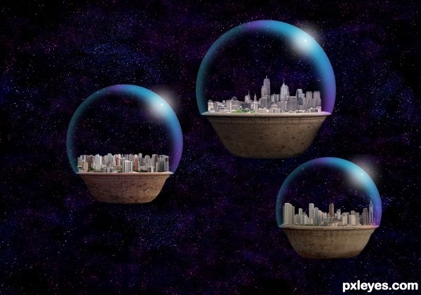
After the Great Sorrow, scientists devised protective Dome Encasements for many metropolitan areas. These extended well underground, and were totally self-sustaining, with nuclear fusion reactors and water capture and recycle reservoirs. When the planet core fractured, these "potted populations" found themselves adrift in space, hoping to find a new home... (5 years and 3292 days ago)

Background image thanks to http://www.sxc.hu/photo/1340045
Author: Chemtec
(5 years and 3295 days ago)
very very nice work author...gl
bit I'm doing am I! LOL cute work
Very cute!! Nicely done!
Howdie stranger!
If you want to rate this picture or participate in this contest, just:
LOGIN HERE or REGISTER FOR FREE