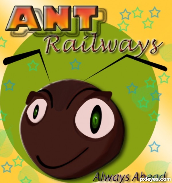
Digital painting...Hope you will like this Logo...
Because Ant Railway Waiting for you...
no external sources used..All made in PS. (5 years and 3173 days ago)
Very fun and colorful. I do find the ghost/shadow "ANT" distracting, however, especially when it runs into "Railways." I also confess I don't get what ants have to do with railways and the "Always Ahead" tag line doesn't give me any clues.
author says:
Actually Ant show Hard work ability and this ANT railway will provide their best service....lol..!
Howdie stranger! If you want to rate this picture or participate in this contest, just:
First animal that came to mind, and suddenly record company followed.... mixed the 2 and got.................................... (5 years and 3167 days ago)
Lots of cute and certainly colorful. But to paraphrase: less crowded is more. The chick and the bear don't seem to be associated with any particular product. The outer edges of "Diaper Company" seem to exceed the boundaries of its logo. "Mouse Cheese" could stand out more from its background. These would be fun presented as billboards/signs/whatever on a cartoon street and would seem more 'realistic' in that environment. [BTW I think "TM" is supposed to go at the end of the text that has been trademarked.]
It also is not clear why these animal would be associated with their logos/products. what makes a lion suitable for a diaper company, and why a worm for "industries"?
I admit I had somewhat of the same reaction as happyme27 but I convinced myself that maybe Algernon Worm, for example, was the founder of Worm Industries. And it's a lioness—which might have a greater interest in diapers than a male lion but whose use here perhaps could be lacking in political correctness.
UPDATE: A male (adult) lion, of course, would have a mane.
Nice job author! If it was me, I would have made just one. There are many good ones but my fav is lioness diaper company. Only suggestion on that would be to make the "diaper company" the same size as the box with lioness
Howdie stranger! If you want to rate this picture or participate in this contest, just:
A logo for the National Bull Breeding Association (it was too long for the title form field) inspired by the logo of the NBA. (5 years and 3171 days ago)
Simple and straightforward is good, except I think you wimped out on that with the pale gray instead of text-white for the bull silhouette and border which reduces the overall impact as a result IMO.
author says:
Thanks Dan, you're right! So I changed it and I think it's better now.
Howdie stranger! If you want to rate this picture or participate in this contest, just:
Very fun and colorful. I do find the ghost/shadow "ANT" distracting, however, especially when it runs into "Railways." I also confess I don't get what ants have to do with railways and the "Always Ahead" tag line doesn't give me any clues.
Actually Ant show Hard work ability and this ANT railway will provide their best service....lol..!
Howdie stranger!
If you want to rate this picture or participate in this contest, just:
LOGIN HERE or REGISTER FOR FREE