(5 years and 3222 days ago)
- 1: Hand Cursor
- 2: Ebrima Font

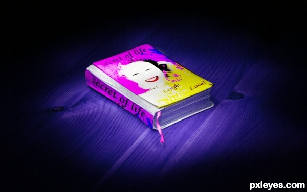
first i removed the color info with the gradient map nd put it on a separate layer then i masked da layer on da lips nd on da flower on her ear......then i cut her off da background nd put a gradient background of ma own, then i used the dodge tool to remove the spot on her face nd then i used da brush tool nd modify it a lil bit and painted on da left upper corner nd right lower corner nd then finally put da text layer nd i flattened the layer nd copied it, i filtered the lower layer with Gaussian blur nd i change the blend mode of the copy to overlay, nd flatten it again.... then i opened the book that i downloaded nd changed the color info using the hue nd saturation, nd i put the girl pic on the book usin transformation tool distort. done! am ready to move this farther if u have any ideas (5 years and 3219 days ago)
Very creative use of the source, author! Cool 'think outside the box' type entry. Nice job!
Funny idea, but perhaps you can put the face options left under? After all it's all white there, while on the right side you cover her arm. Good luck!
Waz is partially right. But if you place the icons in the right side it will be less ergonomic.
That's why i suggest you flip the girl horizontally, so her hand won't be covered.
Very nice work, we had something similar here long time ago but IMHO this is one of the best entry's in the contest...well done author
Howdie stranger!
If you want to rate this picture or participate in this contest, just:
LOGIN HERE or REGISTER FOR FREE