(5 years and 3174 days ago)
1 Source:

 ( 5 years and 3173 days ago ) ) ( 5 years and 3173 days ago )
  now the kid might not understand when she gets older though hehehe ( 5 years and 3172 days ago )
 Howdie stranger!
If you want to participate in this contest, just:
LOGIN HERE or REGISTER FOR FREE
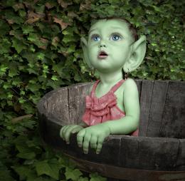
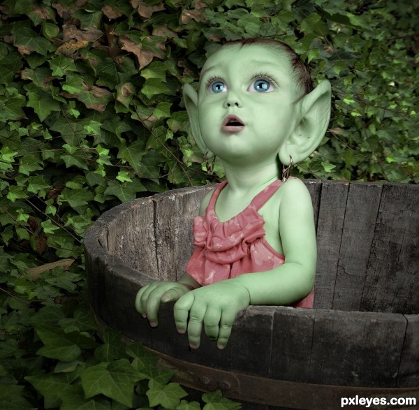
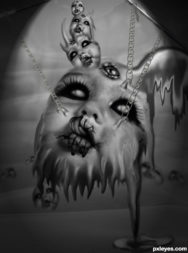
drew the hair, the hair bands, the skin overlay, and the freckles. (5 years and 3173 days ago)
Photography and photoshop contests
We are a community of people with
a passion for photography, graphics and art in general.
Every day new photoshop
and photography contests are posted to compete in. We also have one weekly drawing contest
and one weekly 3D contest!
Participation is 100% free!
Just
register and get
started!
Good luck!
© 2015 Pxleyes.com. All rights reserved.


Wow...kinda creepy, but Super Cool....nicely done author. Super image.
this is a gorgeous entry!!
Thanks
Very Sweet!
Lookin' good, but SBS could be better.
Thanks bob....i never do a over detailed SBS
I
Kind of terrifying in an 'oh god make it die' sort of way, but very good...
Nahhhh Fredex....its cute...hahahahahahaha
I love it ! Good luck author
I think you could have done better merging of the image parts.
Still, its super great idea.
You have my vote
Yoguy .
.
Please clarify what you mean....what parts could i have merged better ?
I cleaned it up a bit more and fixed a few edges anyhow
Author, you know I like your work, but being lazy on your SBS doesn't get you anywhere. In this case I'll give you a break because it's kinda obvious what you did, but members need to learn, too.
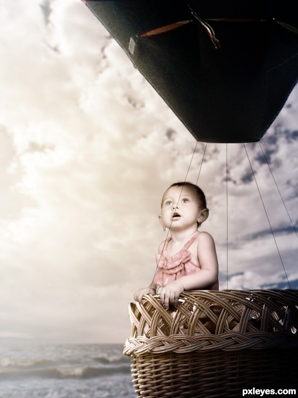
light is coming from the right. see that the front side of the barrel is in the shadow. the fingers should be darkened, all so there is shadow missing beneath them. all so i would try to darken a bit the left side the shoulder, ear, and cheek.
see that the front side of the barrel is a bit out of focus and the left back side, is sharp. the baby depth of field is opposite. the back shoulder is out of focus and the front fingers are in focus.
all so i would add some adjustment layers on top of all to unify more the image
Thanks for your opinion Yoguy, but i have to disagree....Its obviously not alot of light in the pic, and the barrel is on a sloping angle while the fingers point straight down, It makes perfect sense to me that the shadows are right, especially if you compare them to the shadows on the babys face. Also, it seems the barrel is also weathered and more darker on the outside,
As for the focus, you may be right but its such a slight difference its hardly noticeable.
Thanks for your input, but it would be much more appreciated if you had given it before the deadline had finished.
sorry for the late reply, it was immediately after i so your response
nevertheless i think your post is the most creative and in spite of my perfectionist opinion i think it is well done
you still have my vote
Thanks yoguy and the others fr the nice comments
Super work and even though she is kinda creepy she is kinda cute too! It's a two for one elf!
Excellent transformation author.
Thanks Solkee and Arca )
)
Surely the best entry on this contest...
congrats
Congrats Freejay it is cute too
Thanks guys and gals
Congratulations on a wonderful creation!
Congrats on your win, and thanks for your comment on my entry.
Thanks Arca and CMYK
cute child......
nice edit though....
Howdie stranger!
If you want to rate this picture or participate in this contest, just:
LOGIN HERE or REGISTER FOR FREE