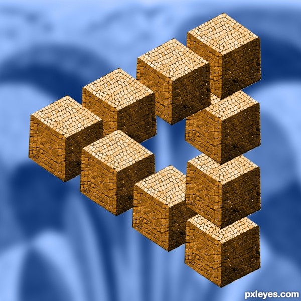
I couldn't resist.
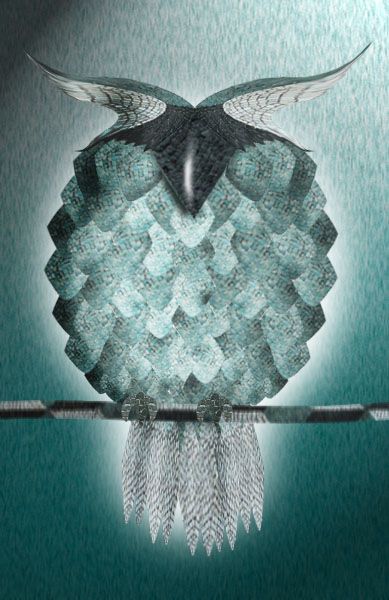
The only source used in this entry was the original contest source image itself. I had included (mistakenly) a link to a Web page with a library of optical illusions for fun, but it was considered an illegal source (?), so I deleted the link, sorry.
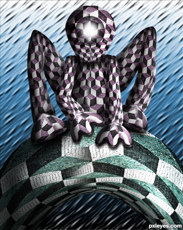
The background was made with a greatly enlarged version of the source, with Polar Coordinates (Polar to Rectangular) applied twice, the Gaussian blur and blue color overlay.
One mosaic "cube" was masked and duplicated to make the "impossible triangle." Then color, levels, and hue/saturation layer masks were applied. (5 years and 3175 days ago)





really interesting
M.C. Escherish. Well done!
Interesting take on a boring source.
nice adaptation .... background should be as simple as possible to have better focus
on the main objects
Yeap..nice!..
congrats
Congrats again Elemare
Congrats!!! Very clever
Congrats !
Wow, thank you, all!
Howdie stranger!
If you want to rate this picture or participate in this contest, just:
LOGIN HERE or REGISTER FOR FREE