why do you thinh that CMYK46 ? Don't make a remark without explanation because maybe I am stupid and I don't understand your subtletys so plase explain but dont forget this is a fantasy so many things can go "rong"
I expect your constructive comment
I wanted to do a picture with a lion and at first I wanted the zebra to be a person instead. But I couldn't find a good stock image of a person running away so the zebra is going to get eaten. (5 years and 3124 days ago)
This is a pretty good piece. I really like it. I do have a couple of suggestions though and will wait to vote. First, do a little research of the size of a lion relative to a zebra. Your picture seems like the lion is a bit large. If both are in the original then I will just accept that I know very little about lions and zebras 
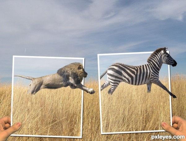
Second, putting one of the frames in front of the lion might add a little more dimension. Finally, the exposure on the hands doesn't really match. Not sure how to fix it, just seems not quite right. Just some food for thought.
author says:
thanks for your suggestions. Instead of making the lion smaller I made the zebra a bit bigger. I moved both animals to the left and put the frames in front of their tails to make it seem more like they are in the pictures. And lightened up the hands to make them a bit more pale because the whole picture kind of just has a pale look to it.
i like the concept. maybe darken the background a bit, to draw attention to the photograph frames?
also, there are some sort of mask on top of the animals, is a little distracting.
author says:
I lowered the brightness of the background and it does help the foreground pop out a bit, thanks. and the mask that is over the photographs is suppose to be some gloss how pictures have, but I lowered the opacity of it over the animals.
Very cool image author...one of the best ideas for OOB image...u should fix some minor details such making edges of animals bit softer and maybe with smudge tool u could work on hairs and fur....also, this is OOB image but don't forget shadows...GL
Howdie stranger! If you want to rate this picture or participate in this contest, just:
What's the baby got a grudge against? Grudge means resentment.
Are you sure you don't mean "grunge," for the grimy, dirty looking effect???
The lettering is too dark at the bottom, it's almost impossible to read, making it an ineffective addition to the image.
author says:
Nop MossyB..have you seen the movie The Grudge?,,I guess not,I made my own grudge little cute baby like that..n about the text.mmm? well I guess you r right its impossible to read it because the pic here its smaller..but I think seeing it in hi-res its much better.
Thanks for the comment though.
a tad bit of dodge and cropping might focus the idea more.. (I can't see dark things very well to begin with and this is quite dark.. ) very good image and as much as the Grudge drives me crazy...(the story line made me wheez.. dead creatures doomed in torture and revenge to continue the line is just down right depressing.. well thought out.. but still hehehe)
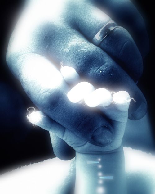
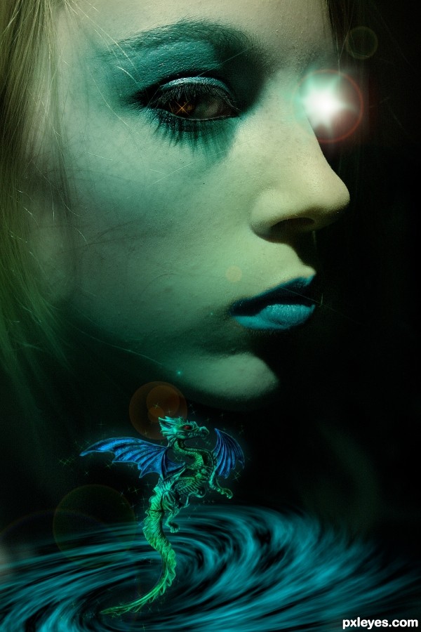
Ouch! The lens flare really hurts.
why do you thinh that CMYK46 ? Don't make a remark without explanation because maybe I am stupid and I don't understand your subtletys so plase explain but dont forget this is a fantasy so many things can go "rong"
I expect your constructive comment
Hypnotic, surreal
Howdie stranger!
If you want to rate this picture or participate in this contest, just:
LOGIN HERE or REGISTER FOR FREE