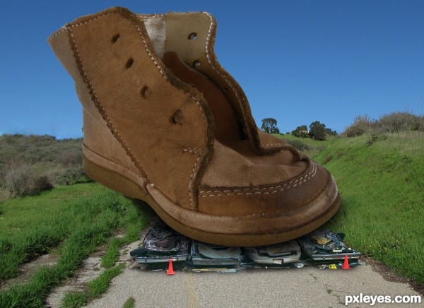
The focus of the various elements is not consistent, and the floor is at a different perspective angle to the man standing on it. This just looks hurried and thrown together.
While the concept is very funny, for a higher score you may want to run a very soft blur brush over the edges of the man, his will make him blend better (he's very roughed edge and the top of his head has the white edging (IMHO)
Select the FLOOR LAYER and use PERSPECTIVE on it, and you will find that it will blend better as well.. (took me some time to learn how to do that and I still have trouble) but you have enough pattern in the floor so it should be quite easy...
Gray Gaussian disks placed beneath his feet (at the floor perspective) will help ground him as well.. Good luck author (The humorous concept of this piece is very adorable)
EDIT: 100% Improvement author.. good luck
author says:
thanks everybody for the tips
Howdie stranger! If you want to rate this picture or participate in this contest, just:
MossyB: I agree. I have tried to improve it, but without much success. Next time I will try look for images with quality more similar. Thank you for your notice!
Gchiou2008: Thank you!!! I'm glad that made you laugh!!!
Howdie stranger! If you want to rate this picture or participate in this contest, just:
The boot doesn't look like it's on the ground behind the cars...brush & grass should overlap the edge. Sharp edge of the sole could use a bit of blur.
Love the concept author,
It's edited now, thank you for your comments.
Howdie stranger!
If you want to rate this picture or participate in this contest, just:
LOGIN HERE or REGISTER FOR FREE