(5 years and 3152 days ago)

(5 years and 3148 days ago)
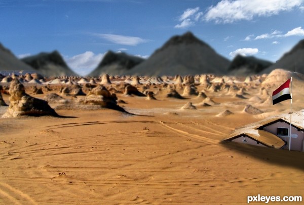
The gold on the LH side in the distance is too saturated. Colors fade with distance, and it's the same shade as up close, which looks odd.
Howdie stranger!
If you want to rate this picture or participate in this contest, just:
LOGIN HERE or REGISTER FOR FREE
Photography and photoshop contests
We are a community of people with
a passion for photography, graphics and art in general.
Every day new photoshop
and photography contests are posted to compete in. We also have one weekly drawing contest
and one weekly 3D contest!
Participation is 100% free!
Just
register and get
started!
Good luck!
© 2015 Pxleyes.com. All rights reserved.

The blurry background really hurts this image, because the distand mountains are in sharper focus than the blurred midground...
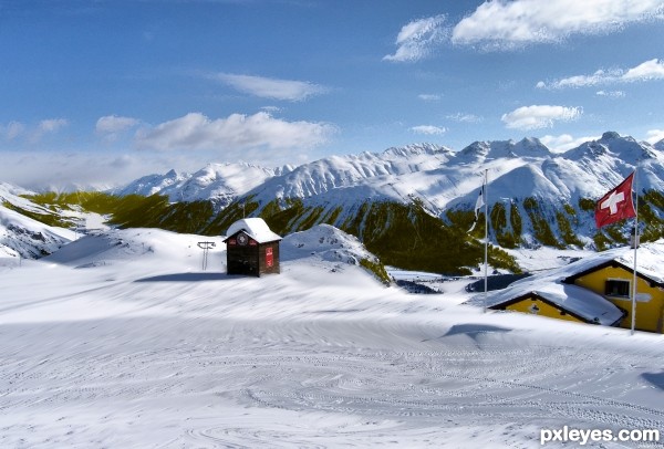
Also, the edges of the cut out contest source are too hard, and do not blend at all with the desert scene.
the focus-thing is not done properly...
suggest:
1) clone some sand at bottom of hut
2) soften all edges of the mountains-peaks
3) make only ONE focal object (either the hut or the house on the right)
composition of image ... (don't be angry) ... lacks "wow" and "ooh"
thank you very much for the suggestions
The focus looks better, and the composition is improved by getting rid of the small building. Now, you should re-color the snow on the roof to look like sand, then the building would look "buried."
thank you very much mossy
does it look better now?
Good job of blending the snow into the sand. Big improvement from your original image!
I don't see any blending of the snow, just replacement. First of all, I'd like to say that I find the idea very good. Your image does not look real, though. The house in the foreground is sharp, right behind it the ground starts to be out of focus, gives it kind of a miniature look. There are parts in focus still, for example, the first rock on the left. The tipp is out of focus, the bottom is IN focus. And there are parts in the middle that are in focus. The background mountains are way out of focus, yet the sky is in focus. You see what I mean? It just does not look real.
.... the dark mountains don't look right.
if you like, you can change the color to dark brown or something
Howdie stranger!
If you want to rate this picture or participate in this contest, just:
LOGIN HERE or REGISTER FOR FREE