(5 years and 3160 days ago)
(5 years and 3164 days ago)
great detail.. a tad heavy on the Yellow/Orange tones.. but that could just be me.. all IMHO.. awesome work 
EDIT: YES! much less sharp.. not a bad thing, but now it's much more decor.. great job!!
I think you were right, took away some yellow. thanks.
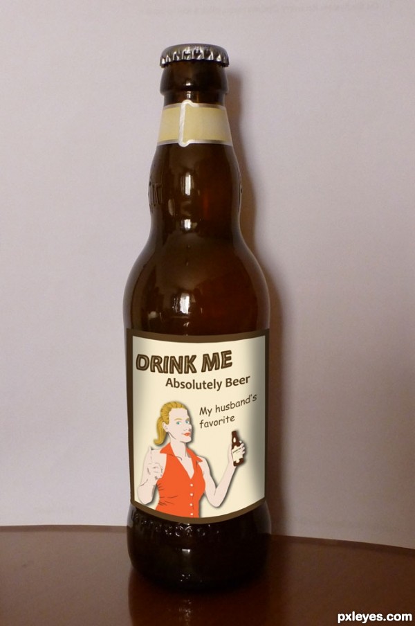
The flat label is great with its elegant layout and 'Pixel' reference, although the non-horizontal goldish stripe things in Step 7 of the SBS are odd. When the label is placed on the bottle, however, the label's curvature is off, especially the bottom edge. Also, the label's saturation is a tad too strong relative to the rest of the image. Additionally, the reflection/refraction in the wine glass seems inconsistent with the background.
Think of it as a studio setting, the reflection is of inside house (decor like wazow mentioned). If it would be taken outside there are more things to mention, depth of field wouldnt be correct and what about the strange brown sky  .
.
I disagree with the curvature being off  .
.
Thank you for taking the time to really look close at the entry though!
very nice..
Beautiful work author! Best of luck!
Howdie stranger!
If you want to rate this picture or participate in this contest, just:
LOGIN HERE or REGISTER FOR FREE

(5 years and 3163 days ago)
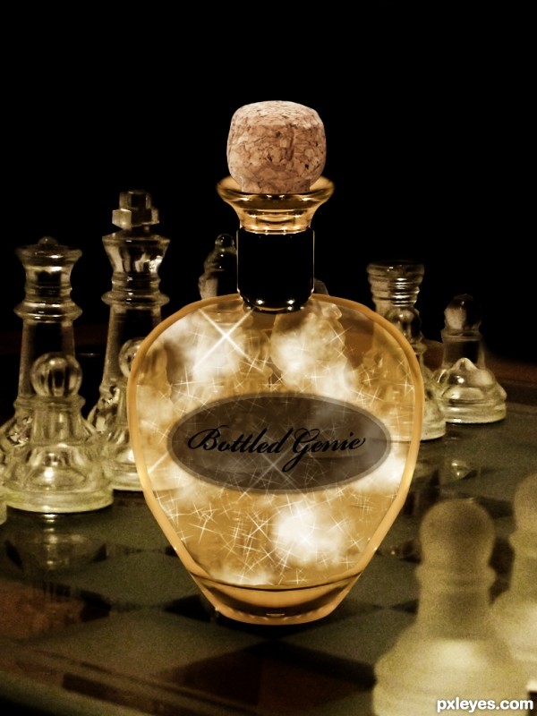
Very original concept, but there needs to be a slight bit of reflection on the chess board from the bottle, to match the reflection of the chess pieces.
Also, the top of the bottle looks very flat, with no curvature or depth. You need to have the "shoulders" of the bottle show light refraction like the cork at the top.
We should see some cork through the bottle neck. Not that you had to, but I'm wondering why you didn't use the glass stopper from the source pic. GL author. 
here i agree with MossyB and CMYK46 author
overall nice work
What a beauty! Classy like bottle!
Howdie stranger!
If you want to rate this picture or participate in this contest, just:
LOGIN HERE or REGISTER FOR FREE

thanks to redzonk
thanks to yenhoon (5 years and 3164 days ago)
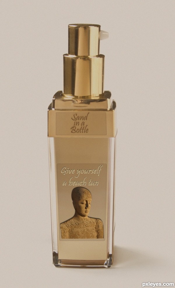
The "Sand in a bottle" label is blurry and hard to read. I wouldn't use a drop shadow with text.
I like the "give yourself a beach tan" text, but the "sand in a bottle text" is kind of hard to read. What you might try is using the same technique you used for the "give yourself..." text on the "sand..." text, only make the text dark and the shadow light, know what I mean? Maybe you'll like that better. 
thank you for the comment and advice
I'll see what I can do tomorrow
realistic work author..
thank you Kushpatel
@ Mossy B and IDt8r I made some changes to the text "sand in a bottle"
I also added an sbs
I like the change. It looks very classy.
Much easier to read, good improvement!
More contrast would be punchier. And shouldn't it be "TAN in a Bottle"? For me, the sand is an irritant, not an objective, when I go to the beach; the last thing I want to do is spray sand on myself. (Or is this somehow an exfoliant?)
@ DanLundberg - It was ment humoristic - with the picture of the woman all covered with sand 
I will have one for me here! lol
Howdie stranger!
If you want to rate this picture or participate in this contest, just:
LOGIN HERE or REGISTER FOR FREE

filter
flood
bevel
emboss
drop shadow
gaussian blur (5 years and 3163 days ago)
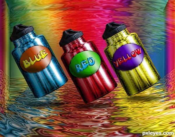
Pretty cool author, love the metallic look man.
I've sat here for a few minutes trying to figure out another way to say this, but I can't. This is so pretty! It is! I especially like that the colors are different from the words of the colors.
very colorful and wonderful work author
all your entry deserve is a fav and high score
good luck
Colorful and powerful image! Cool shop author! Best of luck!
Howdie stranger!
If you want to rate this picture or participate in this contest, just:
LOGIN HERE or REGISTER FOR FREE
Photography and photoshop contests
We are a community of people with
a passion for photography, graphics and art in general.
Every day new photoshop
and photography contests are posted to compete in. We also have one weekly drawing contest
and one weekly 3D contest!
Participation is 100% free!
Just
register and get
started!
Good luck!
© 2015 Pxleyes.com. All rights reserved.

very 50's/60's cool
Great bottle shape, fun label!
omg the line "my husband's fav" will sure increase your score author
good luck
The "my husband's favorite" say it all Nicely done!
Howdie stranger!
If you want to rate this picture or participate in this contest, just:
LOGIN HERE or REGISTER FOR FREE