(5 years and 3131 days ago)
- 1: source1

(5 years and 3136 days ago)
great idea  really cute
very good but why it is a blue shadow ?
Don't know why but I really do like this image 
I'm with Keiley22, this one really has appeal.
Thank you all for nice comments 
Withoutdash, I'm afraid I don't understand...what do you mean blue shadow?
this is very nice 
awesome work author.love it
high vote and fav for you
best luck
Howdie stranger!
If you want to rate this picture or participate in this contest, just:
LOGIN HERE or REGISTER FOR FREE

(5 years and 3132 days ago)
I like the text, looks like a newspaper. Gives the impression of writing about the travel. 
ya good work man good luck
Howdie stranger!
If you want to rate this picture or participate in this contest, just:
LOGIN HERE or REGISTER FOR FREE

(5 years and 3138 days ago)
Beautiful work author! This is a lovely entry as well, the colors are attracting and the finishing is clean!
You should add Lebanon too  , just because I am from there!
I am joking, I love the background and the idea!

Looks like a great t-shirt to me! 
Pretty cool! Your SBS doesn't explain, but I assume you hand-drew this. The top four lines of the background ['Serbia' spelled with a V?] are like rows of brickwork aside from the falling 'USA,' but the rest of the rows seem to be crumbling and possibly incomplete at the bottom. The mandatory PXL logo actually seems out of place. Maybe a mini version in a bottom corner would be better.
@Dan: there's a source given... a mini version of the logo at the bottom doesn't work and I do not want a small logo on it. You are right about the top looking like brickwork, wasn't intended like that, I fix that later on as well as the spelling error, thanks for pointing that out.
@ Joe, Loyd and Bob: thanks!
Perhaps a much bigger PXL logo so your text is more clearly background (e.g., starts below the top of the logo)? It does appear that you did adjust the kerning of the font to add drama-- very nice.
This is by far the best entry so far. IMO it should include www.pxleyes.com
Howdie stranger!
If you want to rate this picture or participate in this contest, just:
LOGIN HERE or REGISTER FOR FREE

Tried to keep it as basic as possible for the T-shirt design.
Compression really kills, please view in High Res. (5 years and 3133 days ago)
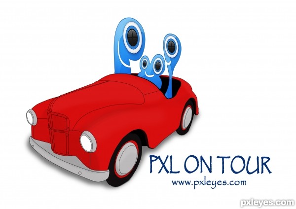
The Pxl logo is too distorted, it looks strange. The car is nice, though!
Letter P -- not riding --
and car too red
shadow of the car ....... on a shirt ? maybe ......
but wait ...................................... it is cool and it is my fav
@ Mossy, the logo is distorted because I had to face them with the car.
@ designed, desaturated the car and I think it is now better. Car looked very floating without the shadow so it stays. And the letter P is riding, look at the high resolution.
Thank you both for your input.
cool idea author good luck
cool idea author good luck
Howdie stranger!
If you want to rate this picture or participate in this contest, just:
LOGIN HERE or REGISTER FOR FREE
Photography and photoshop contests
We are a community of people with
a passion for photography, graphics and art in general.
Every day new photoshop
and photography contests are posted to compete in. We also have one weekly drawing contest
and one weekly 3D contest!
Participation is 100% free!
Just
register and get
started!
Good luck!
© 2015 Pxleyes.com. All rights reserved.

The target circle echos are a bit distracting, but I really like the overall shape of this!
thanks MossyB...
nice work...
simple and effective
thanks passionboy and mehul..
I want to see it printed on shirt. Simple yet great! Good luck author. 1 fav here and a high vote...
thanks Bernie...
Howdie stranger!
If you want to rate this picture or participate in this contest, just:
LOGIN HERE or REGISTER FOR FREE