(5 years and 3152 days ago)
Howdie stranger!
If you want to participate in this contest, just:
LOGIN HERE or REGISTER FOR FREE

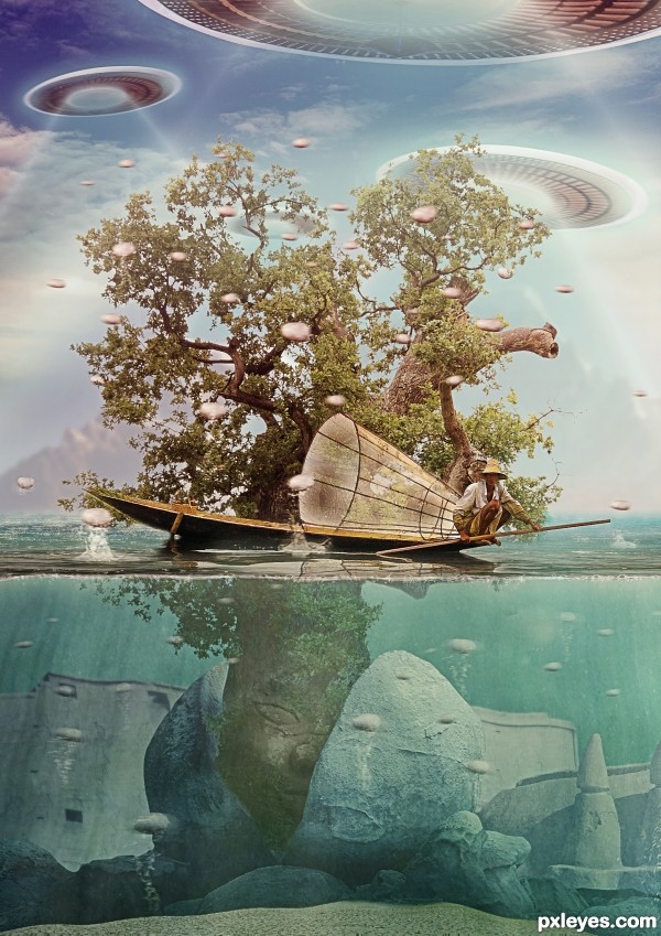
11 ruins 2 - Statique77 http://browse.deviantart.com/?qh=§ion=&q=tunisia23#/d3278hb
(approval to use image in SBS)
12 ocean - salsoul
http://www.sxc.hu/browse.phtml?f=view&id=1155328
13 ocean 2 - theswedish
http://www.sxc.hu/browse.phtml?f=view&id=1208085
14 underwater - Tigers-stock
http://browse.deviantart.com/resources/stockart/?q=underwater#/d41ddbt
15 water brushes - redheadstock
http://redheadstock.deviantart.com/art/Water-II-Photoshop-Brushes-83727899?q=boost%3Apopular%20splash%20brushes&qo=2 (5 years and 3154 days ago)
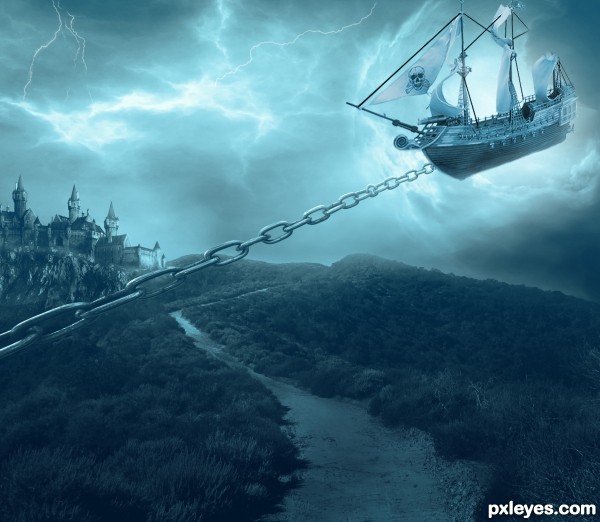
under the rope should not be shadow, and should be seen attached to the boat if it is an idea, everything else is ok ,although perhaps a bit to fill the picture with something IMO .
GL
It's a little to monochromatic, and the square window at the bottom is placed strangely on the building, although the values are excellent, with the fine details in the shadows still visible.
I agree with Vexycon, the rope looks like a flat cardboard cutout stuck on, with that dark edge on the bottom, and no curvature shading and highlights.
thx for the comments peeps, got rid of the rope, replaced it for a chain, looks better imo
Much better with the chain.
wow..........!
Dramatic and evocative. You've turned the Black Pearl (source 2) into the Gray Pearl which is a bit bland. I think greater contrast on the hull and whiter sails would be more compelling.
The chain works as a concept. I think it needs a lot more links, however, so the link at the hull is appropriately small. The stretched near links not to mention the circular link near the hull are odd. Furthermore, I would expect a towing chain to be perpendicular to the masts (when towing through the air) and in line with the bow-to-stern center line of the ship (unless a turn is being made).
I think I would just eliminate the chain and brighten (and bring forward a tad [thinking Rule of Thirds]?) the upper-right corner so it is clearly the focus of the image. Because we can't see what is pulling the chain, it doesn't add a whole lot of explanation for the air ship.
And the big, square window on the house creates a distracting, fairy-tale feel (to expand on MossyB's original observation).
My fav !
Wow... nice colors & nice concept.. all d best author..
This is awesome!!!!
Instant fav!
in your face pirates .................. love it and fav it
thx peeps for all the compliments!
Well i know ur all voted and fav my formel pic but it was removed for some of the images i used, i changed it although i had little time i hope u all still like it and thx for the votes and fav in the earlier image..
Great....
So so much love it .....
very nice work...
great
beautiful work author
I love castles,ships and art,got all in one,great design !
Stunning
Congrats, terrific work
Congratulations!
Nice Job Congrats on your Win
Howdie stranger!
If you want to rate this picture or participate in this contest, just:
LOGIN HERE or REGISTER FOR FREE