(5 years and 3095 days ago)
- 1: blue car

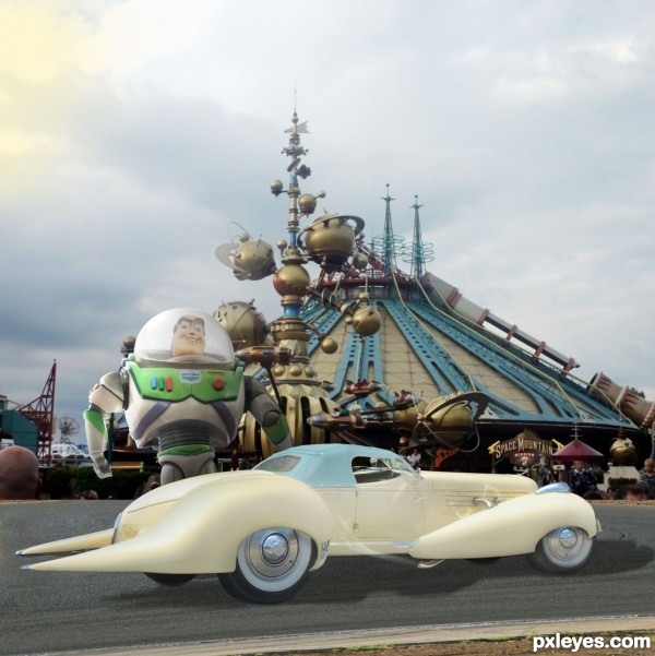
"She's the sleekest classic beauty in the galaxy - perfect for cruising around my spaceport 'hood". --
Buzz Lightyear, of Toy Story fame. (5 years and 3097 days ago)
Good image. The car's kinda small for Buzz to fit in, wouldn't you say?
Thank you, Bob. There's actually quite a bit of leg-room in there, and with Buzz's hydraulics, he fits quite comfortably - tight but snug, like a racecar.
(And if I made him much smaller, he'd get lost against all that great architecture behind him!) 
Great car!
If you shrunk Buzz and put him in front of the car, he wouldn't get lost against anything. Right now his head alone would just about fill up the whole front seat.
Logical suggestion, except that the purpose of THIS contest is to show a CAR manipulation, therefore the CAR is prominent here. I have studied art and design - and have legitimate reasons for how I treat the elements of my work.
I also studied art & design, and taught it as well. Hence my initial comment. Let's just have our own opinions and avoid another flame war. They're getting way too common. GL author.
Buzz seems awfully dark in comparison to the car and the background...He also shows an obvious cutout line on the left hand side, where he is lighter along the edge than the rest of his too-dark body.
The car is also lit from an entirely different direction than the background (Side on the background, Upper Right on the car...)
Thanks, MossyB, valid comment on Buzz's lighting, however it's not a cutout line, it's lighting from the left on him, which I've increased overall a bit, same on the car. Background image IS lit from upper left, as I see it - notice those highlights on the gold globes.
One of Us.. One of Us... One of Us.. giggle snort.. love the car author.. hate to have to back it up into a parking spot though (spikey bumper) LOL... boing boing boing.. extremely fun chop.. good luck author 
Love the background!!!!
love it, i'd give the car some green color as buzz's, maybe the surface, also the shadow must be black, good luck
Thank you for your comment, orientallad. I think that for the bright but cloudy day, the shadow would be only moderately dark. Also, there is a reflection of Buzz's chest in the rear window, but he's not completely green, so I felt that was enough of him reflecting in the car. 
Remember the toystory in a different way.Good thinkingman.. 
Howdie stranger!
If you want to rate this picture or participate in this contest, just:
LOGIN HERE or REGISTER FOR FREE

(5 years and 3098 days ago)
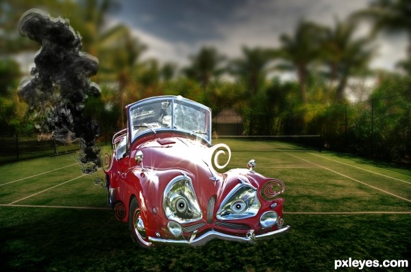
Interesting idea. I think the smoke is a bit confusing together with the trees on the background tho.
i loved it because i'm a big tennis fan, i'd add some tennis rackets and and balls in the back seat of the car for more realism and as a justification for using this particular background, good luck.
Edit: also i'd clone or somehow remove the reflection of the car shown in the silver tires
thanks very much
Nice background.. 
Howdie stranger!
If you want to rate this picture or participate in this contest, just:
LOGIN HERE or REGISTER FOR FREE

base picture is my own ..i have posted it in last SBS (5 years and 3096 days ago)
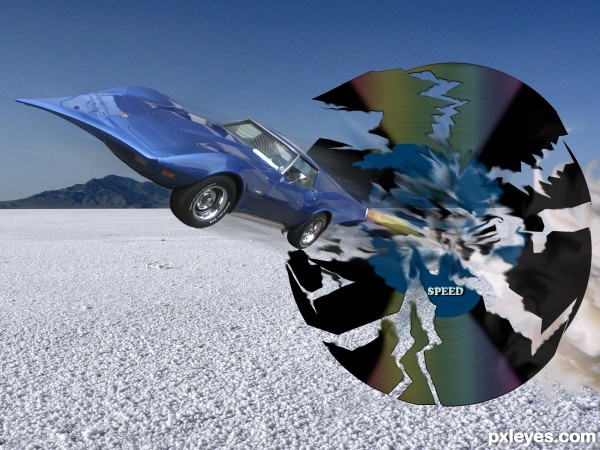
I dont understand the whole thing with the record, the background im not sure about either.. tho its a nice one  , but the work on the car is cool I just think that the setting takes away from it . the car kinda dissapears a bit in the skyblue background for example.. with a bit more diff background color it stands out more n gets more of the attention u want it to get. Holding off my vote for now.
Eladine, the World Land "speed record" has been set and broken on the salt flats... It's a visual rebus...
I think the setting is well done, author, very creative!
the car looks flying to me, but does not look too much caricature, maybe according to it's subject you may add an ear or stick it's tongue out, good luck.
I usually like to stay out of the discussion but I believe there is a need of clarification... first of all thank you to MossyB for your recognition of my visual rebus
A caricaturist draws on the natural characteristics of the subject...and accentuates them... in this case the vet 's characteristic is it notoriety for speed...
Anthropomorphic is giving the attribution of human characteristics to a non living thing ..in that case I may have added the ears or tongue
I did not believe that was the goal
ultimately it is the voters who decide what they like and I will leave that to them
i would tell a lie if i said i had figured out so many new terms you've mentioned in your replay, forgive me but English is not my first language, yet i've always been understanding the term of caricature as a process of distortion to whatever we want to draw by giving them descriptions they do not have, this is the first time i learnt that caricature term is limited in the descriptions that each element has, so thank you for telling me that 
Thnx mossy and author for explaining to me the visual rebus, I have no intrest and much information on records and cars :P or salt appart from using it to spice up my food :P good luck 
Howdie stranger!
If you want to rate this picture or participate in this contest, just:
LOGIN HERE or REGISTER FOR FREE
Photography and photoshop contests
We are a community of people with
a passion for photography, graphics and art in general.
Every day new photoshop
and photography contests are posted to compete in. We also have one weekly drawing contest
and one weekly 3D contest!
Participation is 100% free!
Just
register and get
started!
Good luck!
© 2015 Pxleyes.com. All rights reserved.

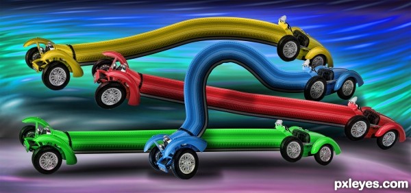
LOLOLOLOL.. haven't heard that song in next to forever LOL
LOL, it's the great Tube Snake Race!!!! Funny chop, author.
Cool snake fight..
Howdie stranger!
If you want to rate this picture or participate in this contest, just:
LOGIN HERE or REGISTER FOR FREE