(5 years and 3117 days ago)

Howdie stranger!
If you want to participate in this contest, just:
LOGIN HERE or REGISTER FOR FREE

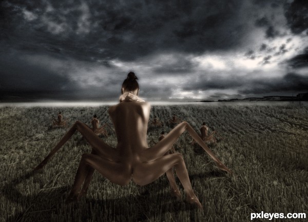
The Autophagy Grounds, a place where human-like mutations flock to feed and grow.
(5 years and 3113 days ago)

cooling down after a long day in the field (5 years and 3119 days ago)
Awesome. Great composition.
High marks, excellent combinations of sources. thnx for sharing
Thanks for the nice comments and appreciations.
Instant fav for me...lov it
good effort, good score.
Wow..color combination is maximum..
Congrats, very nicely done
Howdie stranger!
If you want to rate this picture or participate in this contest, just:
LOGIN HERE or REGISTER FOR FREE