you should tur the item shes holding a little bit more. its seems like shes holding it in her hand on the first view but when looking better you see that its clearly not in her hand but resting on her puls/arm it would not be possible to hold an item that way. techniclly spoken it would be going right thru her flesh the way shes holding it now.. I love the setting and the color changes you did. Also the idea is very nice . Im holding off my vote for now in case you wish to fix this because it would surely change my vote.
This is one of my favourite entry for this contest. The colors are perfectly blended, the work is original.
I think is not so evident what Eladine says; i noticed this "bug" just after reading the comment.
I had funny ideas about what the thing that the model have in her hands is....
Anyway, good luck!
nicely done except the stars could have maybe be a little bit more defined so that it doesn't look so much like smoke
author says:
@ Eladine: I agree partially - the hand's palm is quite flexible, the object could fit there but i admit i should have curved the device a little more.
@ TemporaNigra s: Ahah i swear i didn't think of anything else while making that xD
@ rsguetre: What stars? The ones inside the device? They're quite clear... the stars in the background are all blurred, which is on purpose ^^
Thanks for the constructive and also positive comments
Now that you've mentioned it @TemporaNigra, It indeed does.. well let's just say, after using that "portal engine", she'll be in a whole new world. (Sorry author, had to get that one out)
Thanks to mqtrf from pxleyes, for the pic of the wall, to grafixar from morguefile for the pic of the dino eye, and to ppdigital also from morguefile for the pic of the texture for the foreground. The rest is the result of using the image source. (5 years and 2926 days ago)
The rendering is very nice but there is a little problem with the perspective of the cylinder. The ellipses should be a little flatter at the top and get more rounded as you go further below eye level. You can find several links with google to help, this one will show you the basic perspective: http://www.artyfactory.com/perspective_drawing/perspective_7.htm
As I said the rendering is good, if you could tweak the perspective IMO it would make it even better.
Wonderful execution, but there's something about it that I can't get to believe it's "inside" the container. Might be the perspective or the non-blurriness of the creature behind water. Good luck
author says:
Thank you for comments. Spaceranger: I worked on the perspective of the top ellipses. Tempora: worked on the shadow, and nbaztec: I think the creature looks it is "inside" the water. Thanks anyway.
Excellent tweaking author! Perspective looks much better and the darkening of the shadow adds more drama! The creature looks fine to me, definitely looks inside the container.
Don't get me wrong author, the creature looks well inside, but not like a solid object inside water, I still can't figure out why? The container looks stunningly superb! Excellent job on the container & the SBS.
Above all just ignore me & enjoy a job well done.
author says:
@Spaceranger: Thank you for your tips and all your help!!!!
@nbaztec: Hey, my friend. I had the same problem when I did the filters and the blending for the creature. Nothing wrong with your comment, I really appreciate your time looking at my work.
I was inspired to create this when I saw something similar in a tutorial.
Wanted to take it a step further by creating the glass purely from the source image
Please view high Res, Thanks :) (5 years and 2926 days ago)
Wonderful! The glass is a beauty to look at. A few things (yeah I'm just nit-picking now) the edges are too dark for a "glass", but who really cares, it was a god freakin' stylus before that!
Good luck
author says:
Thanks for the suggestions, I will make some changes
Love the colors, nice job Artist.
Very artistic and great choice of natural colour. Love the flower too. Well done
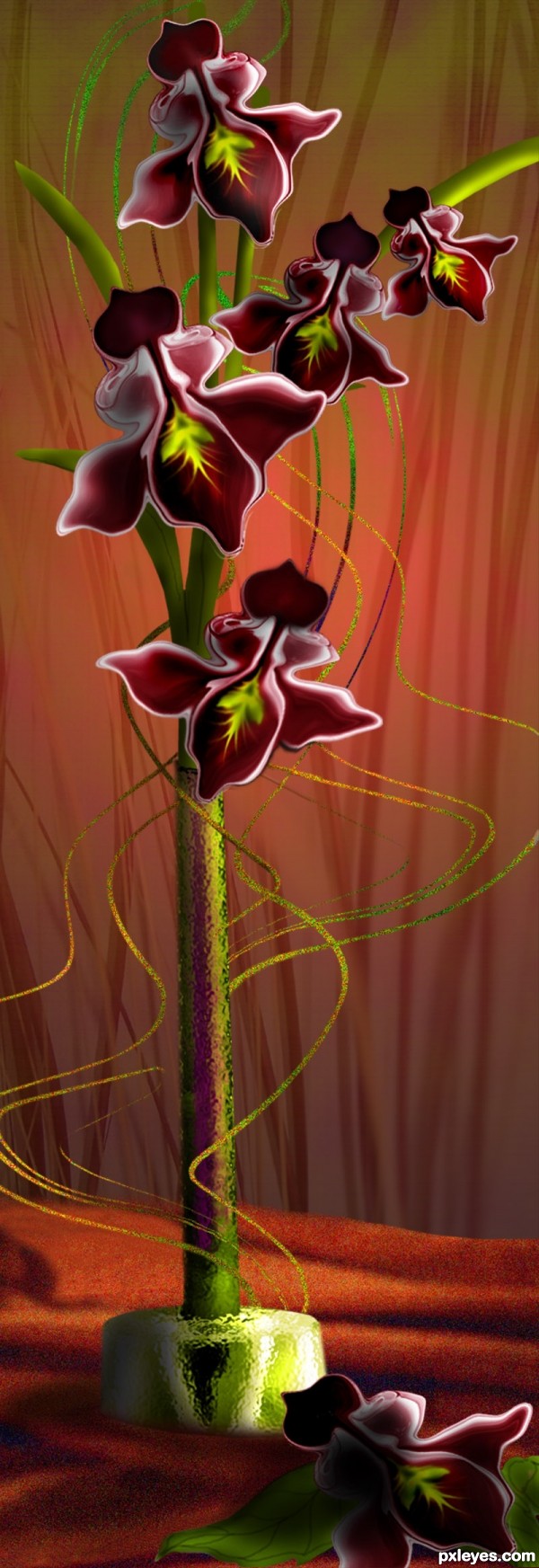
very nice orchids!! at least thats what I think they are nice use of source, lovely colors!
clever, especially the flowers
Boy! I know you, you're the guy/girl who made the Liquify tool in Photoshop!
Excellent work as always, love it.
Love how you made this flower - and your swirls remind me of ting-ting, the 'noise' gives them the sparkle that ting-ting sometimes has.
Congrats Lois, beautiful as always!!
Thanks friends for the nice comments and votes.
Congrats Lois lovely work
Howdie stranger!
If you want to rate this picture or participate in this contest, just:
LOGIN HERE or REGISTER FOR FREE