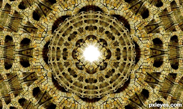
all source (5 years and 3137 days ago)
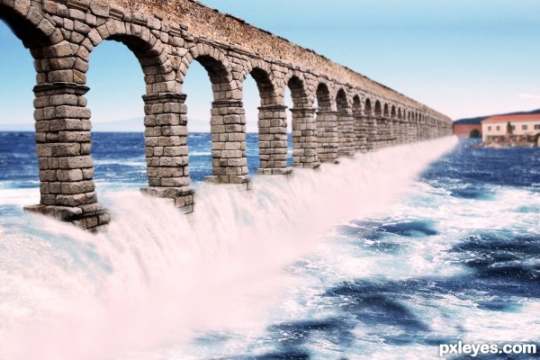
(5 years and 3135 days ago)
very pretty construction and great idea.. GOOD LUCK!!
I really like this, good luck
Howdie stranger!
If you want to rate this picture or participate in this contest, just:
LOGIN HERE or REGISTER FOR FREE
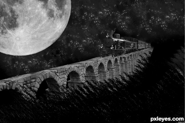
(5 years and 3132 days ago)
Even if the train were at the correct angle, it's wider than the aqueduct, and there are no tracks...
i tried but i wasnt able to add tracks
pls make USEFULL commentS,
Author you should try change the angle of the train, it looks like its placed wron.. if u turn the angle further hes about to fall of if you turn it the other way then u may get it straight. Also I would make the train smaller so it would fit on the edge of the wall. Pehaps you will be able to create your own trackes with just drawing lines and plank images. I like the black n white setting u have made here, also where does the grass/plants, the sky and the moon sources come from? I dont see them listed. If you created them yourself please do show in your step by step 
Author, the kind of feedback I gave you should be very useful.
the bridge n train's perspective not right, improve on the contrast, now alittle flat (not much tonal changes)
not u CMYK there was sm1 else cmnted, sorry
i used brush for the moon and stars, i dnt remember the site, was long ago. search u ll find it...
except the train and brdg evrything else is brush
VE DONE WITH THE SOURCE URL, IS THERE ANOTHER PROBLEM?
u changed train source but u didn't changed the train  )
)
man go to Flickr.com find a train and replace the one in your drawing, http://www.pxleyes.com/blog/2009/06/how-and-where-to-find-legal-source-images/
is there any prblm now?
thanks for d link
Much improved from what you originally uploaded. Listening to the critiques offered will often help you improve your entry, so don't take them as an attack, take them in the spirit they are offered, which is to help you.
finally u got it right this time. Good luck!

Howdie stranger!
If you want to rate this picture or participate in this contest, just:
LOGIN HERE or REGISTER FOR FREE
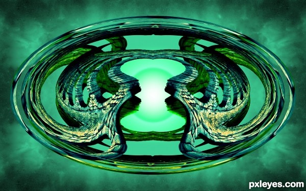
(5 years and 3134 days ago)
Interesting shape, but i have a little trouble 'reading' the image. I don't make the connection with 'space'. It's more like some glass jewel to me.
It does sort of look like a glowing gem, lol. I'm going to stick with space aquaduct though lol, since nobody knows what a space aquaduct looks like haha. Thanks for the comment. Maybe I will add some stars or some sort of element that will better make the connection with space.
Howdie stranger!
If you want to rate this picture or participate in this contest, just:
LOGIN HERE or REGISTER FOR FREE
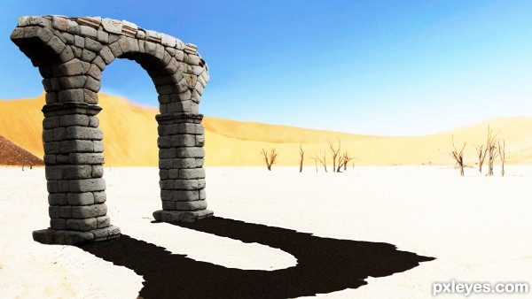
first entry in a looooong time
this is my artistic interpretation of a stone gate long forgotten...
thanks to pinzino at sxc.hu for the desert picture (5 years and 3136 days ago)
The shadow on the ground does not correspond to the shadow on the sides of the aquaduct arch, and it is too light in color. Too visually disconcerting.
Really interesting concept. Just need to tighten the execution a bit.
The black shadows are obviously pasted on, they're bigger than the surface they're on, and they don't correspond to the shape of the gate.
OK, thanks for constructive criticism although the non-corresponding of the black shadows WAS intentional
it was changed and the shadow on the ground also was blacked to be less visually disconcerting
Author, the shadow is better, but no shadow is 100% black. If you lower the shadow opacity you could have something here. GL. 
again, i considered the pure black to be arty kinda thing
but it was changed i think for the better, general burn"n"dodge was applied as well
MUCH improved, more visually consistent now, which makes for a more enjoyable appreciation of the piece.
Author, you will find that pure black, like pure white, is seldom an effective "arty kinda thing," because being extremes, they tend to dominate an image, so *in general*, you want to have them visually consistent to fit the visual dominance they will exert, which the shadow now effectively does.
LOL...now that all that stuff is out of the way, I'd like to point out that the light source is from the upper right, so the shadow is completely opposite the light source. 
i see where your coming from on that, but on the source picture of the desert the shadows of the tree are extending to the right, so i went with that,
a
thanks for all the help gold hands for all!!
Howdie stranger!
If you want to rate this picture or participate in this contest, just:
LOGIN HERE or REGISTER FOR FREE
Photography and photoshop contests
We are a community of people with
a passion for photography, graphics and art in general.
Every day new photoshop
and photography contests are posted to compete in. We also have one weekly drawing contest
and one weekly 3D contest!
Participation is 100% free!
Just
register and get
started!
Good luck!
© 2015 Pxleyes.com. All rights reserved.

niceee.... pattern, realistic
I like the richness of the texture here. I would like it better compositionally if it was not centered, but that's a personal call.
@pingenvy i agree with u, but this is a kaleidoscope and everything is built on the idea of symmetry
Howdie stranger!
If you want to rate this picture or participate in this contest, just:
LOGIN HERE or REGISTER FOR FREE