thanks EveLivesey - http://evelivesey.deviantart.com/art/Tree-PNG-212207997?q=boost%3Apopular%20in%3Aresources%20tree%20png&qo=12 (5 years and 3037 days ago)

credit:
http://stormxstorm.deviantart.com/art/Street-and-City-Stock-17-167645166
http://browse.deviantart.com/resources/?q=batman&order=9&offset=48#/d3h49en
http://mrhighsky.deviantart.com/art/Moon-and-Light-Brushes-119466660?q=boost%3Apopular%20in%3Aresources%20moon&qo=556
http://www.flickr.com/photos/amynkassam/3793627911/in/photostream/
(5 years and 3034 days ago)

Thanks to the following for stock images:
tammysue.deviantart.com
shelldevil.deviantart.com
sikaris-stock.deviantart.com
donstock.deviantart.com
ellemacstock.deviantart.com
linzee777.deviantart.com
cat-in-the-stock.deviantart.com
kuschelirmel-stock.deviantart.com
ashensorrow.deviantart.com
htscratzilla.deviantart.com
brokenarts http://www.sxc.hu/photo/219617
EXTRA LINKS:
Crown
http://www.sxc.hu/photo/219617
Flower
http://scratzilla.deviantart.com/art/flower-3-270233846 (5 years and 3041 days ago)
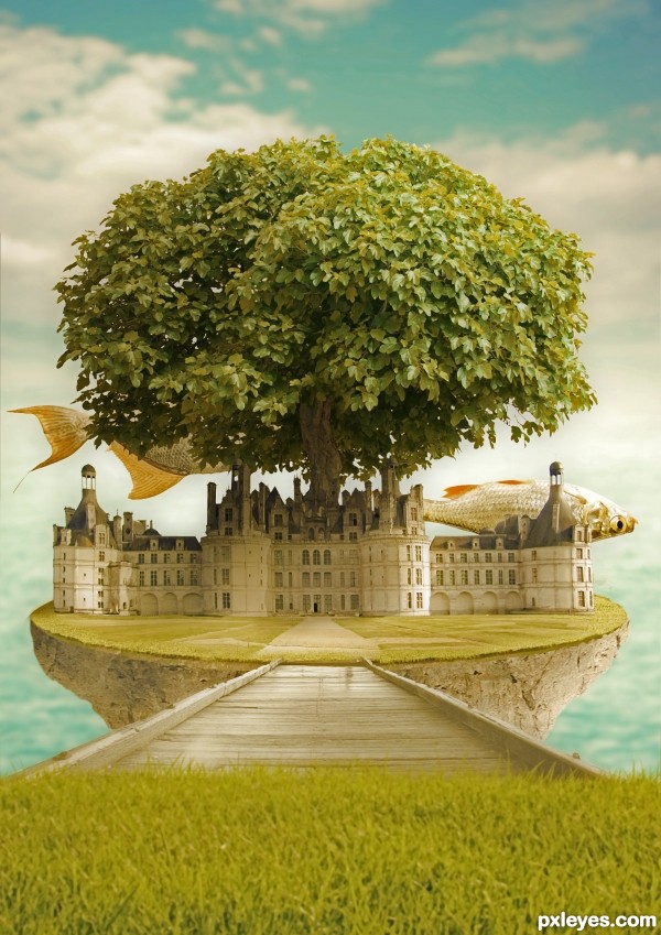
Too bad the fish in the back died and went "belly up," this looks like a cool place for fish to live!
in this world the fishes swim upside down
very well composed.
Just my opinion, but I think the fish on the left would look better in the foreground as it would help the visual depth of the piece... It is titled Fish Island so it would be nice to see an entire fish... again, just my opinion, but if the fish are upside down, people will think they are dead; art shouldn't need a explanation for it to make sense.
Imagine this piece hanging in a gallery with no place for a "swimming upside down" comment; people are going to think they are dead and that the island is some sort of fish afterlife.
Nicely put together piece regardless of my opinion.
"If you have to explain it, you've failed at visually communicating it..." One upside down fish will not convey your fantasy world, it just looks like a dead fish, because you have given the viewer nothing to convey that your fish world is any different from the real world. Everything else is right side up, except for one fish. If you filled the image with dozens of upside down fish, the viewer would generally assume that they were all dead and floating "belly up."
Perhaps if you placed the tree top beneath the castle, so that it was upside down, or flipped your background so the water was on top, and the clouds on the bottom, it would help create a more cohesive "upside down" environment, but as is, it just does not come across as you are envisioning it.
thanks for the feedback,
galiano, in my opinion a piece does not necessarily needs to reveal it self and it can leave room for the observer to fill in the blank and make up the story.
even a piece named fish, without a fish meens something
imagine an abstract piece in gallery titeld fish, and all you see is lines and cubes... the artist does not need to explain anything, thats the beauty of it.
in my story there is a world with upside down fishes swimming, in another person story there are dead fishes, although dead fish dont lie on there back but float side way, and certainly fish dont float in the air, but it seems that it does not bother anyone.
by the way i love your scenario about the fish afterlife...
MossyB,
there is not such a thing as faild art... unless you are criticizing my technique... and even that some times as not importend as the concept.
i dont have to convince you or any one else of my vision, and certainty i dont need to change the image so it will fit your comprehension of upside worlds. the purpose is to arouse the viewer imagenation to complete a story as he or she likes
i wanted to put only the fish upside down and i ilke it this way. for me it seemed better... you want to argue with that?
if you want to visualize this as a world with one dead fish floating in it, be my guest, it is your lack of imagination ot mine.
i love a good feedback even when its criticising, but i dont appreciate the way you give it!!!
by the way the second fish is all so upside down even you dont see it, and if you look in the SBS you will see a second vriation with two "dead fishes" floating.
I love when people are fighting for art ...go go go author
all things being said if you like it that is all that matters.
Failed is a harsh word.
I like this chop and good luck too you Author.
Ah, don't worry author! I just think it is , the viewer wants you to make it how THEY would have made it, without realizing that YOU are the artist here. Maybe they should make their own version so they can be happy? :P
Anyways, this is very interesting, and high marks from me for such imagination!
thanks all for the comments
i like dead fish, they are easier to cook!

lmao @ ripsaw :P nice clean entry, I think a fish in the front would have given u more dof and for me it would add to the title fish island, . nice chop gl
thanks for the feedback
Howdie stranger!
If you want to rate this picture or participate in this contest, just:
LOGIN HERE or REGISTER FOR FREE