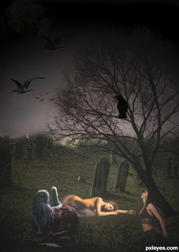
thanks to marcus ranum
moonchild dollieflesh-stock
the moon is not texture just the way it looks after i used
topaz adjust (5 years and 2932 days ago)
- 1: source1
- 2: source2
- 3: source3
- 4: source4
- 5: source5
- 6: clouds
- 7: kneeling girl
- 8: raven
- 9: bird brushes




Quite dark and mysterious, but well done. The only thing that bothers me is that the girl in front gets light from the right, while the main light source is above left of her. Perhaps you can move the girl à nd the angel a bit more to the left so that the light sources match better, ie till the girl's shoulder is on the left from the light source (and this way you make the left part of the image also more interesting, imo it's a bit too dark and lost space that doesnt interact with the rest of the image). Good luck!
Edit: entry adjusted
Howdie stranger!
If you want to rate this picture or participate in this contest, just:
LOGIN HERE or REGISTER FOR FREE