thanks to almudena stock
resurgere,night-fate-stock
please leave comments so i can fix if anything is wrong (5 years and 2933 days ago)
(5 years and 2933 days ago)
Photography and photoshop contests
We are a community of people with
a passion for photography, graphics and art in general.
Every day new photoshop
and photography contests are posted to compete in. We also have one weekly drawing contest
and one weekly 3D contest!
Participation is 100% free!
Just
register and get
started!
Good luck!
© 2015 Pxleyes.com. All rights reserved.


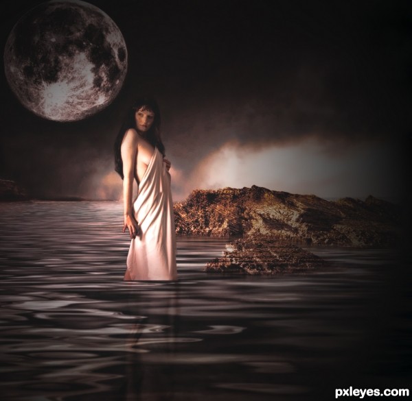
Interesting. I wish the title provided more of a hint as to who this giant goddess is. Her tatoos are not realistic (odd brown outer glow, for example) and overdone IMO. I think the soft black of the foreground trees tones down the drama. The bright blue of the moon seems like a distraction from the mood and color palette of the goddess who should be the focal point; a white moon would fit in better.
hope this is better
hope this is better
love it! i think when u remove some part of the moon or lady i think you forget some part like. some wear on the trees, and i think the lady is some wear in the lake? so she must flout down more! itats my idea! except that, its nice
I like this a lot more as well. The title tells us who she is and her scale seems reasonable. If this weren't meant to be fantastical, her front lighting might seem odd but I'm very willing to get caught up in the moment (although a little more shadow where her towel hits the water might add some faux realism). I wish the light reflections in the water pointed more clearly to the moon as their source. I would crop out the right half of the image for several reasons: The resulting composition would be more compelling. The light source for that cliff is inexplicable. A night scene suggests cool light yet the cliff's light is warm.
hope this is better please let me know
Now is much better!
there is a lot of unfinished lines in the high rez?
Howdie stranger!
If you want to rate this picture or participate in this contest, just:
LOGIN HERE or REGISTER FOR FREE