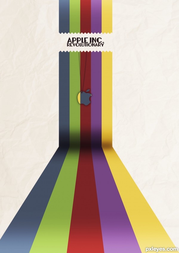
long time i've entered anything on this site. Hope you guys like it.
No external images used, except for the apple logo as a template for tracing. (5 years and 2900 days ago)
Cool image even if I don't get what the message is. Some greater contrast on the rocket might add more punch. The crowded top and barren bottom of the image creates a disturbing imbalance IMO. A bigger orange moon thing moved to 5 o'clock behind a crisper rocket ship might be more compelling.
author says:
Thanks for comment . Ive notice but i didnt have time to upload the finish work. Ive move the moon. Its like a rocket travel company.
(5 years and 2892 days ago)
Howdie stranger! If you want to rate this picture or participate in this contest, just:
Great Job! may want to equalize the letters PER so that the Stroke equalizes (clean line over the top) and the letter E should be symmetrical and the R is a bit weird. (It's still awesome, I'm just pointing out what a client would zoom into.. and they do.. over and over and over again) hehehe
Love the yellow border and the aging process (a blur scrub over the scalp line might soften a bit)
Good luck and good job, and always IMHO, fun image
author says:
The text has been changed, I also added a bit of blur to the top of the head. Thanks Driven!
I just tested all the links and they seem to be working okay on my end. Thanks for bringing that to my attention. I wonder if anyone else is having that problem?
Love the retro texture feel, but she looks like she's falling over...and who knew Barbarella was in Star Fleet?
PS: Don't you think all the type at the top should have the same perspective?
author says:
Thank you Bob! Applied perspective like the old posters of Barbarella By the way, the universe became too big for her to try to save it all by herself... So she joined the Star Fleet crew I'm not sure whether changing her position made it better...
Now she's not falling over, which is a good thing.
As for the type. of course the perspective is up to you, but now "queen of the galaxy" is the reverse of the larger type, not following the same perspective. Think STAR WARS titles.
Nice colors and good pick of sources. I'm less convinced about the choice of font for the tagline. It can have some more drama by using a bigger size, other font and perhaps (just as the text on top which looks better, maybe a bit thicker border) the use of some perspective (maybe you can use the perspective from the metal background to align with). Good luck!
author says:
Thank you @wazowski. I made some changes. Used bold century gothic for the tagline and applied a different perspective. I made the borders thicker too
I agree with wazowski... I love this but the bottom is missing that drama. I think the tag line in side something like this would complete an excellent piece.
http://www.powerpoint-2010.com/wp-content/uploads/2011/12/star-bubble-02.jpg
Howdie stranger!
If you want to rate this picture or participate in this contest, just:
LOGIN HERE or REGISTER FOR FREE