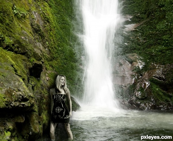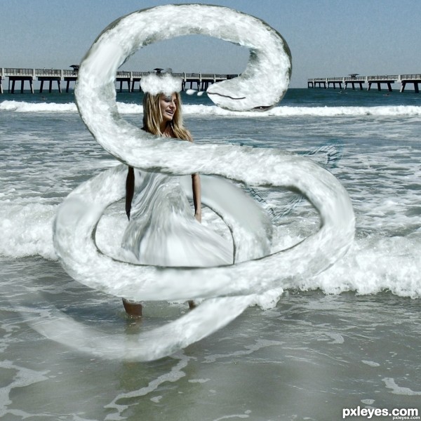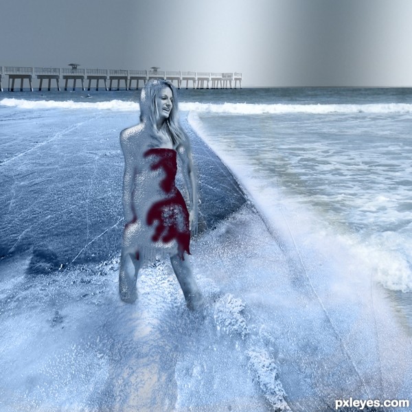
Source image plus my own photo of the waterfall.
Photoshop Elements 6 - used layers to add in the girl, some of the incoming wave and made some level adjustments. Added layers to create shadow, colour matching and blending. (5 years and 2843 days ago)


Light comes from above, so I suppose that the girl's shadow should be less darker, and maybe not above her head! Just a suggestion and my opinion. Good luck author!
I appreciate the suggestions/tips. Thank you.
The girl is too desaturated for the background, and the drop shadow behind her really makes her look artificially inserted into the image. It does not blend well as a cohesive composition.
I was trying to match the shadowing to the level of harshness on the rocks, but I see your point and thank you for the critique.
Howdie stranger!
If you want to rate this picture or participate in this contest, just:
LOGIN HERE or REGISTER FOR FREE