(5 years and 2926 days ago)
- 1: source1
(5 years and 2926 days ago)
fantastic
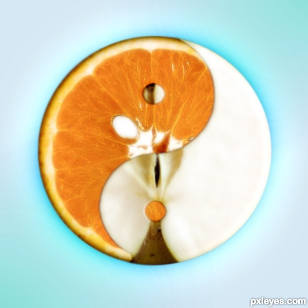
Great concept - almost surprised I've never seen one like it before. Nicely done
almost creamy  great job
Very original!
very strange, very weird, very not... usual....
I like it alot 
Brilliant and creative idea!
I think it is great .... original and makes the viewer keep looking
I would of liked apples to have a thicker skin .... but they don't..
good luck
Howdie stranger!
If you want to rate this picture or participate in this contest, just:
LOGIN HERE or REGISTER FOR FREE
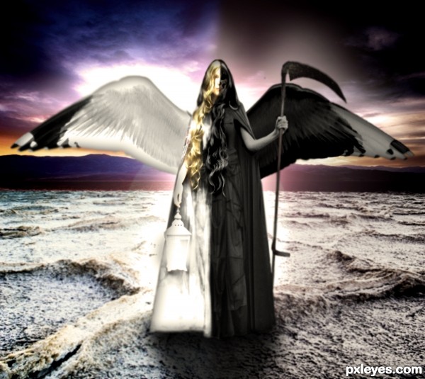
The balance of life and death. (5 years and 2924 days ago)
women are particularly at yin jang. nice job
Interesting but blurry.
Thanks  I know, ugh I just cant get it to do what I want it to. I'll keep trying to fix it though!
great potential..... think you could have done so much more with detail on both sides of girl
good luck
Howdie stranger!
If you want to rate this picture or participate in this contest, just:
LOGIN HERE or REGISTER FOR FREE
(5 years and 2925 days ago)
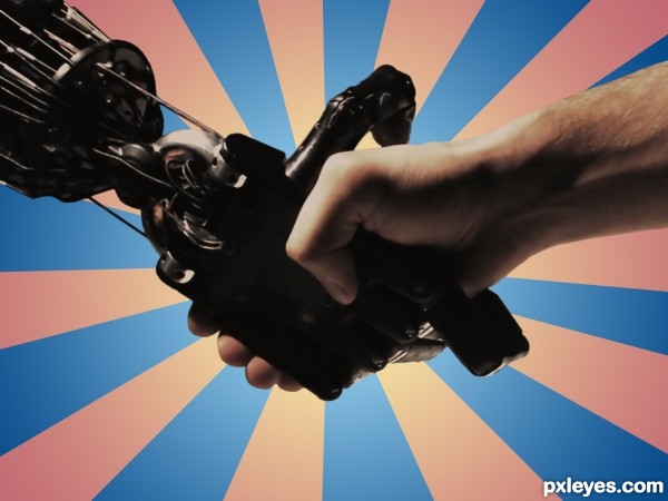
Great find of picture... but that is all it is, right now, a great find... background and picture found on internet... I think you can do something more with this, maybe atleast make it into a yin/yang zin/zang symbol...
Gimme a break! The Yin/Yang symbol is the most trite thing you could come up with in a contest like this. The meat of the contest is: "create a contrast of opposites based on the oriental theme". The concept of the pairs of opposites is fundamental to all philosophies, and many of the entries in this contest reflect that without using the Yin/Yang symbol.
I concur with what you are saying and would totally agree if you had made the mechanical arm yourself; or if you added something additional to the background you created! (people fighting robots or something like that!)
I faved in advance hoping you would tweak it just a bit... not to my personal suggestions... but just look inside and give it the extra boost it needs to be super duper awesome! 
Sometimes a good find is all it takes. I've seen it work many times, and all this one needed was some graphic impact in the background. Something like people fighting robots wouldn't fit what I had in mind anyway...I see this as a friendly handshake between the creator & the creation. That's why the title isn't Flesh vs. Steel.
I see your point! Sometimes the idea or creative imagination goes along way... 
as stated earlier.. really a great picture and concept!
great picture ..Hate your background... my artistic bias..LOL
good luck
Howdie stranger!
If you want to rate this picture or participate in this contest, just:
LOGIN HERE or REGISTER FOR FREE
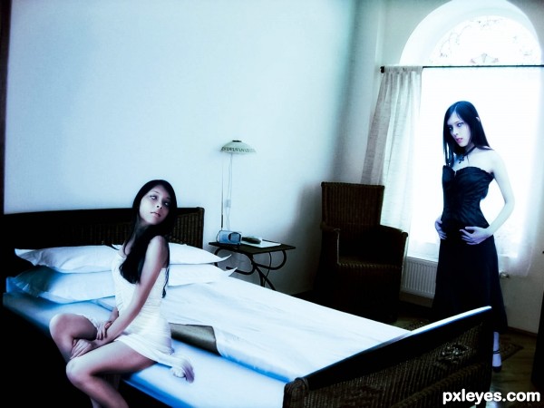
(5 years and 2922 days ago)
In my opinion, the girl in white should blend better with the bed, I think that adding a shadow on the right side of the dress could make it feel more realistic.
Thanks your right, i add a shadow. i had to work in the room picture it was to grainy im working on it.
I really liked the good and bad sides of the bed idea..... perhaps a little more contrast ...I might have brought dark image closer and would have cropped out left hand drape ( Little things)
good luck author
Thanks for comment. i still working on it
Howdie stranger!
If you want to rate this picture or participate in this contest, just:
LOGIN HERE or REGISTER FOR FREE
Photography and photoshop contests
We are a community of people with
a passion for photography, graphics and art in general.
Every day new photoshop
and photography contests are posted to compete in. We also have one weekly drawing contest
and one weekly 3D contest!
Participation is 100% free!
Just
register and get
started!
Good luck!
© 2015 Pxleyes.com. All rights reserved.

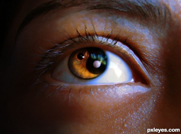
Perhaps it was better to remove the reflection in the eye, just my opinion
Well done but i agree with lincemiope.
Really? I thought it would make it more realistic.. how about just turning it down a bit?
First, I deliver thee from black and white see how he is.
Then the pupil to make the contrast orange, white on a red dot, small, with small veins.
Symbolically, the eye is sweet, but also bloodshot.
Sorry if I said some stupid things, hello
Lol I read a few times... am I daft? 'cause I didn't understand a word lol
my translate is daft
in italiano :
prova a levare tutto il riflesso bianco dal nero dell'occhio e vedi come sta.
Suggerivo di mettere un pallino rosso, con le piccole vene, nel bianco dell'occhio, da contrapporre alla pupilla arancio, in modo da fare simbolicamente un occhio dolce, ma iniettato di sangue.
maybe your translator is better than my
ahhh sì! Google translate aiutato. Ora capisco. Cercherò che. grazie. Conosco un po 'di spagnolo messicano, ma non italiano.
I feel a great job, neat, precise, well done
Nicely done! GL author
Thank you
Howdie stranger!
If you want to rate this picture or participate in this contest, just:
LOGIN HERE or REGISTER FOR FREE