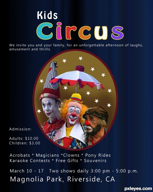
Thanks to Robert Francis, cobalt123, and hkfuey97, from flickr, for the pics of the clowns. (5 years and 2604 days ago)
3 Sources:
(5 years and 2605 days ago)
Photography and photoshop contests
We are a community of people with
a passion for photography, graphics and art in general.
Every day new photoshop
and photography contests are posted to compete in. We also have one weekly drawing contest
and one weekly 3D contest!
Participation is 100% free!
Just
register and get
started!
Good luck!
© 2015 Pxleyes.com. All rights reserved.


I like this poster. The justified left throughout doesn't work for me. Nice work with the clown sources. This looks like it might be for a county circus. Something smaller and more local than a nationwide one. Nice job on this, author!
Howdie stranger!
If you want to rate this picture or participate in this contest, just:
LOGIN HERE or REGISTER FOR FREE