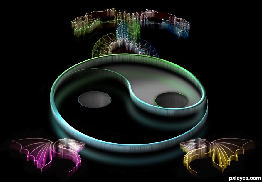
Had fun with Yin & Yang (5 years and 2521 days ago)
Howdie stranger!
If you want to participate in this contest, just:
LOGIN HERE or REGISTER FOR FREE

Thanks Ben Earwicker for the skull photo.
Frame and background are in SBS. (5 years and 2522 days ago)

(5 years and 2522 days ago)
Interesting technique! GL author.
THX Bob
This is lovely...
Thank you
so cool i love this
Thanks Karen
Very cool image!
Thanks Randy
Firstly, interesting treatment. I like it. Maybe I'm being picky but shouldn't the dragons reflect on the black surface the same was the symbol does? Also - at least looking at it on my monitors - there are some grey artefacts on the black surface that shouldn't be there.
Thanks for pointing out the grey areas, I had to get a real weird angle on my screen to see them but they are gone now.
Very nice. Looks like a 70's t-shirt.
Thanks Mark! Dunno if a 70's shirt is good or bad LOL
Well... from my point of view - that would be good. Reminds me of high school.
This could be a great wallpaper! Simple and colourfull...
Thank you and thanks for the fav
Interesting image right on theme. Yes, love your technique. GL author.
Thank you and thank you for the fav
Very well done with a strong design sense!!
Thanks Rein
Congrats!
Thanks
Congrats Rob nice work
Thanks Megan
Congrats Rob, fine work!!
Howdie stranger!
If you want to rate this picture or participate in this contest, just:
LOGIN HERE or REGISTER FOR FREE