(5 years and 1687 days ago)
Howdie stranger!
If you want to participate in this contest, just:
LOGIN HERE or REGISTER FOR FREE

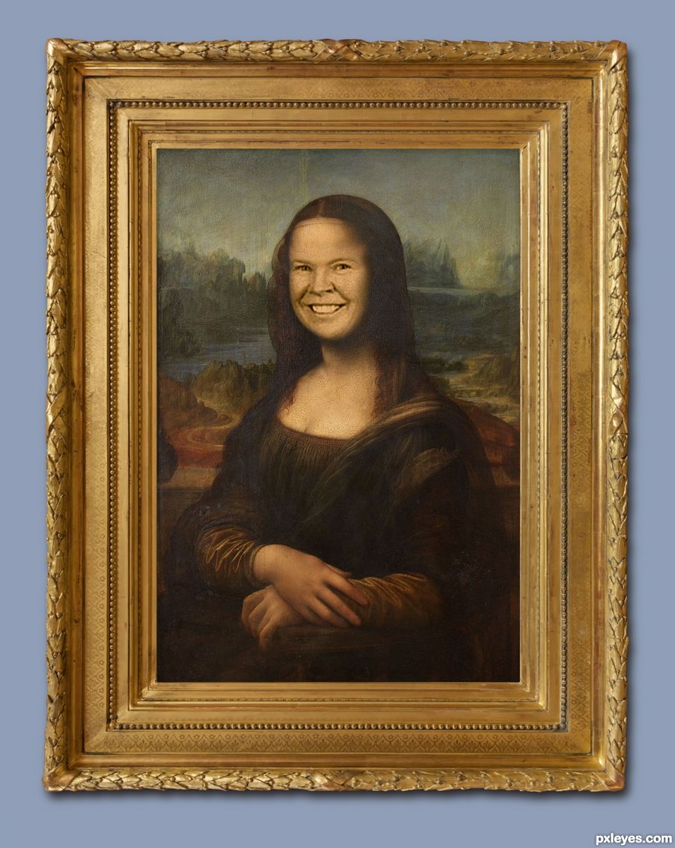
A little fun with perhaps the most well known painting in history. Thanks to madamemonty I'm sure she has a sense of humor...(I hope).
The Mona Lisa (La Gioconda) is over 500 years old. Painted on a wood panel in oils it's rarely loaned out because of it's fragility. If you ever have the opportunity to view it in person you'll never forget how magnificent it is to see. (5 years and 1688 days ago)
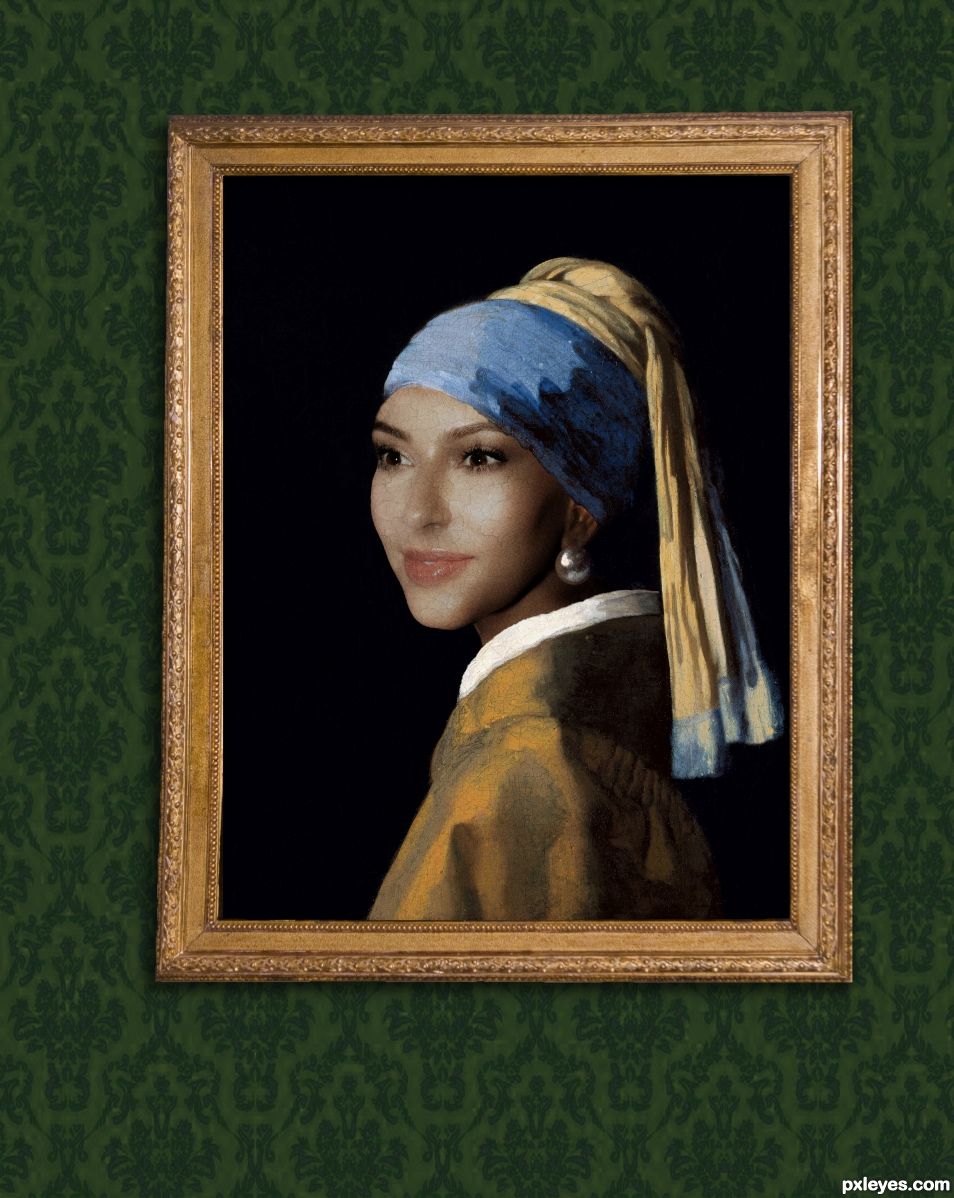
Well done! (But note to author:nobody wants to see Kardashians if they can help it).
Thank you, I do agree on Kardashians.
The texture blending into the face is outstanding. Would some sort of French Toile Twill wallpaper light and dusty give it a little more grounding? The green is very bold for a modern room. (I'm just thinking of the Zelig theme here.) The pitch black background takes away from the painting effect that is done so gloriously in the face. (I'm thinking putting the same texture of the face into a dark bokeh/dark back ground of some sort, like old paintings always have, again sticking with the Zelig Theme). Excellent work, I'm just putting my two cents worth in. (I've looked at a bazillion Zelig images and they all seem black and white and dusty.) But what do I know LOL GOOD LUCK author.
Thank you
WOW, the French toile wall paper really helps A LOT author, it gives it such a nice feel, like going to Grandma's on Xmas Great job
Thank you, I had to change the frame so I figured I might as well follow up on your suggestion.
Congratulations nice image.
Thank you, I'm really thrilled.
Congrats!
Thank you
Congrats... WOOT WOOT
Thank you, and thanks for your good suggestions.
Congrats Vibeke!
Thank you, rather pleased with a 1st.
congrats
Howdie stranger!
If you want to rate this picture or participate in this contest, just:
LOGIN HERE or REGISTER FOR FREE