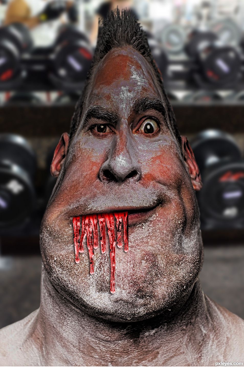
(5 years and 704 days ago)
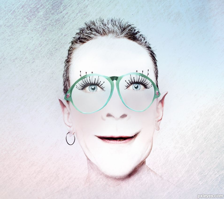
Took some parts of the two faces, the top of the sad one and the bottom of the happy one, but two same eyes of the sad face. Topaz filter effect added. (5 years and 704 days ago)
Photography and photoshop contests
We are a community of people with
a passion for photography, graphics and art in general.
Every day new photoshop
and photography contests are posted to compete in. We also have one weekly drawing contest
and one weekly 3D contest!
Participation is 100% free!
Just
register and get
started!
Good luck!
© 2015 Pxleyes.com. All rights reserved.
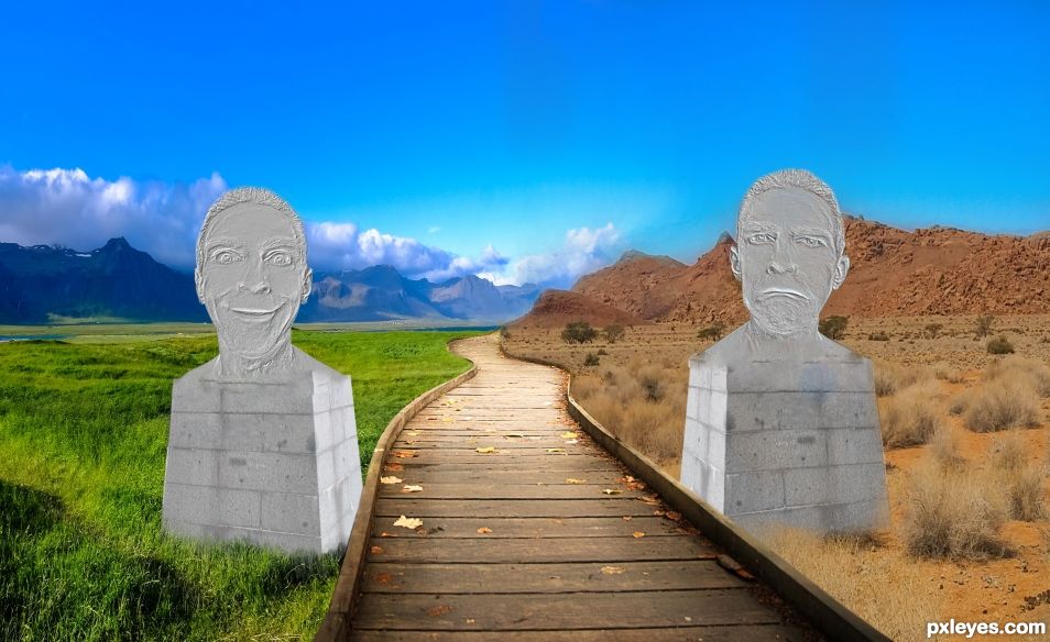


If you can maybe blur the edges just a tad. It had that "hard cutout" look to it.
I always forget that I should go through and BLUR all the edges for a computer monitor visualization, when this is printed, on a 5" X 3" ad card (in it's original state) it comes out fine because of the size...
I blurred the edges as you suggested (good advice) even though when I print it on paper, the blurring really screws up the finished print (that's because the image is a card size, on a large print 11" x 15" the blurring DOES enhance the finished print..)
One of the hardest things for me is that I worked in the "Art Gallery" world for over 30 years.. and painting/drawing/photography in their finished state (a print/card/serigraph)and the visual you see on a monitor are two TOTALLY different worlds. (The color blue is a real pisser because no matter how great the computer image is (sea/lake/ocean) the printer always decides to make the blue color A TOTALLY different shade... I even had "computer view" files right next to "use this one if you want to print it" files LOL)
Like I told my ex boyfriend, seeing an image on the internet (Van Gogh/Matisse/Picasso/Chicago/O'Keeffe...etc) is NOT the same as seeing it on a museum wall. Things add to the painting... the smell of the day, the lighting choices of the curator, the atmosphere of the Gallery, the background music playing on the sound system.
I remember that because it was about the only thing he ever said I was right about. LOL
OMG I haven't laughed that hard in several days. That last sentence was a great "punch line" to the whole story.
You blurred it more than I thought was necessary, but you know what? It looks really awesome now. It adds a depth of field to his head that is pretty darned tasty.
Howdie stranger!
If you want to rate this picture or participate in this contest, just:
LOGIN HERE or REGISTER FOR FREE