(5 years and 692 days ago)
(5 years and 691 days ago)
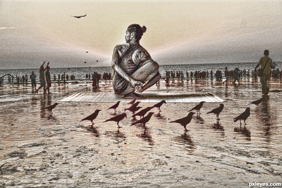
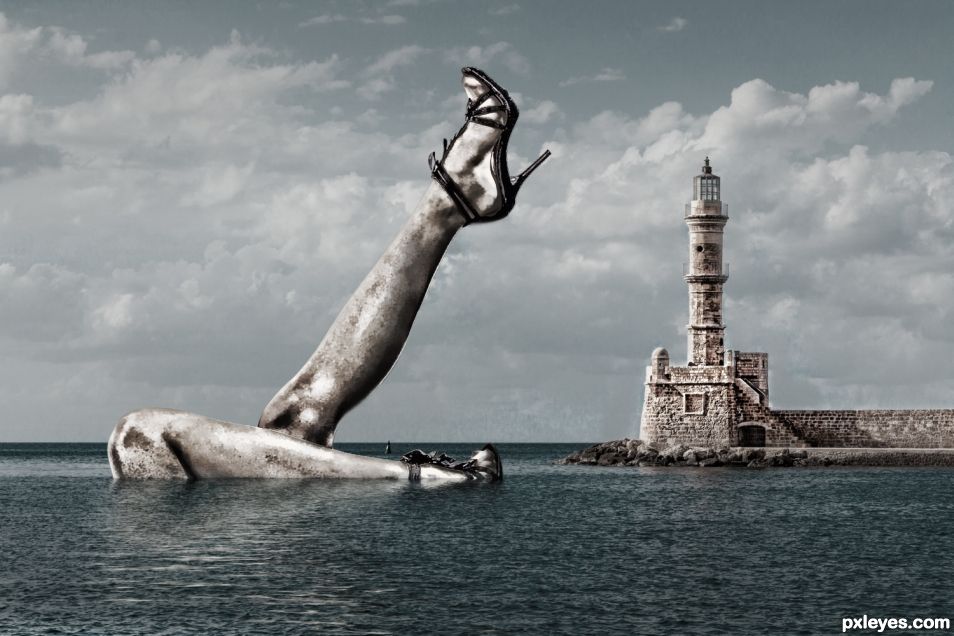
There is some real bad white fringing on the far right leg and some on top of the other, probably from a poor cut out. Those blown out highlight areas on the legs are real bad. There is also a ton or jpg atficats everywhere. Very apparent in the clouds, around the shoes, legs, and lighthouse. I don't know why you made this so small or what jpg setting you used, but you need to crank it up a whole lot more.
Sorry, I print an actual photo when I make a chop, and I review the image as if it appears in a magazine or on a postcard handout. (I did magazine ads for over 15 years for the art gallery I managed) and I always reviewed prints in their physical form.
When reviewed on a high resolution screen (any thing over 2 feet viewing area) of COURSE imperfections will show up. On a 5 inch ad placed next to a vogue ad, I was never concerned with ghosting... force of habit. My bad. The "real bad white fringing" really looks great in the final print, but I always forget that the digital view creates back lighting when viewed on a computer monitor is TOTALLY different then the ink print and since I usually always work in the physical world (book prints, postcard hand outs, sports posters and banners, presentation handouts)I always used my final print out of the printer as my guide.
As to the size of the image, I always send my clients the image to their iPhones/iPads and any image over 4mb disrupt their systems, or I would get "I can't see the whole image" so I got into the habit of shrinking the final image down to a size their smaller viewing area could accommodate.
I have to disagree with your "TON of jpg atficats" (I'm sure it's spelled artifacts but you must have discovered a new word) but then again I could be wrong. The blurring and crunchy edging looks awesome in the print version. Then again that's what happens when you work with the public.
When you work with physical prints the outcome is completely different then what you see on an HDR screen. A fact I do know of, but it never really helped me with clients. All they want to see is what the finished product looks like, and they never want to see the work involved.
Us Photoshoppers can see imperfections in an instant. We also have Photographers on this site who have just as good, or better, eyes than we do, and they too may be judging your art. The contest calls for an image up to 3500 X 3500 so you may as well take advantage of that. Your image is 1500 X 1000 and will have to be scaled UP in order accommodate even the lowest resolution desktop monitor they sell today - which is 1920 X 1080. This scaling by itself will add noise, blur, etc, and make the image look worse. In other words, when "we" (the judges) look at it, we are seeing it all messed up looking. In these contest people don't know or care about the reasons you may be using to make your images smaller. We just look at it and determine how well it looks to us.
While you did fix a great deal of noise, there still is "copious" amounts of it left. You did lessen the yucky fringing on the legs, by a lot, but it is still "glaringly" obvious. Now trust me, I am not getting critical here at all. These things that I am pointing out are very obvious. I can and do get very critical when critiquing images, but that is not what I am doing now. These things are still very recognizable, distinct, evident, and clear as a bell.
https://image.ibb.co/eyeuHe/yucky_statue.jpg
Sorry, I don't know how to talk to you, you kind of remind me of my ex boyfriend, he always had something negative to say in such a passive aggressive manner that I would sometimes feel like I'd just been hit in the head with a sledgehammer followed by tons of hugs.. hehehe
Take your "yucky" statue jpg and embrace that fact that you went in with your talent to demean someone in such a pleasant manner and rejoice. Your a smarty and I'm a dummy.. rejoice... Now trust me, I am not getting critical here at all. I'm just pointing out things that are very obvious. hehehe
Nothing will ever be up to your "standard" unless it looks like something you made, and I get that. I've lived it my whole life. Your technical brilliance is amazing but your communication skills are that of an alligator coming on a hooked fish. I'm caught on the hook and you have all the power.
Though it is quite a giggle that you took time out of your busy day to get out your red pen and slaughter my creation... hehehe
Thank you for your attention in this creation, but I can see there is NO WAY I could ever equal your excellence, so why even try. You're asking me to thread a needle when I'm trying to hoist the mast and I really don't care.
I tried to help you. No need to come at me like that.
I am reading your dialogue with held breath and disbelief.
When you put an image up on any site you are inviting and hoping for sensible, honest critiques from fellow artists, these comments are put forth to help you grow as an artist, and you may disagree with some, agree with others, but when comments are received with grace civility ensues.
I come to you from the photography side and I am constantly bellyaching because the reviews on photography are few and far between. In effect, what I’m trying to say is that critiquing is a tool by which the giver and receiver both learn in an atmosphere of sharing and caring. It is a wonderful opportunity whereby all can learn; even I can learn something from the detailed review given to you.
This is not evident here with pejorative, demeaning, derisive, sarcastic words thrown with aplomb at a caring and very generous reviewer who took the time to highlight and point out discrepancies in your upload.
Even though photography is an art form and the final results are considered an artistic expression of your thoughts and ideas there is a very strong technical element and I agree with all that the reviewer has stated whether viewed in print, high resolution, blown up to a squigillion pixels, scaled up or scaled down, the errors, artifacts, blow outs are clearly seen.
I for one, am very grateful for this in-depth review given by a caring teacher, a top-notch photo chopper for through his gracious and generous teaching I have learned something that I will apply to my work.
Thank you both......to the author for your creative vision which is both unique and capricious and for stimulating my gray cells and to the reviewer for your in-depth, clear and constructive critique, I appreciate both of you.
I liked this one and hoped it would get a better vote... And I like also all the litterature it caused, which shows that artists can be touchy, or generous, or talented, or different, or all that at the same time... different but never indifferent 
hehehe... if voting mattered to me that would be important I guess LOL.. .though my expectations weren't very high to begin with when I'm told it's real bad (twice), blown out highlights, and yucky, so I'm happy with what I got  I guess I'm just not that creative hehehe
hehehe... if voting mattered to me that would be important I guess LOL.. .though my expectations weren't very high to begin with when I'm told it's real bad (twice), blown out highlights, and yucky, so I'm happy with what I got I guess I'm just not that creative hehehe
I have noticed several times that high votes are not always related to talent. Art appreciation is such a subjective matter, it varies with periods and places  Your talent is unique, you are one of my underground heroes, and this is a compliment
https://www.youtube.com/watch?v=CwVqOs3Aess
Howdie stranger!
If you want to rate this picture or participate in this contest, just:
LOGIN HERE or REGISTER FOR FREE
(5 years and 693 days ago)
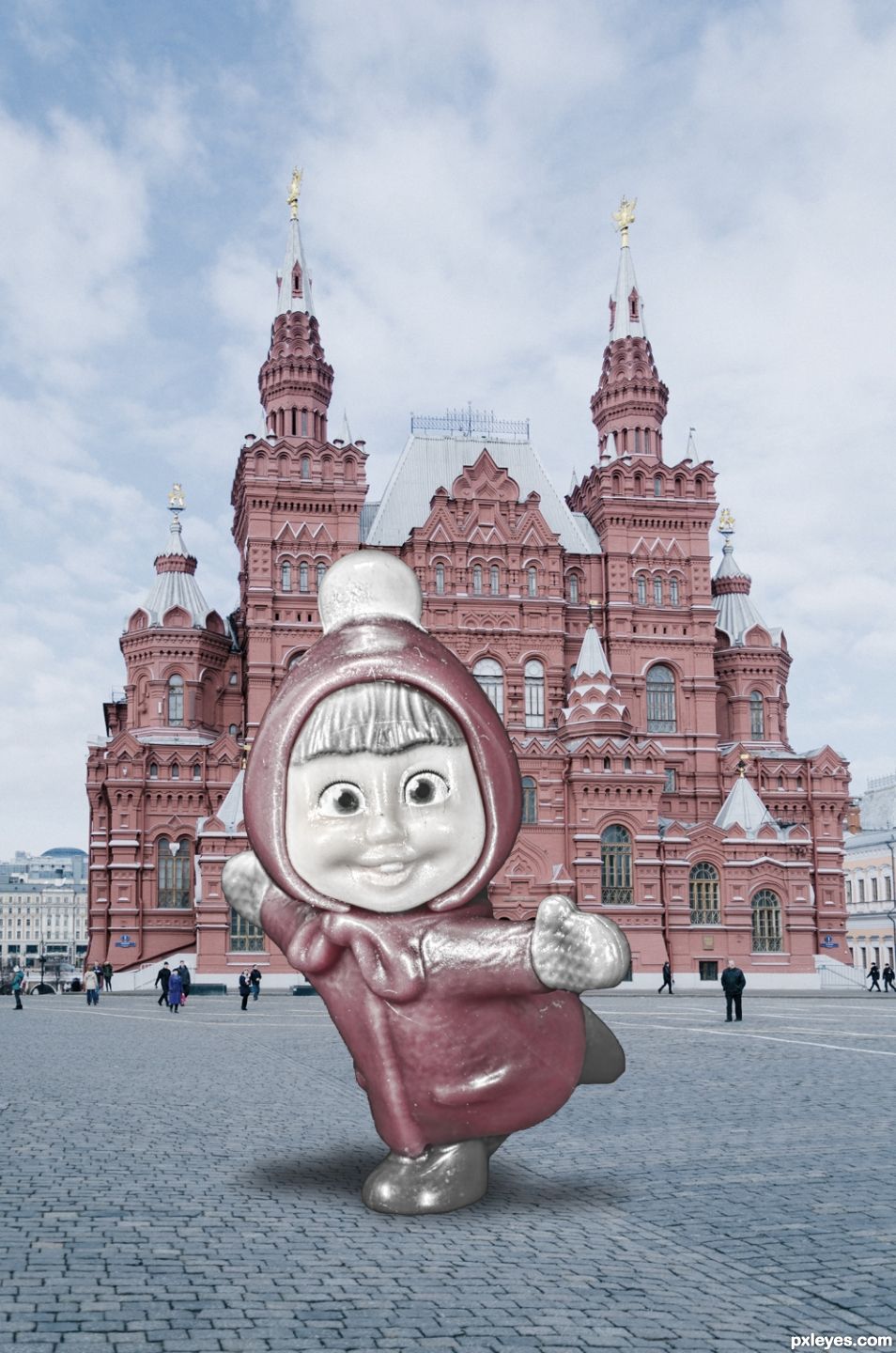
Your masha is already a statue. We are not allowed to use sources which are already sculptures or statues. The idea is to make one out of something which is not a sculpture or stature.
Contest Goal:
Use different sources to create a statue or sculpture.
You can NOT use sources of statues and sculptures though!
The last time I checked, and I may be wrong on this one, but I don't recall a plastic toy being a "sculpture or statue". I'm a little slow so you could be right. Though I never thought of my "Tobor" I had as a kid as a "statue" but I guess the clean lines and neatly shape head might qualify as a "sculpture". Whatever.. no big whoop.
I guess I can only suggest you to "red flag" it and ask them to remove it.
I am not going to red flag it. The mods will eventually decide if a toy qualifies as a statue/sculpture or not. In my opinion all toys qualify as statues though. Dolls are just mini 3D statues or models of people, animals or cartoons.
https://en.wikipedia.org/wiki/Doll
I just thought the contest idea was more along this line.....
https://www.youtube.com/watch?v=eCwcKEUcqcU&t=245s
Doll or Statue I like this and the colour palette works for me. You also included a nice shadow behind the "doll statue".
Howdie stranger!
If you want to rate this picture or participate in this contest, just:
LOGIN HERE or REGISTER FOR FREE
(5 years and 693 days ago)
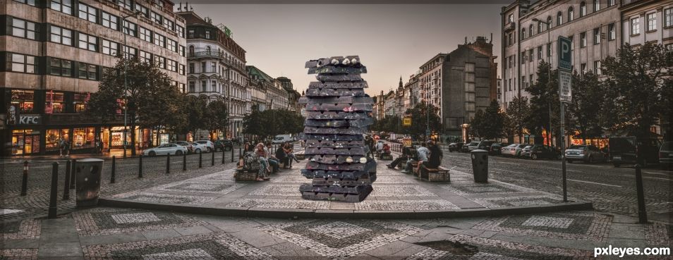
Where is the sculpture that you created? You have done nothing to the source images except cut out and resize the chocolate and paste it on top of the other.
I actually got the vision when I was coping with my dosage of meds that are suppose to keep my heart beating and the only way I can do that is to lay down and wait for the side effects to disperse (usually takes about a couple of hours) so I day dream. In this case, the statue contest. I had a vision of a Hershey bar in the middle of Times Square.
While I felt that a Hershey Bar would be too much on "the nose", not to mention the nightmare of copyright, I searched through about a thousand photos to find a chocolate tower, (a picture that didn't reflect any form of commercialism) then I searched through a thousand other photos for a city square with the perspective that matched up with how the chocolate was sitting.
Placing the two pictures into photoshop, I selected out the chocolate tower, and used several functions to cut it out. (The original photo is dark on dark) I think that's one of the things you do in photoshop. As I am disabled and can't afford the "modern photoshop online" I use the White Rabbit Photoshop which serves my needs. I then thought of the great brass/bronze sculptures in city squares I was granted the joy of reviewing in my meager travels around the US.
I do enjoy the occasional abstract.. the Miami fried eggs the size of Studebakers and the giant glove in a public park in San Diego. This is my creative process. Childish I know, but that's how my brain works.
I then matched the texture of the Prague photo up with the chocolate using a variety of filters to give it a more convincing look. De-saturating the nuts and nuggets in the chocolate to make it more into a sculpture was my goal. I erased the base of tower with a super soft brush to give it a ghost edge then repeated it (layers) about 7 times and merged it into the brick pattern in the Prague photo, then lightly burned the ground and the blurred edge I created to make it sit properly to the best of my ability and eyesight.
I'm sorry that you feel my work is "nothing" but a cut an paste job and I just humbly disagree. I love your work, and I think you are probably one of the most talented people I've ever seen on this sight. You opinion is very greatly appreciated. I just happen to disagree with you on this one.
W/E is wrong with you, I hope you get better.
I like your post processing here and of course the chocolates (oh if only). You have a thin bar like hue running across the very top in the sky, did you mean for it to be there? Maybe just crop down to eliminate?
That was done on purpose, the framing was actually a stroke bar frame that I faded into the image. It exists around the whole image. I know that framing is a no no in photography, but photoshop does give you a little freedom in this area... I used to use plastic wrap and lens flare all the time and now I don't (due the the frightening negative reaction from everybody.) I still use it in my private work and it's a lot of fun... I just don't like being governed by the norm, never have and never will... that's just me
Now my eyes have been opened. Yes I see the border. Thank you.
Howdie stranger!
If you want to rate this picture or participate in this contest, just:
LOGIN HERE or REGISTER FOR FREE
Photography and photoshop contests
We are a community of people with
a passion for photography, graphics and art in general.
Every day new photoshop
and photography contests are posted to compete in. We also have one weekly drawing contest
and one weekly 3D contest!
Participation is 100% free!
Just
register and get
started!
Good luck!
© 2015 Pxleyes.com. All rights reserved.


Surreal and I really like the grungy feel, the two tone sepia-ish colouring. Shadows are realistic.
Howdie stranger!
If you want to rate this picture or participate in this contest, just:
LOGIN HERE or REGISTER FOR FREE