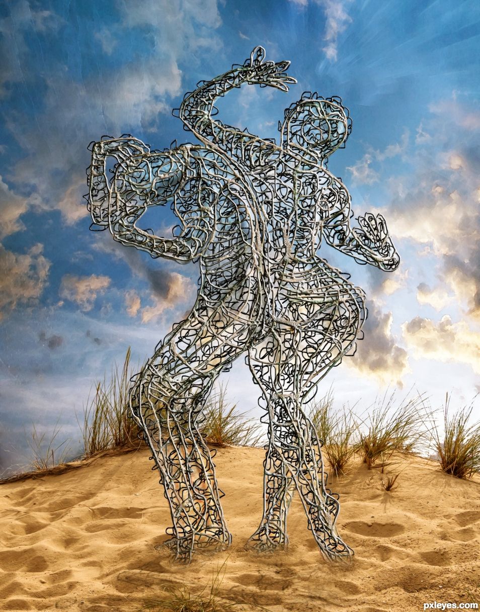
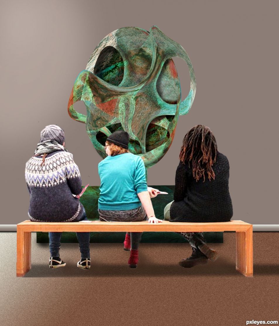
Please tell me what you did to this in order NOT to make it look cut out and pasted on? It blends in really well. Good work.
author says:
Thank you Still. I tried to give the statue some volume using dodge and burn. I like blending the colors, to give the picture some unity, doing Image - Adjustments - Match color, then you have to pick a source layer for a reference and adjust the layer you chosed to adjust with the 3 options (luminance, color intensity and fade).
I have written down this valuable information for me so I don't forget to try it. I do not know how to pick a "source layer" but will google it. Thank you very much.
author says:
Don't google it. You will know when you get there, PS will ask you to pick a "source layer", which will be the reference for the colors you want to get close to on the layer you need to adapt.
Add a description...The circle on the back of her head was done with a piece meteorite.. transforming tool… the wall is a gradient with texture.... (5 years and 551 days ago)
It seems to have that "cut out and pasted on" look about it (oh I struggle with that so much). Cannot tell you how to overcome this difficulty. The colour palette is really nice and calming.
Howdie stranger! If you want to rate this picture or participate in this contest, just:
Interesting sculpture but the perspective is all wrong. Look at the where the wall meets the floor on the art visitors source and make sure the new wall and floor meet in the same place. The green box would also be a lot lower and visible from under the bench in the area where the feet are. The top of that box should be the same perspective as the top of the bench.
author says:
Thanks Angel... yes, the perspective as you say, it was all wrong.. I do not know, I think I just placed things around, without looking first, as you know, you get all excited after finishing a work... and want the world to look at it... and see what happens.... thanks for your advise... I made some changes.. I am open to make more if necessary... have a good night my friend...
The floor and bench all look level now to me but the whole chop looks "cut out and pasted on" effect. There also seems to be an incongruity between the subjects who are dressed in woolies but are sitting inside a building. The balance is nice with good marginal space all around. My eyes would have preferred everything in focus but that is just me and I bow to your artistic prerogative.
author says:
That is what happens when you have to look around to get some sources and work with them... this is not a regular photo, taken with a camera, it is a blending of shapes and forms. It is true, it looks cut and pasted on, as it is what I did. Working with photoshop it is not easy, and I did what I could. Artists, like me, take the time to look around and work as best as we can... just putting the image together is an art form. As for the people sitting inside a building dressed as they are, I think it is possible... as you can see in the original source. That is all I can say... I am still learning... thanks for your comment... it helps me....
(5 years and 549 days ago)
Howdie stranger! If you want to rate this picture or participate in this contest, just:
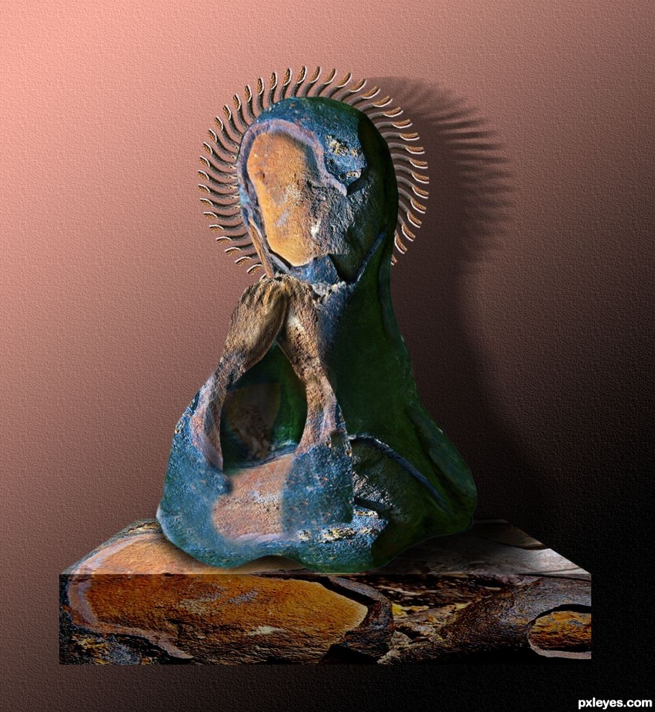
Very imaginative. Me like.
Thanks BWR.
Interesting technique you used to make the sculptures
Thanks Rob.
Good chop. Good win. You won two today!!
Congrats again Skyangel
Thanks Sylvie.
Howdie stranger!
If you want to rate this picture or participate in this contest, just:
LOGIN HERE or REGISTER FOR FREE