Thanks to binababy12! (5 years and 3981 days ago)
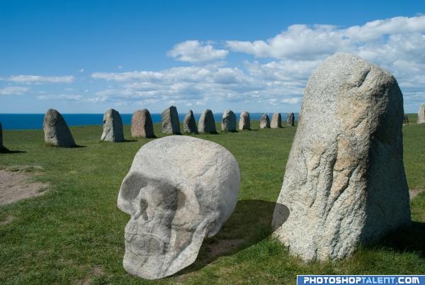
Tools used:pen tool
brush tool
copy/paste etc (5 years and 3980 days ago)
Darken the skull & fix the shadow. Look at the shadows of the stones...the light is from the left.
Very interesting choice... you may want to try and match the shadow angle.. your shadow is at 1 o'clock and the shadow on the stone is at about 3 o'clock.. also the darkness on the shadow side of the skull should match the darkness on the stone.. it's really a great idea,, I'm sure other peeps will be along to help push Idea
Looks like the skull is floating.
Skull is not luking like made of stone....Its jst like a cutted paper texture....add some tones...GL
time is something like quarter past one... :P good luck!
1> you texture doesn't cover the entire skull, the top left, 2> darken the area over the eye sockets, nose opening and around the teeth, as if someone carved the rock, a very good idea, just needs a few tweeks, good luck =)
Interesting image !!!!
A good idea.. Apart from the shadow fix's as mentioned, I would download a new texture and use that, the rick while nice has specific shapes in it that you would need to make follow the contours of your skull.. GL.
You can see where you copied the texture of the stone onto the skull - use the clone tool to fix this so the skull looks less see-through...
You can see where you copied the texture of the stone onto the skull - use the clone tool to fix this so the skull looks less see-through...
Very interesting but the skull needs work.
Cool, but needs a bit of work still ...light source, skull, shadow...go fix fix fix 
nice 
Why is the skill opaque? Also why does its shadow just go flat over the other rock, and sorry to be mean, but also, the shadow is in the wrong direction, look at the other shadows. But after all that, I still like it, with a little work it could be a great entry 
nice
good idea, shadow on the stone need to be reworked
Oeh, great idea but not made that good... will hold my vote to see if you can do better
gl
I like it... good luck
skullhenge
Needs work on shadow and the on the texture
the skull is very light. goodluck.
Howdie stranger!
If you want to rate this picture or participate in this contest, just:
LOGIN HERE or REGISTER FOR FREE
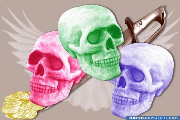
I used only the source image and a free wings brush I downloaded.
I used plastic wrap on the skulls and the coins and halftone patterns.
The colors where created by using levels, color balance, hue saturation and brightness/contrast.
I also put a little skull on the sword. (5 years and 3977 days ago)
Nice idea good luck!
good cut out, good luck
BWHAAAAAAA HAAA HAAA HAAAA... SKULLS... IN PASTELS???!?!?!?!?!.. where's the frippin Humor Bar???!?!?!?! this is just ... well.. wonderful.. and the wing background is a super cool touch.. good luck on this author.. thanks for the ear to ear smile.. really different
EDIT: Should have known.. only you could make skulls sweet LOL
very nice 
gl
Its cool, but I dont think you have done enough sorry. 
ehe ...you like it yea
Thanks for the comments everyone. I thought I'd try something different... @GolemAura LMAO Thank you!!
Different work - good luck..
Colorized skulls.... well, it is a nice attempt anyway... good luck
Nice 
Nice One! You could bring reb or blue skull to the foreground to bring depth to the picture! GL!
Howdie stranger!
If you want to rate this picture or participate in this contest, just:
LOGIN HERE or REGISTER FOR FREE
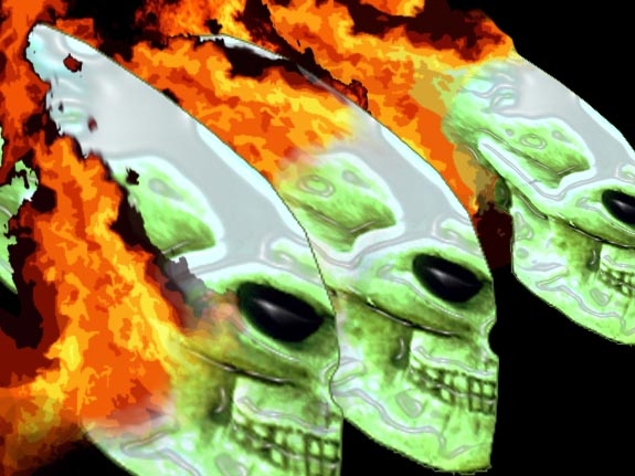
distort,transform skull,filter plastic wrap, add flames tranform,filter(cutout) (5 years and 3980 days ago)
Nice idea good luck!
you need to post an sbs, good luck
You ROOOOOOOCK!!!!
(I love PLASTIC WRAP) skipping quickly out of the room to the land of lens flare and rendered clouds.. doot da doo


Good luck
nice entry
Scary skulls!
Yes I would like to see a sbs for this one.. GL.
animax sbs is opcional or not?and i didn´t keep the way i transform the skull, maybe it´s your question? or not? but i explain i flip horizontal,then distort, then color levels until green, then i cut almoust alf skull,the i used filter plastic wrap, then the rest probabli u know better them me i guess, i`m not ear to win a cup or even nothing i like challenges, and pst is making me evolute so ...next time just 4 u i will do sts : )
This is cool looking. Please post a step by step and links to sources.
Good Luck...
nice 
good luck
Why do I recgonise these skulls? What did you base them on? they look like they are from alien or something? 
Reminds me of Ghost Rider, lol!!
Author - the sbs isuse is a strange one. Its usually optional - but mostly common place where people have not used outside sources or its difficult to see how the author produced the image.. In this case I could not think how you managed to end up with your image - take it as a compliment.. Others want to see how you did your work.. GL
psst - better delete your last bit of the comment - its supposed to be anon.. GL.
gl
very weird lol goodluck 
Howdie stranger!
If you want to rate this picture or participate in this contest, just:
LOGIN HERE or REGISTER FOR FREE
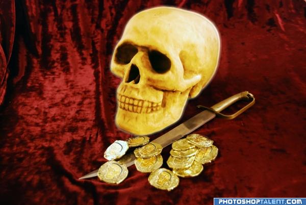
no source image..
â–º bevel (5 years and 3976 days ago)
Simple and great implementation Author GL!
heheheheee golden work!  good luck!
what the.... ) nice man
Interesting idea very simple but still good luck!
gl
good luck
Good Luck 
Nice
Nice job... good luck
Howdie stranger!
If you want to rate this picture or participate in this contest, just:
LOGIN HERE or REGISTER FOR FREE
Photography and photoshop contests
We are a community of people with
a passion for photography, graphics and art in general.
Every day new photoshop
and photography contests are posted to compete in. We also have one weekly drawing contest
and one weekly 3D contest!
Participation is 100% free!
Just
register and get
started!
Good luck!
© 2015 Pxleyes.com. All rights reserved.

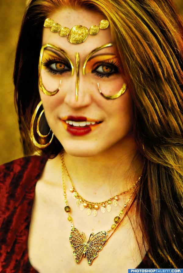
i love her
nice idea, good luck and welcome back =)
Interesting use of source
Nice work - but i think the eyelashes are overdone? especially the lower ones.. Maybe reduce the opacity for them? GL.
What's with the lips?
Half yellow, half red to match both, the dress and the gold artifacts ~~
This is great!!
Nice !!!!!
very cool idea and well done good luck!
Her eyes look very good!
looks real nice
for a person with your tecnique this is nothing.u work with photoshop
Great!
nice idea
Nice idea
Nice, looks wealthy
gl
your job ..your best
nice job..but still needs some more attention from you
Howdie stranger!
If you want to rate this picture or participate in this contest, just:
LOGIN HERE or REGISTER FOR FREE