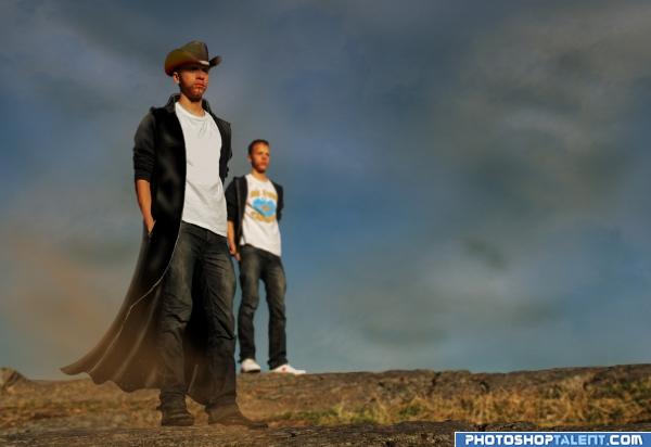
Credit to rotcev from sxc for the stetson (5 years and 3935 days ago)
- 1: Stetson
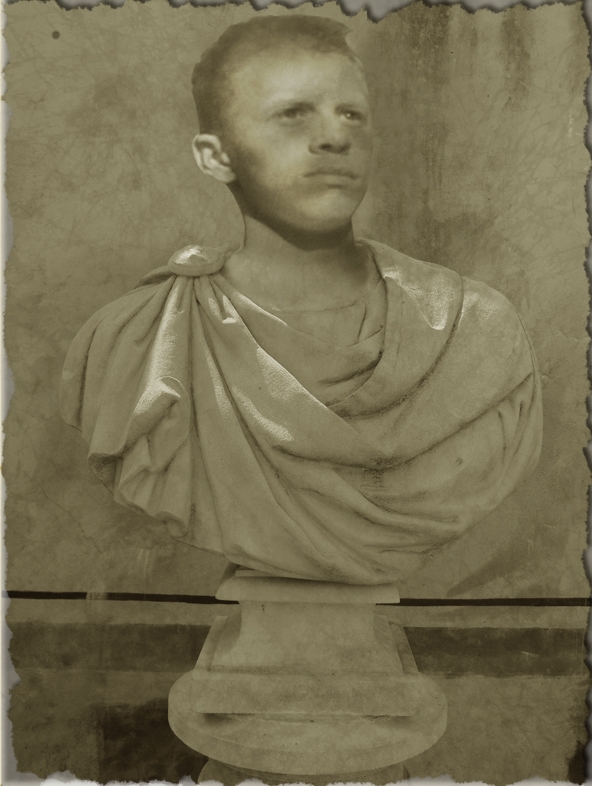
the statue is my own image and i'll post it in my stock once the contest has finished :) (5 years and 3935 days ago)
I may sound childish: First comment on the first entry !
LOL p3!!! Great idea author! Best one so far! LOL!
the neck looks just a little small where it joins the statue, very nice idea and good luck =)
Edit: much better and looks perfect, the best first entry ever =p
I agree with tapiona.. the neck area needs a little work.. try transforming the head a little bit large and use warp to set it around the neck area.. but don't overdo it.. good luck..
Good idea!
Head looks a little flat.nice idea though.GL
Definitly an original idea! I think you should burn some light parts, to look more realistic.
Congrats for the first new entry of our new beloved home. (oh and I like it too!)
Congrats for first entry 
i think the ear has too much light on it....gl
the neck area needs a bit more of blending with the body. The ear looks realistic while face looks like a pencil sketch.Try giving outer shadow to the face. Also dupicating the layer and giving an overlay style may give u some highlights on the face . gl
Cant...resist....must...post...in...first...PostPST...entry...ever...Done! And yes, also agree with Tapiona: maybe if the head&neck are a bit bigger plus you wrap the cloth a bit closer around the neck (perhaps with liquify you can push it a bit more to the right), it would all fit better. Good luck!
Love the concept... good luck 
Thanks folks for your comments ... i've listened you you and give lodd a fat head  i mean bigger head
add some contrast on the face, and if you can, make the edges sharper... see that the bottom part edges are very sharpy compared with the ones on the face
Cool very nice work Good luck!
His face expression fits perfect for something like this  Good luck!
Make the hairs more white.
very good idea! good luck!
 AWESOME! the head needs some sharper highlights to match the rest tho. and the ear is a bit to light.
Nice.
I liked this idea before and I still do...maybe needs some subtle darker areas on the head to blend (eyes, nostrils, under ear)...gl!.
it looks better than before.. u can still work on the hair region. It still looks like a pencil sketch. Give it some shadows and highlights. gl 
Maybe overlay a sandstone texture to match the rest of the bust?? GL.
Congrats of first entry 
Good job, its well 
nice one
Great idea, needs a bit more work to make him look like stone thou...GL
good job and good luck
nice work author  goodluck.
You lost the highlights on the head from your outside source pic...what were you thinking? You've had lots of time to amend this into maximum coolness...
Congratulations, celebrations, well done  Keep up the good work
congrats Reap!!!!!!! 
Howdie stranger!
If you want to rate this picture or participate in this contest, just:
LOGIN HERE or REGISTER FOR FREE
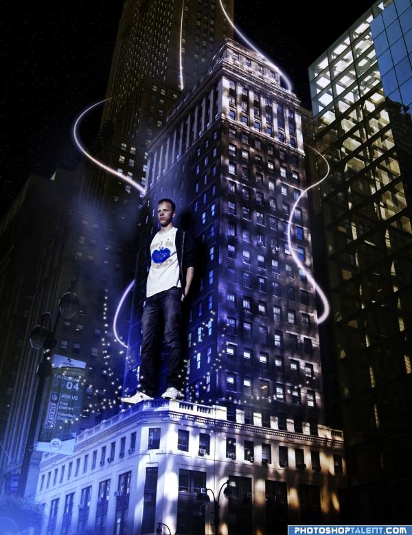
city´s lodd (5 years and 3934 days ago)
Very nice idea and good chop Good luck!
Nice idea, i like the colors and the effects 
nice lodzilla
Dont Jump Lodd!
lets hope he doesn't fall on one of us =\ good luck and idea, welcome back
what do you think yet - jump!  good luck!
I like the mood here. wish it was't so obvious that it was day on the building to the right (in the reflection)
Well done. I like this one.
Love the effects
Cool idea - tho why is he surrounded by blue when the rest of the building is brown?!
they are the lights only
Nice - but he appears to be floating? You need to lower him to the rooftop of that building and then erase the right parts of the feet and legs to show the building edge.. GL.
he's huge! people like making lodd oversized.
Nice colors! Not sure, but are there two shadows from Lodd against the wall? If so, I'd reduce the one left behind Lodd's shoulder. The perspective fits well. Good luck!
Very cool!! Good luck! 
good
good mood, but it's really not a skilled piece;it's not hard to do and I think you should put more work into it.
good job and good luck---what can i say nice 
Howdie stranger!
If you want to rate this picture or participate in this contest, just:
LOGIN HERE or REGISTER FOR FREE
(5 years and 3929 days ago)
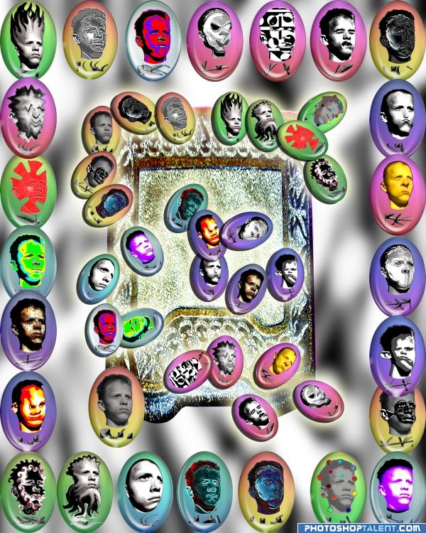
I knew exactly who did it as soon as I looked at it.  Not sure it looks like runes, but it reminds me of the box of old 80's punk/goth/new wave buttons I have saved from junior high and high school.
annabat..the rune is on the base of each one 
I figured you for a Rune chick..hehehe. my room mate had a 400 dollar set of Tarot Cards. and he use to guard them like mother bear.. hehehe
I know...  ( I have several sets of runes) but still that is what it reminds me of.
thats a lotta lodd lol
hard work ehh...nice
nice idea good luck!
I know you tooo : good work!
Lodd-you can't get enought of it 
dear gawd... one face of lodd is enough ... hehe !! good concept
A lot of work went into this. Nice work, good luck 
bahha amazing
Howdie stranger!
If you want to rate this picture or participate in this contest, just:
LOGIN HERE or REGISTER FOR FREE
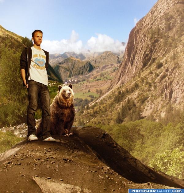
Thanks to momotte2stocks at deviantart for stock pictures. (5 years and 3932 days ago)
this looks great!
nice blend
looking at the environment, the bear and lodd need to cast dark shadows... fix it.. nice work.. gl 
Cool, I like bears 
lodd is out of the picture's mood
next scene... LODD AS BEAR LUNCH. err um SNACK.. he aint that big.. hehehe
Cool idea good luck!
Thanks for feed back, added cast shadow and balance color of lodd.
Is Lodd a giant, or is the bear a midget?
CMYK has a point here, but nice work on shadows and colors 
lol  GL
GL
lol, a boy and his bear, good luck
Awesome blending author, great use of philters i guess, and i like the shadows, but the background is to bright , good luck though! =)
Nice blending  Is the bear his pet? :P
good. finally he got a friend
Interesting - comments as suggested.. GL.
they seem to both have the same facial expression lol
nice matching of tone.....but Logically bear size is tooo smalll......its luking like DOG.......
Thanks for Comments and suggesstion. Updated 
good job and good luck
well done, i like the mode.
Nice blend here.
Howdie stranger!
If you want to rate this picture or participate in this contest, just:
LOGIN HERE or REGISTER FOR FREE
Photography and photoshop contests
We are a community of people with
a passion for photography, graphics and art in general.
Every day new photoshop
and photography contests are posted to compete in. We also have one weekly drawing contest
and one weekly 3D contest!
Participation is 100% free!
Just
register and get
started!
Good luck!
© 2015 Pxleyes.com. All rights reserved.

Hey NEWBIE.. you double uploaded... giggle snort.. (great Pic)


hehehe.. all fixed, wink wink wink nudge nudge
Nice idea is very funny Good luck!
Hey look!!! a screen shot from " Broke Back mountain !!!"
I like the blowing sand Good luck!
double the trouble, good job, good luck and welcome back!
I like the draw part.
outlaw brothers... good luck!
now that's a beard! i wish the coat was a bit bluer tho, the sweater is dark blue so that would fit in better.
Nice work.
Just how he always wanted to be, haha. You may want to make the coat's edge (there where the zipper is supposed to be) a bit more smooth. The Lodd in the background is blurred (which is ok), but then the outer edges should be blurry too, here and there they're still sharp. Those black shoes look pretty good on him! Good luck!
love the mood
I like the front one - I'd remove the back one.
Hahaha - he needs a gun!!
do a rotating kick Lodd!! he needs a shotgun!!
Nice job clothing the man
Very cool!
good
good job and good luck--erase the old lodd
that's hot ;p ;p ;p
I fully agree with mellowdesign - leave the front one only. They don't match. Front one looks great (and I voted as if there's just one lodd, not two).
Good luck.
Congratulations, celebrations, well done Keep up the good work
congrats!!!!!!!
Howdie stranger!
If you want to rate this picture or participate in this contest, just:
LOGIN HERE or REGISTER FOR FREE