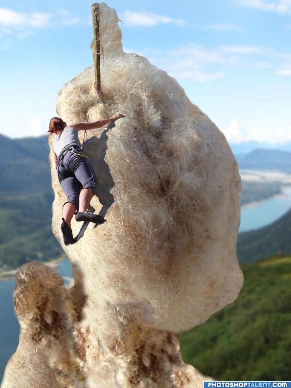
(5 years and 4053 days ago)
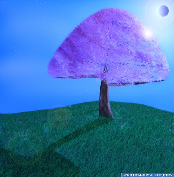
(5 years and 4057 days ago)
nice idea, do you really wanna use lens flare? good luck and welcome back =)
I love lens flare, but it is a tad frowned upon in the Photoshop communities (like page curl, rendered clouds, etc...) I personally like it and the usage of it in this picture.. to each his own.. GOOD LUCK!! (Experiment with other lighting effects but DON'T mess with the image if you ruin the initial effect) 
image is a bit flat... add some shadows and darker/brighter areas to make it more catching
Beautiful work, good use of the source!
nice idea but i think you shoud reduse the opacity(or even delete) the lense flare!And as Mike suggested,add some more shadows and highlights!Good luck!
Thanks for the comments.. SBS follows v.shortly
nice good luck is a very cool idea!
Not bad, but there's something with the light here (and then I dont even mention the l*ns fl*r*). Because it looks like the "branches" of the tree gets light from front right, while the shadow is also on front. Unless the l*nsfl*r* is messing with my eye...Good luck!
EDIT: light fixed 
this is a very good picture of naivism! i love it!  good luck!
Nice image, I agree on the lens flare... Suggestion? Add a "simple" cartoonish character to it
This is great. I really like it.
Cool idea but kill the lens flare...find your own sky with light source, it's much more effective (the lens flare filter looks bad unless it's used well - which isn't often)...
Quite creative - Good Luck.
very nice
unreal, I like it very much
I wanna eat it, can I eat it?
nice
like the color scheme & style
very nice 
interesting idea.. good
Thanks for the feedback folks.. if my hand wasnt so poorly i might of tweaked a bit more.. I hope santa brings me a tablet !
good job and good luck
*starting to drool* i love cotton candy 
Congratulations, celebrations, well done  Keep up the good work
Howdie stranger!
If you want to rate this picture or participate in this contest, just:
LOGIN HERE or REGISTER FOR FREE
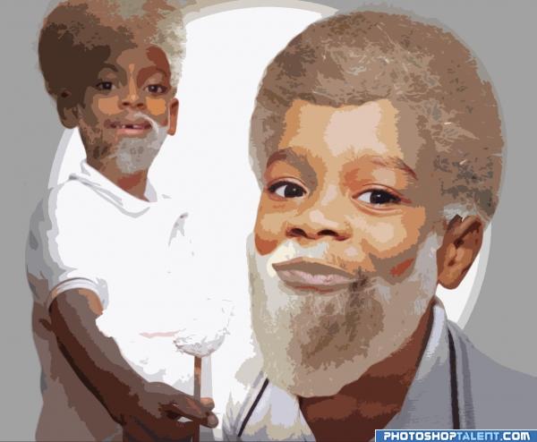
transform and adapte cotton 2 make hair an biar then apply filter render and cutout (5 years and 4053 days ago)
hahaha very good perspective  cool! good luck!
sweet and simple... I like it a lot.. good luck author
cool 
good luck
Nice work, good luck :-0
Nice idea good luck!
good job and good luck
good idea 
good
This is really nice! Especialy background guy without couple teeth)))
i wood like to thanks to MEMMOOSA that made this source possibel
Howdie stranger!
If you want to rate this picture or participate in this contest, just:
LOGIN HERE or REGISTER FOR FREE
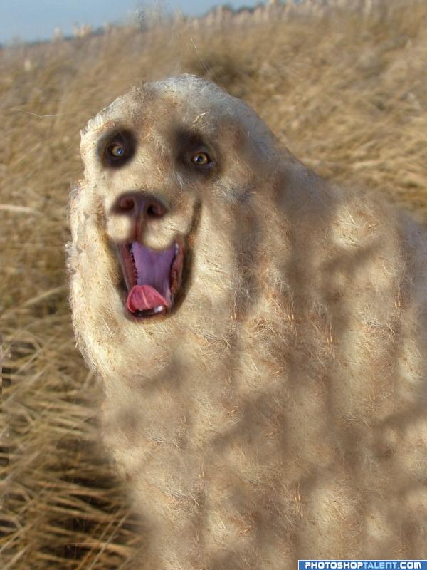
(5 years and 4057 days ago)
Was that a dog? Amazing idea! New animal specie xD
you need to show your external sources !!!!!
a new animal .. damn i have to get one very fuuny idea good luck!
He's so fluffy and fun... hehehe.. Good Luck


 very funny!
  good luck!
good luck and welcome back =)
This is really good.
Try using a smaller brush for the clone tool - it take longer but makes for a more realistic blend (and watch out as you can see where you copied). Cute animal!
I can't decide if this is cute or creepy. 

Hahaha - he would be a pain to brush!!
I'd run if I see something like this !  Nice work..
Cute and creepy 0_0 gl
cute image 
Nice idea, but try to spend a bit more time on the masking and, as Mellow said, the cloning. Right now the fur looks a bit too repetitive. About masking, some parts like around the mouth look a bit too sharp, others like the edges from the body a bit too blurry. In case you used a layer mask, you might want to use the smudge tool (not too big with maybe 60-70% strength) to give the fur some more shape and volume, so that also around the edges it really looks like fur. Good luck!
nice
good attempt
nice 
good job and good luck
lol, here boy!
Now thats a BIG dog! Great idea and GL
Howdie stranger!
If you want to rate this picture or participate in this contest, just:
LOGIN HERE or REGISTER FOR FREE
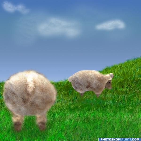
Source and PS and being tired, lol (5 years and 4054 days ago)
I like it
I'm not too sure.. seems a tad bit below your usual skill level.. hope everything is okay... good luck!!
EDIT: YEAH!!!!!..WHEW. you must have been tired.. MUCH MUCH better now.. I was worried there for a second.. good luck
I *love* this idea! totally funny  play with it a lil bit to be less blurry, and you've got one super cute entry!
Left sheep seems too flat to me :P gl
sheeps oo where is the wolf im sure is over that hill ,nice idea good luck!
Hahaha - well sheep here dont have tails! Nice idea though.. GL.
nice 
cute!
Very nice...but the use of the clone stamp tool or healing brush tool (whichever you've used...) rendered same hair pattern, if you know what I mean! Maybe you should have picked different hair areas along the way to get more diversity! And maybe a touch less blurry! I love the colors though! Good luck!

haha awesome 
good job and good luck
lol, good work.
good job, these sheeps looks like decoys perhaps some kind of trap?) Author good luck
nice work  really like the left one

Howdie stranger!
If you want to rate this picture or participate in this contest, just:
LOGIN HERE or REGISTER FOR FREE
Photography and photoshop contests
We are a community of people with
a passion for photography, graphics and art in general.
Every day new photoshop
and photography contests are posted to compete in. We also have one weekly drawing contest
and one weekly 3D contest!
Participation is 100% free!
Just
register and get
started!
Good luck!
© 2015 Pxleyes.com. All rights reserved.

oh lord.. I think my brain just left the stem... just amazing.. good luck HIGH MARKS..shadow is a tad too wriggly, (the shadow by the knee has a huge chunk bitten out of it), but that is hardly here or there because the piece is just wonderful..good luck (the shadow of the arm is FANTASTIC)(hope the author doesn't mind that I SUCK at shadow work, I'm always getting yelled at for them
EDIT: EXCELLENT WORK AUTHOR.. good luck
tnks Golem..you have absolutely right,.I fixed
edit i fixed and edges also.
Fantastic job with the climber , I would take another look at the cotton ...how it is blended at edges
Very creative
Nice way too look at it, well done
Nicely done That.. shadow looks great. GL
nice wrk on climber......but outer edges of the cotton are letting me down.......
good luck
like the overall idea and the climber is well done -- just the edges of the cottion seem too smooth
Funny idea good luck!
good job and good luck
good shadow work
good
The perspective a bit off in my opinion but overall it's quite impressive work (maybe blur the background?) Anyway great shadows and GL!
Shadows are great, only the wool seems to miss them
Congratulations, celebrations, well done Keep up the good work
Howdie stranger!
If you want to rate this picture or participate in this contest, just:
LOGIN HERE or REGISTER FOR FREE