photoshop only (5 years and 3909 days ago)
3d modelling and some PS work
Please see SBS for smaller and integrated versions :-) (5 years and 3909 days ago)
hehehe.. where's david bowie when you need him... singing... IT'S ONLY FOREVER.. that's NOT LONG AT ALL.. 
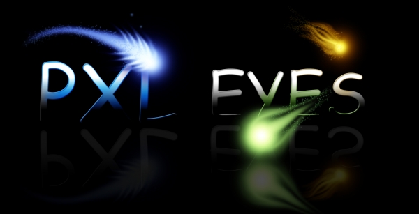
good job (Hope you got the Labyrinth reference) This really is absolutely beautiful.. I wish I could crawl inside your mind and lay me down to sleep in your imagination (I'd feel very safe there)
It's very pretty, but I wonder how it will read as a logo in different sizes and it makes me think of actual painting or an RPG, rather than a digital art site. The piece itself is very well done though, good luck.
gl
Nice idea good luck!
nice strong entry ..
great
I dont think it will be readable when it is scaled down.
beautiful work but i feel like im looking at a site for painting goodluck though.
Bit Art Nouveau like. Nice result, but not sure if this is the style that PXLEyes would like to have. The .com is maybe a bit too small compared to the rest. Good luck!
Cool!
Howdie stranger!
If you want to rate this picture or participate in this contest, just:
LOGIN HERE or REGISTER FOR FREE
simple pxl logo (5 years and 3909 days ago)
Nice floating effect.. very different
cool type
Nice idea good luck!
I cannot read the smaller logo.
I think this is trying too hard...font isn't working
gl
looks like an arrow not a y ??
Not bad, but the smaller version (in high res) is hard to read, guess it's a combination of font type and size. The black pixel is a bit too big imo and asks too much attention. Good luck!
lolz "E"s look like Pacman...but nice use of colors.... Good Luck!!
Nice!
Howdie stranger!
If you want to rate this picture or participate in this contest, just:
LOGIN HERE or REGISTER FOR FREE
(5 years and 3909 days ago)
top secret again?
yes top secret but hey is good but i just think that that "space fish" is just copy paste but good luck!
The idea means something! :P
When this logo is reduced to the required size for the site it is very difficult to read. It would be better if the base of the letters were not so dark.
those look a little like Ps top secret !!!
i like the idea, but not the font used... comic sans is not a good fint for a business to use...
top secret?? what does it mean? BTW looks very nice try to work on colors and make it more readable (as Paulus said)
needs more definition when shrunk.. as others already said.. beautiful though
gl
Good Luck
photoshop top secret nice one i like it search google for photoshoptopsecret and order the dvd nice one but not so impressive
nice texture on the fonts
yeah I saw it LOL ...top secret ahahha..
Nice job
Nice light effect, but imo a bit too dark to work as logo. It also maybe needs a bit stronger font. Good luck!
sad wont be that effective once shrunk....Good Luck!!
Interesting but the font is wrong...should be a solid font.
Howdie stranger!
If you want to rate this picture or participate in this contest, just:
LOGIN HERE or REGISTER FOR FREE
The Pixie Man!!! (5 years and 3911 days ago)
in this way it is like ppxleyes... 
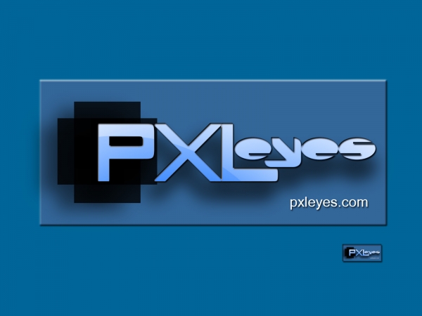
oh! one more word! plexiglass... plexieyes
very cute
now i like this alot
good job and good luck
nice work
gl
Nice idea good luck!
good
i agree that the extra P throws it off a little, but i like the idea for sure!! also the pixelated P is a little hard to see, maybe try to define it's edges a little more... perhaps a drop shadow could take care of this whithout giving it away too much...
Good Luck Nice Idea
Nice that you made the P in pixels, I might have used a bit deeper colors so the shape has more contrast with the background. WHat you may want to add is a tiny bit of white-ish gradient on the lower side of "pxlseyes), so it gets a more shuny effect. Good luck!
Overly pixelated
LOL!!!
Nice idea - typography needs work...
Howdie stranger!
If you want to rate this picture or participate in this contest, just:
LOGIN HERE or REGISTER FOR FREE
Photography and photoshop contests
We are a community of people with
a passion for photography, graphics and art in general.
Every day new photoshop
and photography contests are posted to compete in. We also have one weekly drawing contest
and one weekly 3D contest!
Participation is 100% free!
Just
register and get
started!
Good luck!
© 2015 Pxleyes.com. All rights reserved.
Nice idea good luck!
Thats cool
Nice -- straightforward and uncomplicated. I like it with the dark background better.
Not keen on the effects or the squashed text. Needs a lot of work.
gl
good work
Not bad. Quite much attention goes to eyes because of the yellow, maybe the yellow should come back somewhere else in the logo too. Good luck!
Nice one.. Good Luck!!
Nice one!
Howdie stranger!
If you want to rate this picture or participate in this contest, just:
LOGIN HERE or REGISTER FOR FREE