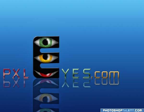
I wanted to express how you vote for us a picture! like a traffic lights!
for a final touch I used topaz 3 (5 years and 3910 days ago)
Tell me what you think :-) (5 years and 3909 days ago)
It sure is a lot of work.. but you have to remember to think in a small scale.. once you put too much detail the eye can't focus and hold... this would be fantastic as a Marque.. or on a giant billboard.. but as a logo, it would be difficult.. think of what is on a stationary or business card etc.. and that will help you focus.. this is terrific, but I fear it would be hard to convert into a logo unless it was going on the side of a stadium.. keep up the good work.. good luck
very stylish but hard to read especially on the clouds background; i think a darker background would make it stand out more
Nice idea but the clouds make it very dated, and the .com text doesn't work. Good luck!
gl
Compared to the rest, the P should be wider (one pixel more). FOr the rest not easy to read, at least not with the current background. Good luck!
agreed too hard to read...Nice effort though.. Good Luck!!
GL!
Howdie stranger!
If you want to rate this picture or participate in this contest, just:
LOGIN HERE or REGISTER FOR FREE
I tried to make a text illusion (5 years and 3911 days ago)
exes? this is not software site! good luck!
edit: but if you know how, then you can use Exel's tables in your work!
it says : PXL on the transparent part and EYES on the blue gradient .....anyway
what is writed there
the whole idea about text illusions is to follow the same color pattern for all the letter: so where is a blue gradient is a word - EYES - and the gaps between the letters formed by the blue gradient is another word - pxl...from what i know the text illusions are much more interesting if they are subtle..maybe i am wrong..anyway it was an interesting experiment for me
i like't but is not verry readable....my opinion...the colours is ok.....gl
yes, now i can see, but what says that third part of color then? btw i already like this one
oh i get it now! very good but it's too subtle imho...
i know about the third color
....it was the only way to separate the letters i am trying to find a way to eliminate them....it is my first attempt to make a text illusion
ohh - i have not ever done it... it will be hard work! actually E and P are pretty clever!
Nice idea good luck!
aaand you know what! in this are more areas, what are not letters - what about to try that everything put to one third part?
i have done that and put it in a sbs file
hmmm... yes this is not that good...
yup..i know
get a room already you two.. sheesh
very hard to read this .. nice concept
good colors and effect, but name is not clear
Great use of negative space!
very hard to make out what it says ..
Its a bit hard to tell what it is.
It's appreciated that you played with shapes and rest shapes. The result is interesting, but also confusing. I guess for a logo you need a strong image and although it doesnt have to mean that the viewer has to see without thinking what he/she's looking at, I do think there has to be a certain link with the word PXLEyes. However, as creation nice work. Good luck!
barely readable..
it says what exactly?
GL!
Howdie stranger!
If you want to rate this picture or participate in this contest, just:
LOGIN HERE or REGISTER FOR FREE
(5 years and 3911 days ago)
Good Luck
very good
Nice idea good luck!
good job i like it
nice
like the idea but looks a little outdated
gl
Nice one.. Good Luck!!
Nice!
Howdie stranger!
If you want to rate this picture or participate in this contest, just:
LOGIN HERE or REGISTER FOR FREE
Layers upon layers upon layer upon erm...layers :D (5 years and 3911 days ago)
I think it's to much elements... but nice good luck
remember this should be about 89 pixels high... it will be completely unrecognizable
Dont worry i made sure that it was clear at the right size. Still fully recognizable
Nice !!!!!
nice idea good luck!
OMG.. this is AWESOME... yowza
hard work good job but it's complicated i think for the site
nice effects. but as a logo some limitations are there(text and design spread everywhere).
Very nice design. I'd still like to see your lettering with a simpler background....just my opinion.
nice
Great background, bad type...
Great concept, its a bit too big tho
too clutteres, gonan be hard to read anything once shrunk. goodluck.
Too hard to read, too many things going on. Good luck!
Love it... Good Luck!!
Nice one!
Howdie stranger!
If you want to rate this picture or participate in this contest, just:
LOGIN HERE or REGISTER FOR FREE
Photography and photoshop contests
We are a community of people with
a passion for photography, graphics and art in general.
Every day new photoshop
and photography contests are posted to compete in. We also have one weekly drawing contest
and one weekly 3D contest!
Participation is 100% free!
Just
register and get
started!
Good luck!
© 2015 Pxleyes.com. All rights reserved.
good luck, nice concept.
There's some problem with reading Eyes to Yes...otherwise nice concept...
ooooooooooooooooo I really like this,, so much work..kinda sad the reflection is kinda lost in the bottom.. really is pretty, don't know about that dern YES that keeps popping up.. really is causeing some major issues
Nice idea good luck!
Though i might be wrong, but IMO PXL would look better up and Yes.com at bottom to minimize the "YES" Effect ;D
Nice work, good luck
Thank you all for votes, especially the critics!
Better....Nice work..Good Luck..
gl
while creative and very very unique, its gonan be hard to see those eyes when the logo is shrunk
Mmmnot sure what the traffic light has to do with voting, but that's maybe me. Shouldnt it be red on top and green under, btw?
. Good luck!
Low the opacity on the reflections.
GL!
Not really working...
Howdie stranger!
If you want to rate this picture or participate in this contest, just:
LOGIN HERE or REGISTER FOR FREE