(5 years and 3947 days ago)
1 Source:
- 1: Aller Sans

its a nice idea to have a contest for the logo.. i was amused to see every one concentrating in the "eye" and making it the main thing in the logo, when three types of logo ("Pixel Eyes" , "Pixelize" and "Pixel Lies".) have Pixel in comment not the "eye" .. and so i made 'pixel' the main topic of mine, the blue pixelized square,
there are three types of the same logo if it was used in different places..
either the second or the third could be used as the logo in the main page of the website, the first one will be used for articles about Pixleyes coz it is the largest :) (5 years and 3949 days ago)
Photography and photoshop contests
We are a community of people with
a passion for photography, graphics and art in general.
Every day new photoshop
and photography contests are posted to compete in. We also have one weekly drawing contest
and one weekly 3D contest!
Participation is 100% free!
Just
register and get
started!
Good luck!
© 2015 Pxleyes.com. All rights reserved.


 , after all, im just 20Yold, need to make for a living :P
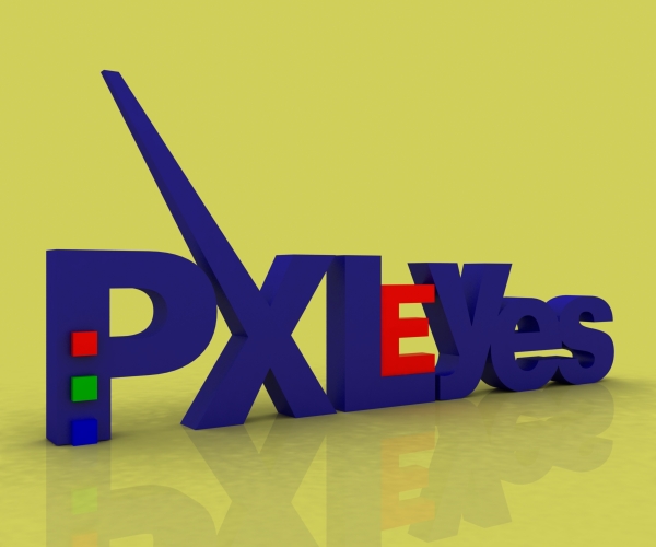


Nice idea good luck!
this on is looks good...
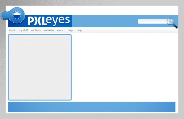
too classic + too professional = PERFECT.......but the implementation of this layout will increase xtra workload for superadmin .....
nice idea!! G/L
Good Luck
i think this one looks good...
I like the crisp, less-is-more approach.
The mag glass is a bit of a cliche - like the idea of the icon but needs work.
gl
nice and simple, good job
Looks professional
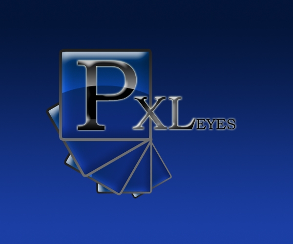
logo is prfect, maybe change the txt
Nice theme for the site...but logo needs some work... Good Luck!!
Great skin!
Howdie stranger!
If you want to rate this picture or participate in this contest, just:
LOGIN HERE or REGISTER FOR FREE