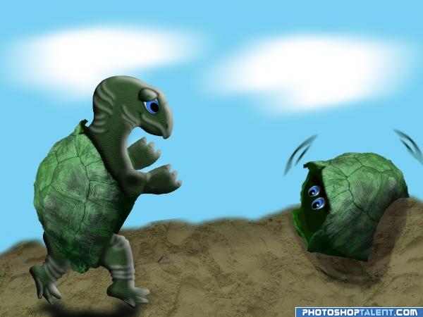
nothing but source. cut out shell and made a few copies played with hue & saturation drew in the inside body parts and highlighted and shaded.
used my own textures. (5 years and 3944 days ago)
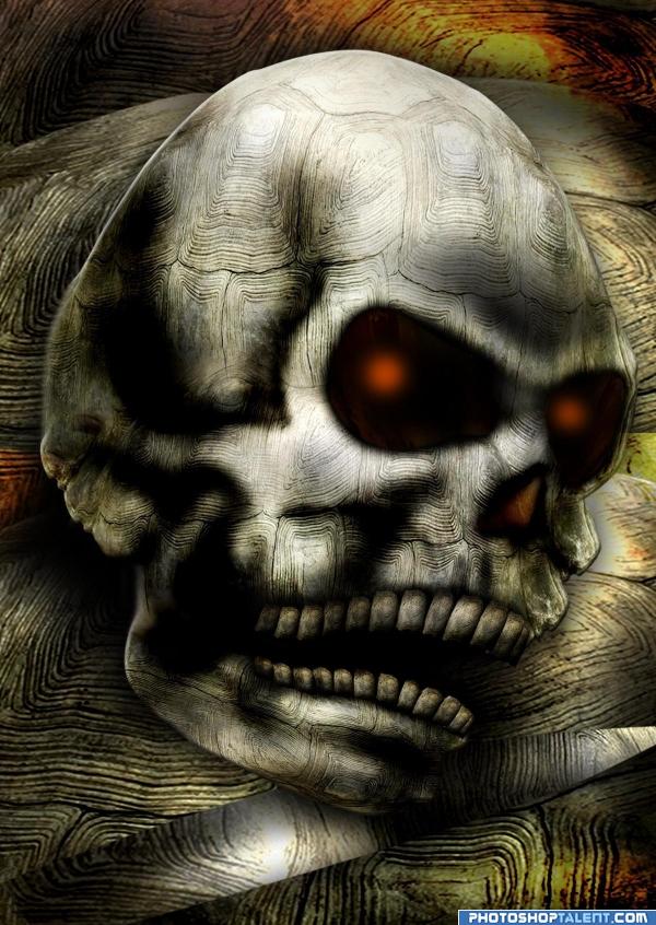
i didnt use any images or source from other site. just the original image.
My 4th entry. i hope you like this one. (5 years and 3942 days ago)
Very creative idea,nicely executed!
good work. teeths fixed little outside, correct it. Why that yellowish clolor inside?
agree with gopankarichal...................... plz fix tht.n ur image is grt.good wrk...
great
so many teeth? when he died he was young... 
Lovely execution.........Good Luck........Author.
Lovely execution.......Good Luck Author.
maybe too dark?
I like it XD love sckulls wish i knew of you did that. 
Not bad. Here and there maybe a bit too dark for my taste, perhaps you'd like to reduce those heavy black areas a bit. Smart use of the source for the forehead, but something tells me that you could use the shell's inside plus surrounding on a better way to make the eyes (if you look at that part, it kinda hàs the shape from an evil eye already). But that's up to you. Good luck!
very creative 
good luck author
your work is great
that's amazing
very Creative!!! very nice
Howdie stranger!
If you want to rate this picture or participate in this contest, just:
LOGIN HERE or REGISTER FOR FREE
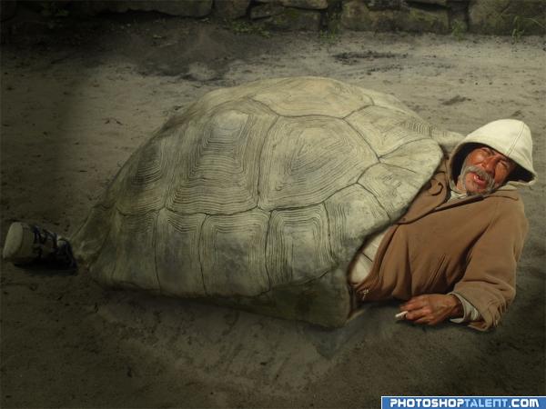
Thanks Franco Folini . (5 years and 3948 days ago)
Quite a nice home for someone 
lol hehe cool man! 
cool idea!
Nice idea good luck!
funny mate funny and good work
haha, this one is sooooo cool 
warm blanket 
hahahahhahahah
Great idea.  Suggestion: IMO I would get rid of the darkened edges of the image. They don't seem to add to the depth of this piece and I think that they take away from your overall entry. Good work and good luck!!
exceptional.. good LUCK
nice
Very good!
lol 
cool and funny
Funny image (although in a way also a bit sad). Agreed with musicj19 about the darker edges in the image. It looks too much like a spotlight, I'd make it a bit more subtle (so that also the foot is a bit more visible). Good luck!
Nice house!! 
Howdie stranger!
If you want to rate this picture or participate in this contest, just:
LOGIN HERE or REGISTER FOR FREE
(5 years and 3943 days ago)
WHOA... OMG.. this is amazing..... I just love it!!!!!! Where is your SBS, Description Sources
UPLOAD THEM NOW.. don't you dare get this piece pulled.. this is just FANTASTIC!!!
WHOOPS.. there it is..hehehe, scared me for a second
Really love this piece.. GREAT JOB AUTHOR.. the color scheme the balance the subject matter.. just excellent
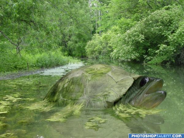
Shellfish...LOL...yer crackin' me up! I could quibble about a few tiny things, but I won't. It's pretty well done, and made me smile...good luck! 
(Well yeah, just a tiny nitpick: put a highlight on top of the shell to separate it from the background).
high mark here very very good work i like it olso ..it make my cry  ) good luck
Lol, shelled-fish 
it made me hungry! 
good work author!  lol
lol 

good work, can improve
nice
Thats a big fish lol i like this one
That's pretty cool  . The greenish slimey stuff around the shell looks better than under the head (less slimey
  ). As CMYK said, would be nice if you could do something so that the shell is not too much part of the background. Be it a bit of highlight or some more contrast (for the whole shellfish), up to you. Good luck!
Howdie stranger!
If you want to rate this picture or participate in this contest, just:
LOGIN HERE or REGISTER FOR FREE
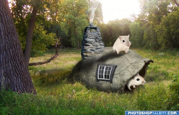
Just a cutsie little something.... (5 years and 3941 days ago)
very cute
very nice image.. but u need to work on shadows..it appears like each object is casting shadow in a different direction.. one more thing too, when an object casts a shadow this dark as u have put it, the part of the object away from light should be darker too.. just my opinion.. gl 
This is a funny idea.I would try to flip the entire shell to get a little closer to the light source(sun is in upper left corner).
Edit:The mouse would be darker on shaded side also.
rich mousepeople  good luck!
there GERBILS.. giggle snort.. oh the things I could say... but this is a family site.. I will NOT be bad LOL.. good luck author.. very adorable.. 
well done -- maybe a bit more of a definition between the shell and the brick work and a touch up on the mouse in the shell
ehhe funy man i like it
idea is good
Howdie stranger!
If you want to rate this picture or participate in this contest, just:
LOGIN HERE or REGISTER FOR FREE
Photography and photoshop contests
We are a community of people with
a passion for photography, graphics and art in general.
Every day new photoshop
and photography contests are posted to compete in. We also have one weekly drawing contest
and one weekly 3D contest!
Participation is 100% free!
Just
register and get
started!
Good luck!
© 2015 Pxleyes.com. All rights reserved.

cool
a bit more work on the turtle standing would make it gr8......
Extreme Sweet Factor on this one.. the imagery is precious.. good luck
Beautiful Work......... G/L Author.
Nice!
interesting idea good luck!
good work
good work GL
GL 
awww poor lil guy Very good work
funny
cool idea
Funny. The texture on the turtle's body would work better if you wrap it here and there around the edges. This way it'll look more round. Same for when you highlight certain parts, then it means that there must be some kinda curve in the body. Accentuate that with a bit distorted texture. Liquify can be a good help for that too. Good luck!
by the way....from your sbs not result how to make the turtle....i dont wanna be nasty...realy.....!!!...just maybe learning something!
Howdie stranger!
If you want to rate this picture or participate in this contest, just:
LOGIN HERE or REGISTER FOR FREE