Source only (5 years and 3882 days ago)
Nice idea good luck!
(5 years and 3888 days ago)
Nice idea good luck!
well done
Shadows need some work. We can still see in shadow whereas your shadow is look like solid color. If they are on seperate layer then reduce opacity.
good
Nasirkhan is right. We should still see the drawing in the shadowed areas...
nice work
good
NICE!
Very interesting, good luck
Not bad, I'm just not sure if the drawing plan is still good to use. Might need some redrawing. Good luck!
Howdie stranger!
If you want to rate this picture or participate in this contest, just:
LOGIN HERE or REGISTER FOR FREE
adding something (5 years and 3881 days ago)
i like the way the paper's been treated, but the whole artwork is too simple for me. i wouls also like know how did you crumble the paper at the back?
Great effects! This is awesome!
good work.
solid.. good choice author.. less is often more.. good luck
Love the crumpled paper effect and glasses blend in nicely.PXL lettering doesn't quite lay right on the curved hammer handle.
Howdie stranger!
If you want to rate this picture or participate in this contest, just:
LOGIN HERE or REGISTER FOR FREE
haven't done a flower in a while (5 years and 3881 days ago)
nice idea! gl
great
good work
I just noticed, that when you look at the big red flower and scroll up and down pretty fast, it looks like the flower is moving. I just did this the past 2 minutes Good luck!
Wonderfull work! Excellent! Well done!
very good blending, i love your garden, good luck author
nice entry, gl
Howdie stranger!
If you want to rate this picture or participate in this contest, just:
LOGIN HERE or REGISTER FOR FREE
Own source photo as shown in step 1 (5 years and 3889 days ago)
good job
I would darken the tape a little bit to blend in better gl!
i don't want to know what he is measuring lmao
Forget what he's measuring, why is the door curved?
Edit: Oops, sorry....
I never did anything to the door CMYK - check the original source photo.
Nice idea good luck!
Hahahaha.....bring the brightness down on the tape measure
Brightness on the tape measure now corrected.
LOL...George never looked so good!
Mr. fixit is a ghost
good one , but colors are very dull.
That is because he is covered in dust!!
Good!
Because its just easier to hose off? 
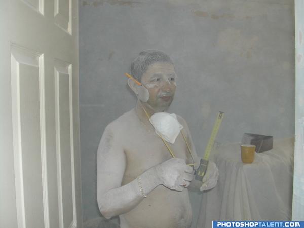
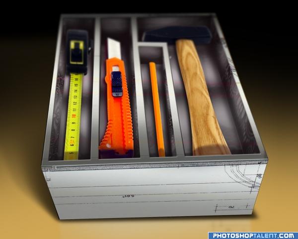
The tape measure looks like part of the original picture. Nicely done.
This image seems to be both artistic and a bit disturbing, can't really say why. Anyway, you did a good job
Howdie stranger!
If you want to rate this picture or participate in this contest, just:
LOGIN HERE or REGISTER FOR FREE
Photography and photoshop contests
We are a community of people with
a passion for photography, graphics and art in general.
Every day new photoshop
and photography contests are posted to compete in. We also have one weekly drawing contest
and one weekly 3D contest!
Participation is 100% free!
Just
register and get
started!
Good luck!
© 2015 Pxleyes.com. All rights reserved.
wow. aren't we anal...LOL Just kidding.. the perfection and attention to detail is amazing
inetresting idea keep it up
very nice work.. just remove the shadows under the box.. judging from the direction of the light source, it looks like its floating.. gl
good work. good use of source
Nice work, I think you have blurred the far end of the box and tools a bit too much
alles ist ordnung! good luck!
good idea but too much blur
very original idea
Great idea, creative use of source. Agree about blur...also the top right corner of the pen's compartment angle needs to be slightly pulled up to match the angle of the top of box. Great job, however!
for source only you need an sbs
Pretty nice result. Agree with the critic about the blur and the shadow under the box. Also, I see some red lines over the box (but not tools), why is that? Good luck!
Too much blur...you probably don't need any at all...nice job.
Hi guys, firstly i would like to thank everyone of you for taking your precious time checkimg out my work. and thanks for the comments and suggestions, you guys are right about the shadow and the blur i now can see its bit too much. since i have editted the artwork, but thought it would be unfair to replace the above one, since some of you guys might learn from these mistakes. Lastly im from South Africa and we are hosting confederations cup, im so crazy about soccer tomorrow we are playing against Spain and we'll beat them!!!
Love the idea. Nicely done!!
graet work author lovely idea
good work
Howdie stranger!
If you want to rate this picture or participate in this contest, just:
LOGIN HERE or REGISTER FOR FREE