ONLY SOURCE
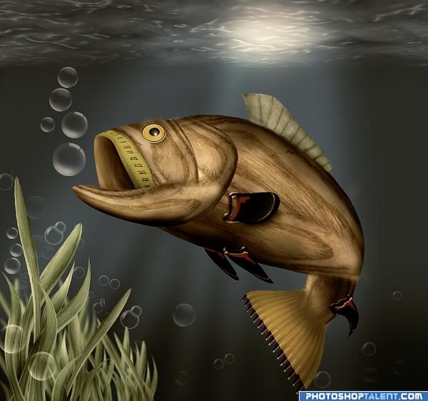
Bubble brush from http://www.brusheezy.com/brush/413-Bubble-Brushes (5 years and 3959 days ago)

Howdie stranger!
If you want to participate in this contest, just:
LOGIN HERE or REGISTER FOR FREE
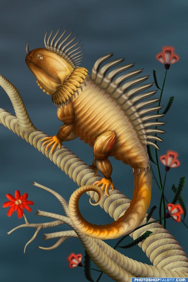
Only the source image is used.
(5 years and 3957 days ago)
Sweet and cute beast as usual
nice work on the constuction -- lighting is quite effective
TAPPING MY TOES.. oh no
Oh dear.. NOT THIS AGAIN!!!! Severe Bottom Smacking for not having your SBS ready ahead of time.. giggle snort.. smooch
YIPPPPPEEEEEE.. all DONE.. beautiful work AUTHOR
Very nice image.  Cannot wait for the SBS
beautiful work looks like it took alot of time waiting for the sbs 
Yeeeees, DigitalDreamer, it took a bit of time to submit the sbs. Next time I could upload only one step without explanations and you'll be happy not to wait for multistep sbs 

Great Work Author.......Good Luck.
Quite nice work! Very talented, author! 
WOW.... GREAT!!!! 
Very cool.
Great looking image nice constuction!
Top entry!! good work!!
WOW!


EDIT:Yeah,I thought it would be you...
Thanks to all for the comments 

Sweet indeed! 

AWESOME !! Congrats ! 
Congratulations for 2nd, great
Congrats!
congrats my cute friend

Congrats! Way to go! Great entry!
Congratulations.
Beautiful! Congrats!
Howdie stranger!
If you want to rate this picture or participate in this contest, just:
LOGIN HERE or REGISTER FOR FREE
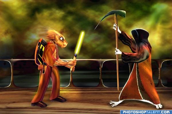
No outside Source.see in high resolution. (5 years and 3957 days ago)
wow.. a LOT of hard work went into this. I'm sure you're going to get it for the rendered clouds but I really like the gamer feel and the overall result.. GOOD LUCK (And what would we ever do without good old Star Wars Light Sabers.. wooooooooosh.. zing.... vreem vreem... waka waka )
amazin wrk.....................................gl
Amazing
Welldone!! nice color scheme. Highlights on the devil picture need to improve. good luck
brilliant stuff here... a lot of work and excellent use of source image... great SBS too.. gl 
very smooth!!! i like this one.... hey!!! Where's the Joysticks???
Love This Style of work !! very impressive
cool!
nice hard work
Nice Entry...... Good Luck Author.
Very nice!!!
And another good one.
This is very strong entry !!! I do like it very much 

Congratulations for 3rd
Congrats!
congrats!!
Congratulations.
Congrats!
Howdie stranger!
If you want to rate this picture or participate in this contest, just:
LOGIN HERE or REGISTER FOR FREE
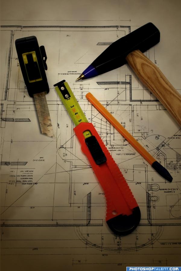
I wouldn't use these if I were you...
Thanks for the comments guys..
I made the revisions and added a rust texture to the blade.
(5 years and 3962 days ago)
OMG....best and funny transform i ever see...good job
 hahahaha definitely I wont use that
hahahahaaaa i didn't say in first moment tape measure! 


lol nice work 
Very well done! - Great idea too... The only thing that looks odd is the pen point on the hammer.. Looking along the highlight towards the taper, the new pen highlight does not follow the same angle. Also the perspective on the end of the measuring tape, as you have rotated it, it is now off. You need to tuck the tip under the tape some more as it then gives it some height - to justify the shadow. Otherwise it looks like the tab is pointing into the air.. Again, a great idea.. GL.
I'm not sure if I understood animmax's suggestions correctly, but I did a quick revise. Thanks for the help! 
hehe cool! gl
Sorry author: the tape looks a lot better  The other part - where the hammer tapers down to the tip. You can see the edge highlights of each side. These lines dont match the new lines from the pen tip [for the hammer] Mainly the middle line. It should follow the same line as the hammer.. Hard to explain. Sorry.
high High HIGH mark.. just wonderful... awesome actually.. and I see ANIMMAX is helping in the perfection department..AWESOME.. just a great idea all round
good work, I like it
lol 


looks real
Nice job! Great work!
Creative!
If this is what's in his toolbox, I don't want this guy building any houses. Well done!
Very well done, I'm LMAO here.
Well done author.
nice changes loved it.........................
Yes!! This I like a lot. Thank you
ill use those what can happen nice work and idea
 very smart, neat and clean work........
 Great idea!
Great job i love the switch around i would not use them ether
My favorite in this contest. Take a look at the shadow under the tape measure right next to the 5 inch mark. It looks like the shadow is missing for about a quarter inch. Should go all the way to the orange handle. All else appears perfect.
There, the shadow comes all the way to the orange handle now. Keen eye you've got there.Thanks chaplain! ("(^-^,)"
so many details to take into consideration nice job!
Haha, that's pretty convincing and funny, nice work! Good luck!
Brilliant!
you did very well, keep going
Howdie stranger!
If you want to rate this picture or participate in this contest, just:
LOGIN HERE or REGISTER FOR FREE
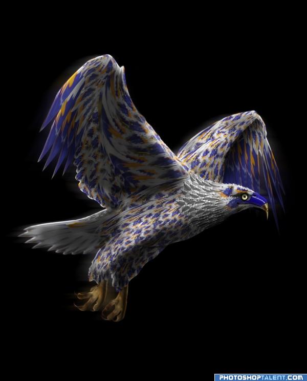
http://www.stockxpert.com/browse_image/profile/bthompson (5 years and 3959 days ago)
nice work 
ton of work.. mega ton.. oh hell, an entire elphant stuffed in a Blue Whale... LOL
HOLY CRAP.. didn't realize a whole new background would create a whole NEW piece... amazing.. and much better.. solid choice author
Lot of work done here...great job
Very good work. I´d like to see a SBS. Good luck.
Nice work, but a step by step guide would be nice
good work! 
cool fly!  good luck good luck!
sbs on the way....
very nice; looks like a lot of work
I didn't use any of the stock photo for this, only as a reference. credit for photo goes to ~ http://www.stockxpert.com/browse_image/profile/bthompson
falcon is very nice.Eges make little more blur. Background is not ok, it is forcely fixed. try to change it. still high marks
good work
Very Nice.....Good Luck
Wow! You have talent! Very beautiful! 

grt wrk......................gl
nice idea!! G/L
Very nice indeed!
you did very well, keep going
Howdie stranger!
If you want to rate this picture or participate in this contest, just:
LOGIN HERE or REGISTER FOR FREE
Photography and photoshop contests
We are a community of people with
a passion for photography, graphics and art in general.
Every day new photoshop
and photography contests are posted to compete in. We also have one weekly drawing contest
and one weekly 3D contest!
Participation is 100% free!
Just
register and get
started!
Good luck!
© 2015 Pxleyes.com. All rights reserved.

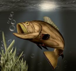
good job. to get good dimension add some more light & shade effect. And water is totally behind, add some bubbles, plants to avoid this
nice just try to make the fish to look like its in the water, by changing the color tones of the fish to more bluish and try to darken it a bit. Nice its great , but its too light and doesnt look like its inside of a water. Anyway thats my opinion, maybe u like it this way better
  Overall great, keep up the good work
gopankarichal and MrHack thanks for your great suggestion, I have added grass, water surface, light beam and make whole scene a bit darker.
nice
oOo!This is really good!(maybe make the inside of the mouth a bit darker)
The fins are absolutely deadly, the entire piece is just wonderful, but those fins throw it over the top.. very inventive and fantastic.. good luck
EDIT: had to sneak back for another peak.. YEP. . fins are still fantastic.. I lived on a 22,000 acre lake as a kid.. and Just LOVE FISH pictures..hehehe
quite a big fish! good luck!
now we are talking real masterpiece! looks much better.
great work!
Fins don't look attached to the body, and the water surface should be evenly lit, but everything else is great!
amazing
well done..
Pretty ok. If you can make the wood texture for the body a bit rounder near the edges, you'll create more volume for the fish. Good luck!
I like the fact that you used only the source, but...but. since its the under water scene i think you should have introduced maybe bubbles or something so that the fish becomes part of the subject, to me the fish appears to be on its own! otherwise the fish is cool, so as the background. can you see what i mean?
haha! i comented before i read other coments so im not alone about the fish being separated from the water!!!!
Thanks to all for nice comments and suggesstion. Giggles made mouth a bit darker. CMYK46 tried to better blend fins. wazowski made some changes. stayrsa bubbles added using brush from brusheezy.com.
It looks better now!Well done!

Very good job, good luck
nice job
Hey, look familiar
 FUN!
FUN!
Good work.
Awesome Job!! Good Luck
very nice, u make photoshop look easy
beautiful i think there needs to be a hook with a worm on it :P very creative thinkin author lovely detail.
where's the photo of the largemouth bass you used for reference?
Very well crafted top stuff!!
very nice one
Congrats, really lovely work
Congratulations for 1st, fantastic pic
congrats
Congrats! Way to go! Great entry!
First again??? Wow Nasikhan you're good, soooo good, congrats!
Congratulations.
Congrats!
awesome!!!!!!!!!!
great
Howdie stranger!
If you want to rate this picture or participate in this contest, just:
LOGIN HERE or REGISTER FOR FREE