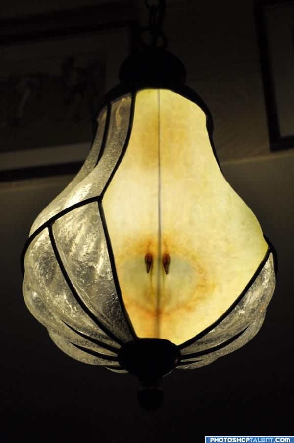
Thanks to sofijab for the pear (5 years and 3965 days ago)
- 1: Pear
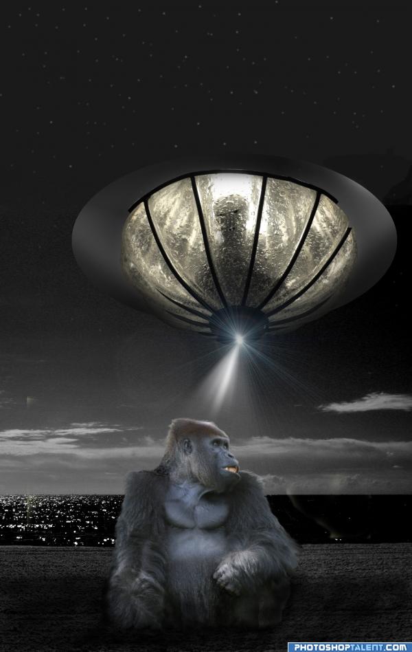
Many years ago the first instant message arrived on earth.
All sources are my photos and included in the SBS. All comments are greatly appreciated. Thanks for voting!! (5 years and 3967 days ago)
Nice idea good luck!
cool! i like it 
nice idea......but lens flare dosent works for me......
nice mood
Great idea! Again, not sure about the lens flare, and I think maybe you need to continue the black line underneath the ship's edge all the way round? 
ncie work ..king cong wins
lol, funny stuff  goodluck.
Nice idea! Very funny! 
dimension problem is there, otherwise a good entry
Funny! 
I agree, the flare is a bit out.. maybe a ray of light instead?
I made some changes.Thank you for your comments. Thanks especially to LKY, Mellowdesign,gopankarichal, and zatrix
Howdie stranger!
If you want to rate this picture or participate in this contest, just:
LOGIN HERE or REGISTER FOR FREE
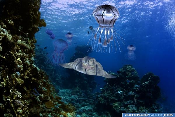
This contest had so many possibilities but i just HAD to choose this one! :D (5 years and 3963 days ago)
nice entry
looks nice
Good Entry with Good Luck Author.
You beat me to it 
Not bad, maybe you'd like to give a bit more saturation to the creature in front so it fits better in the image. Good luck!
hah. nice idea.
Howdie stranger!
If you want to rate this picture or participate in this contest, just:
LOGIN HERE or REGISTER FOR FREE
(5 years and 3964 days ago)
good
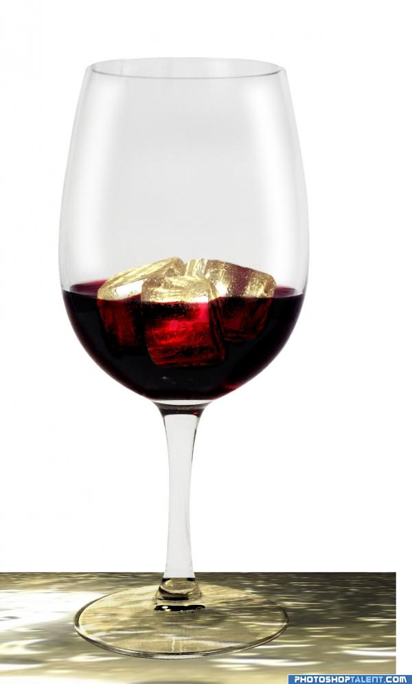
poison in right goblet need more work (horizontal i mean)  good luck!
ICE?!?!?!?!?! IN RED WINE?!?!?!?!?! are you a barbarian.. white zinfindale maybe with a soda mixer but RED?!?!?!?! ICE?!?!?! ( Pulling out my sissy fan and flapping my wrist like a mad hatter..). ICE IN RED WINE...what will the neighbors think.. how will we show ourselves in public... Great Image.. work on the perspective on the fallen glass ( cube constuction is very clever though they still look just a tad dirty.. might want to push them to the white spectrum.. love the source use to make the table surface.. good luck
EDIT: Zatrix.. hehehe.. and Author, I think you decided best. much more focused piece now.. good luck
The curved glass would distort the background...
Golem - personally I enjoy chilled red from time to time *barbaric smile goes here*. overall nice idea, author, distortion and levelling needed on right glass ))) gl
i couldn't distort the background behind the right glass so i got rid of it! i hope this is better. thx all for the nice comments! 
Good job! Small suggestion that might really help. Since ice is transparent, it would most definitely show the color of wine distorted thru the glass. In other words, ice does weird stuff to light and would have red color where the wine exists, not the yellow that's there now. Perhaps red color on 'overlay' mode and brush that color into various areas that are yellow...Hope that makes sense.
By the way, there's an artifact or glitch in the upper left rim area of glass.
i fixed the glitch and i tried to make the ice a little brighter and give it a little red color. thx a lot pixelkid 
Nice edit, author. Looks  .
.
Pretty nice result. Maybe some nitpick, the cube in front is closer to the glass than than the other 2, so especially the cube on the right side would be covered with more wine. That would mean that cube would be less visible due to the cube than the one in front. As I said, a nitpick  . Well done for the rest, good luck!
i darkened the cubes in the back, my entry is getting better and better! thx a lot wazowski! 
Like icecubes from soda.  GREAT
GREAT
ye ice in red wine is strange but ideia is very original,g.l.
Nice work author!! 
Howdie stranger!
If you want to rate this picture or participate in this contest, just:
LOGIN HERE or REGISTER FOR FREE
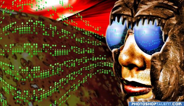
all source and my picture (5 years and 3967 days ago)
Hey, this is super! Would make a great cover for Information Technology handbook. 
Is it a man, a woman or a fly?! Funky! Love the green dots!
Awesome idea! Well done!
very creative 
Creative work 
great
good
u have talent G:L
Awesome!
For some reason I think this is kinda cool. In the superhighres version there are some rough edges and all. You could make them more smooth with the pentool or brush, on the other hand maybe this way it fits more with the whole image. Good luck!
interesting use of source )
Howdie stranger!
If you want to rate this picture or participate in this contest, just:
LOGIN HERE or REGISTER FOR FREE
Photography and photoshop contests
We are a community of people with
a passion for photography, graphics and art in general.
Every day new photoshop
and photography contests are posted to compete in. We also have one weekly drawing contest
and one weekly 3D contest!
Participation is 100% free!
Just
register and get
started!
Good luck!
© 2015 Pxleyes.com. All rights reserved.

Well done
Very fruity.
aahhhhaaaa!!!! do you know that english words "pear" and "bulb" is in estonian one and the same word - "pirn"!!!! and this is not joke!!! high points for this relize!! good luck!
serious fille.. that is so cool
Love the idea. Simple and effective.
idea is good
lol, is the author russian? we do have a kid's riddle com[aring light bulb to a pear gets my vote!
zatrix, what about russians? i said in estonian!!! very very very very different thing!!!!!!!!! you have only visual games, we have word!
Good idea. Image may be even better if you center the pear according to the center of the lamp. Maybe you have to move it a bit to the left and skew the lower part a bit (to adjust to the lamp's perspective). Good luck!
GL
awnsome very good creativiti and use of source
Howdie stranger!
If you want to rate this picture or participate in this contest, just:
LOGIN HERE or REGISTER FOR FREE