(5 years and 3945 days ago)

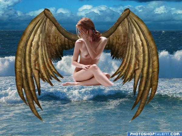
When I first saw the source photo, I immediately thought of old wings. If nudity offends anyone, I apologize. However, I believe the photorack stock used for this chop is artistic and not gratuitous. Thanks goes to Photorack and whoever submitted the source for the "Ocean and Sky" Contest. (5 years and 3945 days ago)

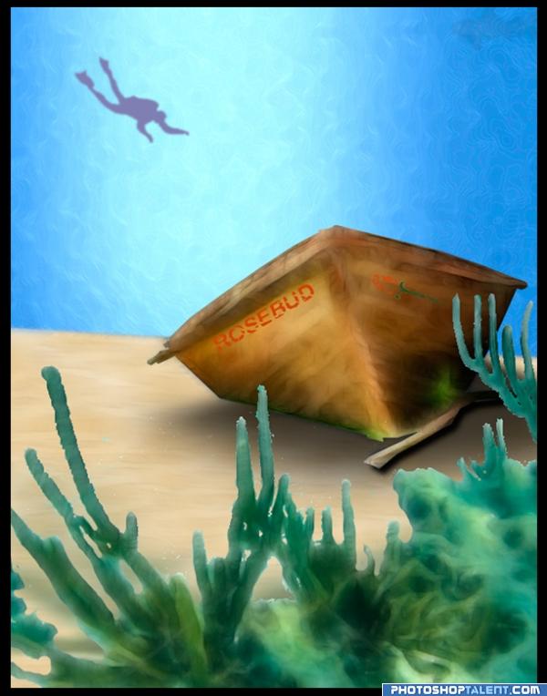
I played with Photoshop's painting and drawing tools. I created a brush for the water, adjusted the transparency and saturation, blurred the diver, seaweed, and shark, adjusting the saturation levels to help create depth. I used the transform tools to play with the text and rosebud and then eroded them to add aging and the results of being under water. I used a drop shadow and played with feathering and transparency for the dinghy on the sand. I applied texture to the sand, adjusting the transparency until I achieved the subtle look I wanted. I used a seaweed photo and a clipart diver for references from my Microsoft clip organizer. (5 years and 3943 days ago)
good colors
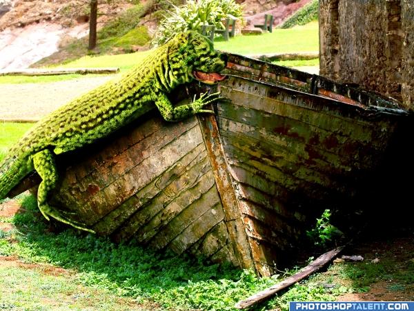
Just a wonderful Idea all around, I'm wondering if another tone of green for the lizard is in order.. or maybe into the komodo dragon brown would help, the head really blends into the back ground and doesn't pop... and there is some AWESOME beautiful work that is unseen unless you go HIGH res and really magnify.. just thinking of the print version, the lack of contrast/color difference makes the wonderful face blend too much..IMHO
good work but only seen in high resolution
OMG is that a crocodog!!!

Howdie stranger!
If you want to rate this picture or participate in this contest, just:
LOGIN HERE or REGISTER FOR FREE