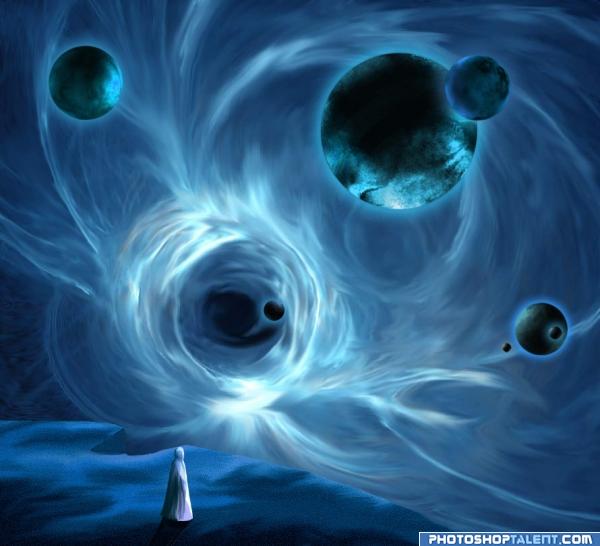
I like spacial scenes, I thought, maybe this "blue" contest would be good to use one of my space works...
Changes made, foreground a little stronger... and the smaller planet over the bigger has the highlight diminished. About the big planet/moon it looks ok to me, I think it looks rounded and spherical...As a matter of fact I used the Filter - Spherize to get this effect.
(5 years and 3940 days ago)



 beautiful....!
 !
!


Very spacey...good luck!

Nice flow.. good luck on this author
i don't know... but how i can to know - i've never been in space... good luck!
Nice textures and mood! Good luck! Looks great!
intriguing? the blue suits the mood. like it
Interesting image, I like the light. Perhaps the big planet in the right corner would receive a bit more light (compared to the smaller planet in front of the big one). Good luck!
interesting image, i like it alot goodluck.
Thank you for comments... Waz..I will reduce the light over the smaller planet that is over the bigger...
Cool idea. The edge of the foreground surface, and the notch in it especially, should be stronger. The biggest moon/planet seems more like a disc than a sphere.
welldone. nice feel
gr8 job....
I love spacial scenes as well
Changes were made....... Thanks for comments and suggestions
nice job
Nice Image!! Good Luck
awesome!!
AMAZING
Congratulations on the top-7 and thanks for the congrats
Howdie stranger!
If you want to rate this picture or participate in this contest, just:
LOGIN HERE or REGISTER FOR FREE