(5 years and 4045 days ago)
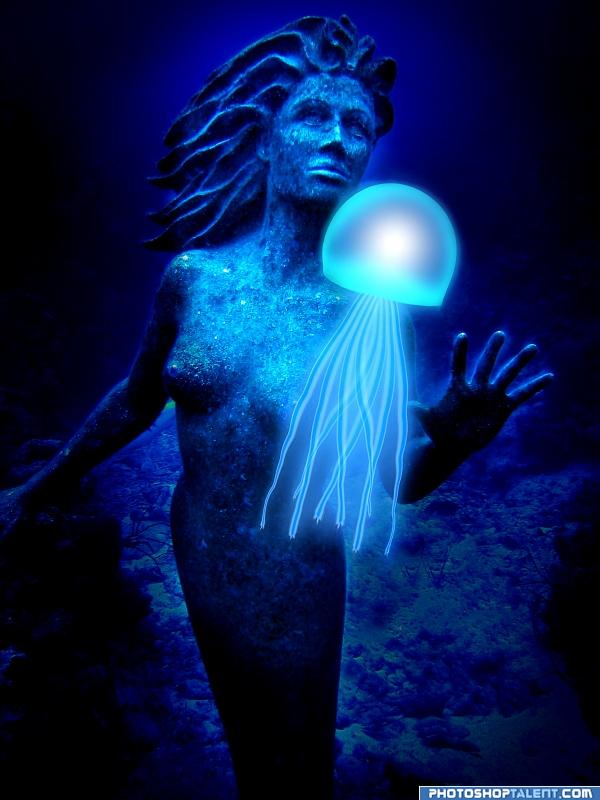
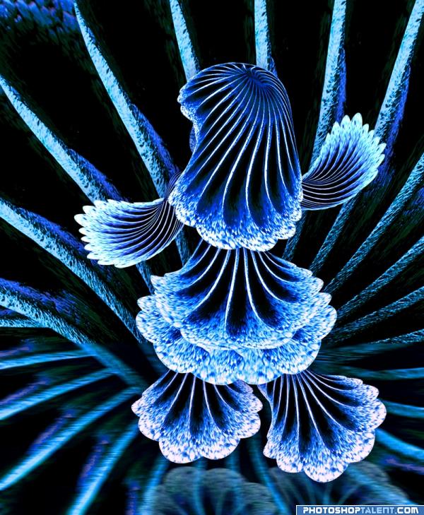
I created the jellyfish thing in Photoshop using a line from a brush tool, warp tool, liquify and Gaussian blur and a circle marque tool.
The background image is downloaded.
SBS will come soon. :) (5 years and 4044 days ago)
great background image; the jellyfish looks nice too
well done . good feel
nice idea....but I'm quite unhappy with jellyfish....its luking artifical.....u can also use some image in place of it....anyways GL
did this woman drowned with in time of this work?  high! good luck!
good work 

nice job 
Certainly not bad, but for some reason I like the jellyfish in step 7 more. Like it's more mystical there, also seems to fit better with the background. Maybe it's just me. Maybe if you give it some transparency it'll interact better with the mermaid. Good luck!
wazowski, I agree. I like the step 7 one better as well.
sweet. do you have the image without the jelly? the lady looks like my girlfriend but she's afraid of jellyfish. it would look great in a backlit frame, chipsullivan@hotmail.com, thanks
Howdie stranger!
If you want to rate this picture or participate in this contest, just:
LOGIN HERE or REGISTER FOR FREE
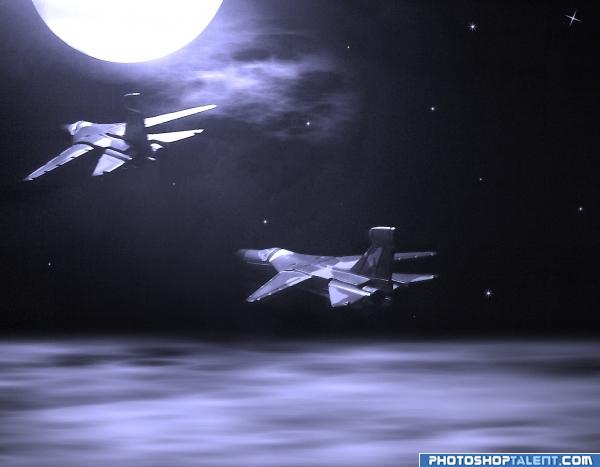
I was inspired by the Toy Story series when I made this entry. Two toy planes flying under the moonlight...
"TO THE INFINITY... AND BEYOND!!!"
P.S. My own sources. (5 years and 4046 days ago)
high High HIGH MARK for using your own images.. just wonderful.. good luck
ohhh just a little more and it is perfect! 
GL!
But thats really not very blue 
i think this needs more blue in it
very nice
it looks more grey than blue??? will hold vote 
Hey, folks... I know that it's not specified in the SBS, but after I composed the image, I desaturated it, then I applied the blue filter. That's it. Therefore, there aren't any other colours than blue there. Thank you...
It's perfect, but you should make it a bit more blue.
I still don't see how it doesn't fit the guidelines; I have tried other tones of blue, but they seemed very artificial for a moonlight feel, that's why I made the choice of just letting it as it is. Hope you understand. Thanks for the feedback anyway 
nice job 
WAY OFF THEME
That's pretty harsh, Christy... and by the way it is NOT off theme, since black and white are just the two extreme tones of ANY colour 
Well, as a matter of fact white may be considered a colour, but if we take this into account we'll have most of the entries removed.
I wish there was less criticism here...
very nice mood
Nice mood indeed. If it's blue enough...ow well, depends on how you see it of course. Maybe on some screens this is more purple. As creation I like it, the only thing that's a bit off in style imo are the stars (a bit too stereotype, maybe if they'd look more like blurred dots it would fit better). But again, just my opinion. Good luck!
Howdie stranger!
If you want to rate this picture or participate in this contest, just:
LOGIN HERE or REGISTER FOR FREE
(5 years and 4045 days ago)
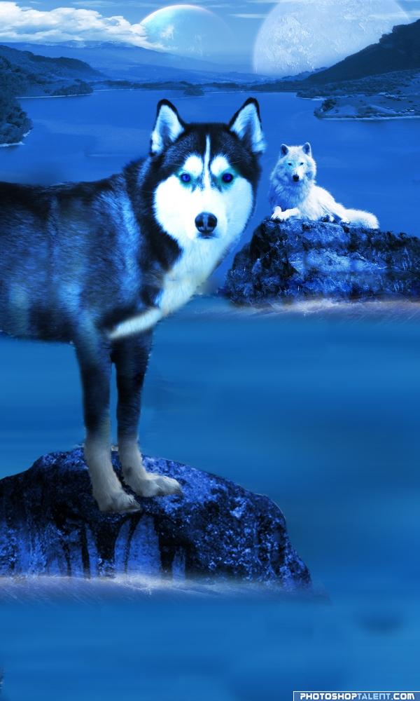
somewhere in other galactica...  my high points ask a little more work with some edges, blur or blend or something, but no need answere..
  good luck!
yup, u need to work on the edges (the leg part mainly).. that extra effort could fetch u higher scores.. gl 
Sorry, author... you mean "blue WOLVES", don't you?  Good luck
Author, the background pic is a down shot. The foreground wolf is a straight on shot...it makes for 2 different perspectives when you blend the images...
(JUMPING INTO THE MIX) Author.. double check the color levels and get rid of any remnant colors other then blue.. I think the black will be okay because blue is it's natural compliment but there is some questional areas by the feet and base of the rock.. everything must be blue.. don't want to see this pulled.. GOOD LUCK
Cute, but thats a huskey, not that it matters, nice work 
id personally like it better if the waves at the rocks were bigger or more splashy. if you look at the left planet/moon, you can see the horizon behind it through it-maybe cut the land out behind the planet? good concept.
i love huskies so heres a good mark from me
In case I'd ever take a dog (unlikely), then I guess it would be something like this, yes  . Very personal, but I'd crop the lower part till somewhere around the rock in the foreground. Now I know that there are waves, but as 8DX suggested, you còuld make them bigger. No bad idea, cause then they're at least bigger than the waves way further in the background. With the crop I think you could make it a more confronting image. But maybe that's just in my head. Good luck!
good work
nice job 
Wolf in front is a composite of two photos? the legs look out of scale with the body (thin)
nice
Howdie stranger!
If you want to rate this picture or participate in this contest, just:
LOGIN HERE or REGISTER FOR FREE
Source used - photoshoptalent.com 'Dog Nose' contest sourse image (lots of warp/free transform)
See SBS. (5 years and 4042 days ago)
you need to link to the original source image
beautuful work here... gl 
As beautiful as this is.. and as wonderful and intricate the constructions.. HUGE disappointment that you could not use the entire color spectrum in its creation.. IT IS SCREAMING FOR COLOR... not just blue.. but that's just me.. still HIGH MARK.. oh man. it's like looking at a brand new coloring book with no cover... SIGH.. excellent work author.. I'm going to lay down for a while to recover.. sniffle...
EDIT: STEP 7 is what made me freak out.. when you eliminated the color I almost wept.. LOL
I REALLY REALLY REALLY SUPERCAGILISTICFARBARLISTIC CALORIE AGA DOSHIUS LOVE IT
oooh pretty 
Beautiful. Reminds me a little of something out of Fantasia. Nice job!
Source used:
http://www.pxleyes.com/picture/2272/4a3d9c702ac03.html
It's from an old photoshoptalent.com contest
Golem Aura - SBS step 7 has it in colour, please check 
imaginary art nice art work
good one but background can be more creative
sadly, you can't use old sources from PST, unless they come up into the old contests, in the extra contest section. All entries that have a source being used have to have a link to a valid source. Or at least that is what I have been told...
nice
VEry nice work ! 
good work
i really do love this... great work! like the perspective.
nice job 
Howdie stranger!
If you want to rate this picture or participate in this contest, just:
LOGIN HERE or REGISTER FOR FREE
Photography and photoshop contests
We are a community of people with
a passion for photography, graphics and art in general.
Every day new photoshop
and photography contests are posted to compete in. We also have one weekly drawing contest
and one weekly 3D contest!
Participation is 100% free!
Just
register and get
started!
Good luck!
© 2015 Pxleyes.com. All rights reserved.

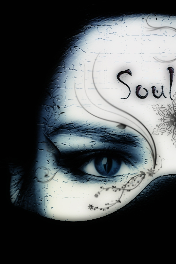
great work.. but source??
good
i think we never see hires again... good luck...
accurate and great blended use of text.. very hard to do.... good luck
beautiful entry goodluck.
Its not really very blue is it?
Bad source link...if it's from Google it's probably not usable...not much blue here, either.
Interesting image, but it's lacking in blueness. I think the odd fin-like thing on the left side only distracts and would be best deleted.
interesting image
 source link doesn't work
its not all blue
I guess I missed something, this looks pretty blue. Wouldnt you like to give the decoration some kinda blue either, author? Good luck!
nice job
great
Howdie stranger!
If you want to rate this picture or participate in this contest, just:
LOGIN HERE or REGISTER FOR FREE