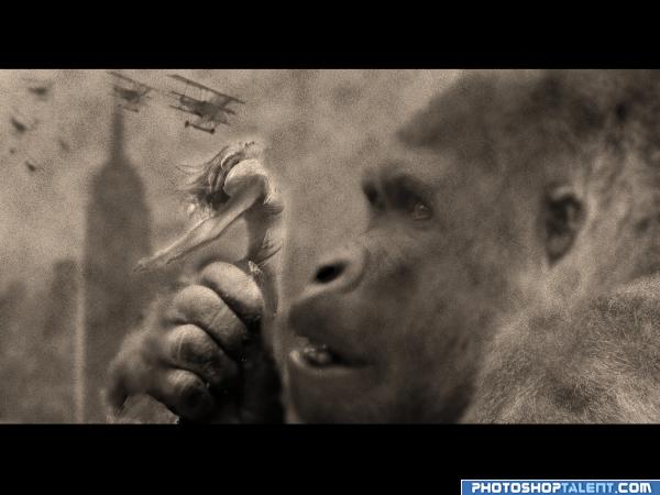
I always felt sorry for Kong ... hope you like it!
My Thnx to Sxc.hu for the images (5 years and 4034 days ago)
3 Sources:
- 1: fokker plane
- 2: old new york
- 3: Gorilla
I always felt sorry for Kong ... hope you like it!
My Thnx to Sxc.hu for the images (5 years and 4034 days ago)
Photography and photoshop contests
We are a community of people with
a passion for photography, graphics and art in general.
Every day new photoshop
and photography contests are posted to compete in. We also have one weekly drawing contest
and one weekly 3D contest!
Participation is 100% free!
Just
register and get
started!
Good luck!
© 2015 Pxleyes.com. All rights reserved.


 I think it was just hard to look at it and like it after i was sooo proud of the previous version... would have been nice though if i got some warning
  Good Luck


nice idea.. some observations 1) the leaves in gorilla's hands (in source img) need to be removed. 2) the aircraft propellers are not rotating!!! 3)both the girl and king kong are at the same distance from camera.. need more highlights on the girl 4) high res will be really appreciated.. nice image tone.. gl
WOW hsbee.. you see A LOT, even without High Res.. all I see is an ape going after the girl's hoo haa... but that's just me (author, might want to think about the angle of intersection between the two subjects.. a bit unsettling, though it will be tough because the angle of the gorilla's eyes is right on the mark) nice idea, you just picked a very difficult subject to work with..kudos on that... good luck
MUCH BETTER.. good job
totally overboard on the noise and blur, its alright cause you can still see what it is, but I would like it in better detail
Author, you captured the mood of the film nicely, but the background should be a bit darker to pop the front edge of the girl just a bit...
EDIT: This is a different image now...it has more problems than the first one! The ape is way too indistinct and the girl has a weird hard edge...first pic was better.
If you can remove the tiny visible hard edges around the girl, would look better. Good luck!
very original and nice,good luck
I always felt sorry for him, too. Great idea and well executed. I think your color choice was spot on.
Great idea, and some very useful comments above. A few adjustments and you have a great pic.
Looks good now!
good one
Gotta love Kong, but I think his face should have been sharper while everything else was blurred
Looks way better now indeed! Good luck!
Howdie stranger!
If you want to rate this picture or participate in this contest, just:
LOGIN HERE or REGISTER FOR FREE