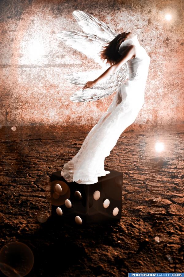
took the blue out since it was distracting from the focal point- the girl. hope this looks better. (5 years and 3947 days ago)
- 1: island
- 2: dice
- 3: background
- 4: wings

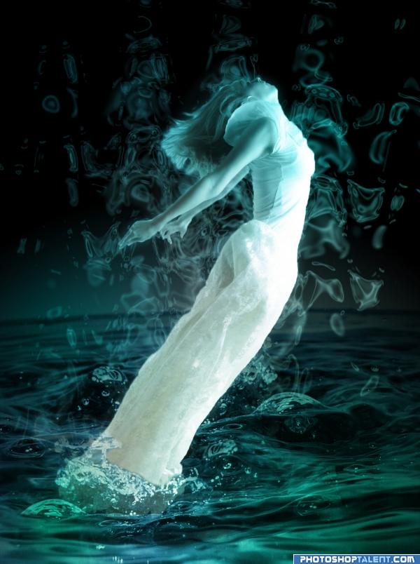
select the img....trim it so that only the figure is visible... copy img on other layer then Filter-distort-wave(adust it until it takes spiral form...) then select the distorted img....contract 10 pxl...feathers 5-10pxl...del the remaining img.... now it looks like splash now wave again Edit-fade 50%..... make the bg layer black.... paste photograph of water on it.....mask this photograph (5 years and 3942 days ago)

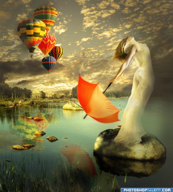
Yes, it's me again...and my balloons :P yet obsessed of them. oki, so basically I used my favourite tools and options: color filter for creating the mood, selection tool and smudge for creating nice forms (i hope they seem to be like that :P ). masking, erase tool...stuff like this...more in SBS. Please, enjoy!
credits and thanks:
http://fairiegoodmother.deviantart.com/
http://laszlo-616.deviantart.com
http://lucieg-stock.deviantart.com
http://www.cgtextures.com (5 years and 3944 days ago)
please comment... wow this one took me an a lil over a hour to do
No dice...
And foreground wings are upside down...
Very energetic piece.. I personally like the dice.. but I'm considered a Fringe Dweller.. If you want to keep the dice you have to balance the dark blue.. .. it really draws your eye and you almost completely ignore the subject...lots of options to balance it.. a blue planet in the sky, a blue buidling in the horizon.. lots of ideas.. using a primary in a brown tone arena.. always draws the eye..GOOD LUCK.. and high marks
EDIT: MUCH BETTER NOW.. good job author
the lens flares distract me. I love your way of thinking though.... very creative. and your lucky it only took an hour. I sit with image like this some nights for about 4 hours watch your blending of the two background images, on the left side you can see where they overlap
  also the wings need a bit more attention, the look like they are behind her at the moment, unless you were going for that look
  .... just play with their perspective a little or maybe warping them a bit
  goodluck author, will hold my vote for the moment.
looking better with the dice colour change
If the light is from the far side of the dice, why is there different shadows across the dots on the 5 and the 3?
nice mood
Very nice, surreal
Very nicely done.
very creative
wings fixing should improve, good color
I like the die she's standing on, but the wings look like they are behind her instead of attached to her. Is this the Goddess of Fortune?
whats with the die ... like it
Howdie stranger!
If you want to rate this picture or participate in this contest, just:
LOGIN HERE or REGISTER FOR FREE