Thanks susiet (5 years and 3941 days ago)
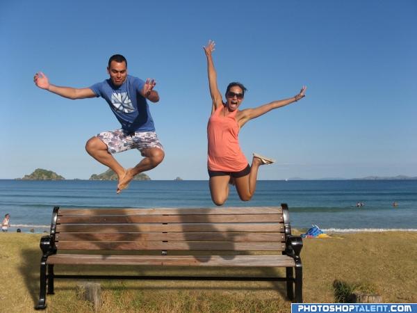
- 1: beach

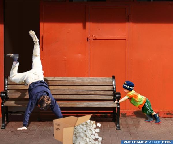
Kids! :-x :-D
Thanks to Mattox on stock.xchng for the picture of the man falling. I notified him.
The other sources are mentioned.
I did a lot of patching up through copy/paste and warping, masking and adjusting layer blending options.
I think the little boy looks a bit flat. Any suggestions on how to fix that?
I hope you like it. I had fun making it... (5 years and 3942 days ago)

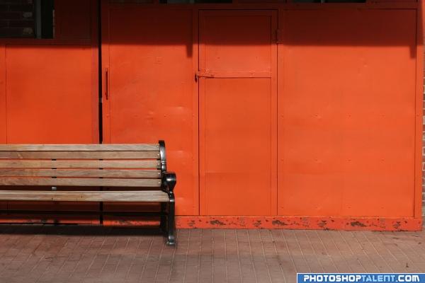
Used Vanishing point filter to create several pieces on different layer to rebuild the metal sheds after cutting out the bench with the pen tool and moving it. Then adjusted the perspective of the bench slightly. The bricks where adjusted for colour using a contrast layer mask. (5 years and 3942 days ago)
Good job and good luck. Take a look at the shadow on the ground. There should be a shadow of the people through the bench and onto the ground.
in the shadow casted by the bench, it should not be completely black as there are gaps between the wooden planks in the bench.. One more thing is the shadows casted by the characters... the shadows of the feet of the male char and knee of female char are wrong.. these shadows fall on the horizontal seat of the bench and do not get seen as shown in this pic. there should be a small deviation between the shadows on horizontal portion and vertical portion of the bench.. just my opinions.. gl
an eg of shadows on uneven surface - http://www.itchy-animation.co.uk/tutorials/01-blue-shadows.jpg take a look at the shadows of the branch on teh window...it maybe difficult to incorporate this fact in PS, in that case u could just raise the shadows so that they fall on the vertical portion of the bench alone..
setting the shadow discussion aside. this is a very energetic picture.. very happy and fun mood.. good luck
Nice idea good luck!
very nice
good
nice
Bench looks way too big in relation to the people.
nic, could do better with the shadow tho
Funny . To make you more nuts about shadows and such, I think the shadow from the bench should be a bit less deep amd more to the left. And up to you, but if you like a more symmetrical image, I'd crop a bit from the right side of the image. Good luck!
Very good, looks like it could really be there, good one
Looks pretty realistic,great job.Maybe you could make the people a bit larger,but that's up to you.
odd clean bench on the beach. What are the tree stumps?
Very fun. Nice job!
Howdie stranger!
If you want to rate this picture or participate in this contest, just:
LOGIN HERE or REGISTER FOR FREE