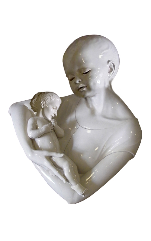
i used clonedstamp cut n´ risized heads. (5 years and 3943 days ago)
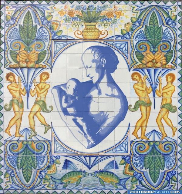
threshold copys clone stamp (5 years and 3943 days ago)
very nice 
this is very well done.. but the central image should be centered I would think.. it's the whole reason behind tile work... she and the baby are around almost one half tile to far up.. .. not a big fix.. but I think it would help in over all balance.. good LUCK!!!
EDIT: BRAVO AUTHOR.. IT really is locked in place now..AWESOME
nice
very nice composition
nice
As a former ceramic muralist, I love this idea. Two small things, though. I would extend the green thing on the left around the character's waste so its not cut off- like you did on the other side. I would also apply a sligh gaussian blur on the center piece to soften those inner edges so they match the blue glaze on the outside. Over all I think this is a nice piece. 
it really forwards the image of ceramic tiles, so nice!
Nice idea! Maybe something you can improve: looking at your used source I only see the drawing on the tiles itself and not inbetween (sorry, dunno well how to call them...the nerves?). In your image you put the whole statue like a grafitti on the wall. In case you can remove the parts inbetween the tiles it will look more like it's meant as tile decoration. Good luck!
nice work
love it & love the idea  wazowski's suggestion sounds good
Interesting display. a little color added might enhance the piec more.
Interesting idea!! 
Wow nice idea! Great execution! GL
good!!
wow! This is great!!!  And very original, before I forget to say


Howdie stranger!
If you want to rate this picture or participate in this contest, just:
LOGIN HERE or REGISTER FOR FREE
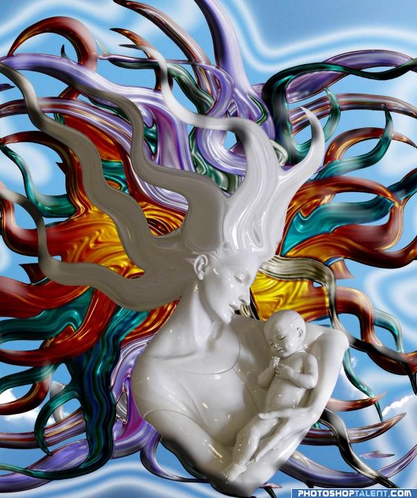
all source
and my sky
New version as per Olivia (5 years and 3945 days ago)
very interesting. I would love this just on a plain black background, to me the choice of background has no use  will hold vote for moment
Are these supposed to be eminating from her? If so there are a few strays.. Bottom right, another next to her shoulder on the left, another in line with her eyes on the right.. Also if its mother and child, would the child have similar styled hair?
title is the MOTHER'S FORTRESS... not the child's fortress.. her hair is her defense against all that would approach her child and she will defend it with all her being.. and the fragmentation of the hair makes me happy
Hey, where's the child's hairs....
LKY, LOL Smart A$$ 
nice maybe blur the background a little
good work
nice
Interesting image. Here and there you added some shades ,which works well. But I kinda miss them behind the statue itself (and then I mean a shadow from the white statue on the coloured strings), it might get the whole image closer together. Good luck!
nice work
ohhh i like that much better, i love the colours you have created on this image  well done, got my vote
  and goodluck author.
Interesting idea it like a sea anemine.GL
Great image! I like the hairs and the background as well, simple and beautiful!
Howdie stranger!
If you want to rate this picture or participate in this contest, just:
LOGIN HERE or REGISTER FOR FREE
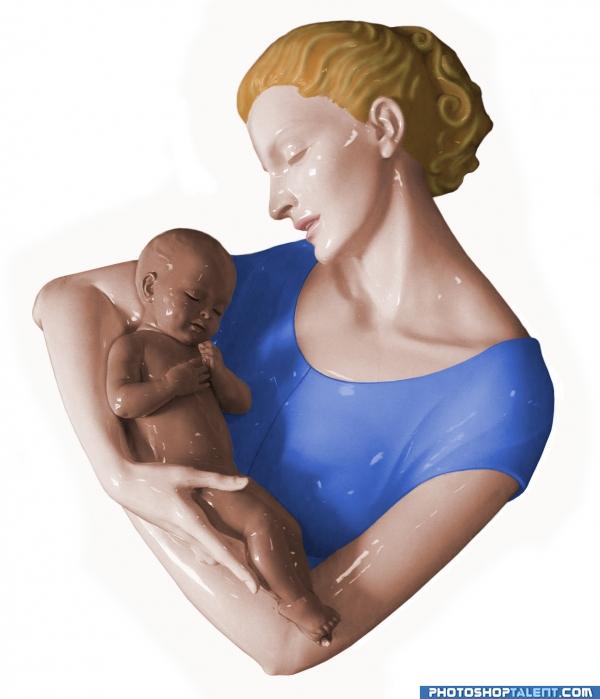
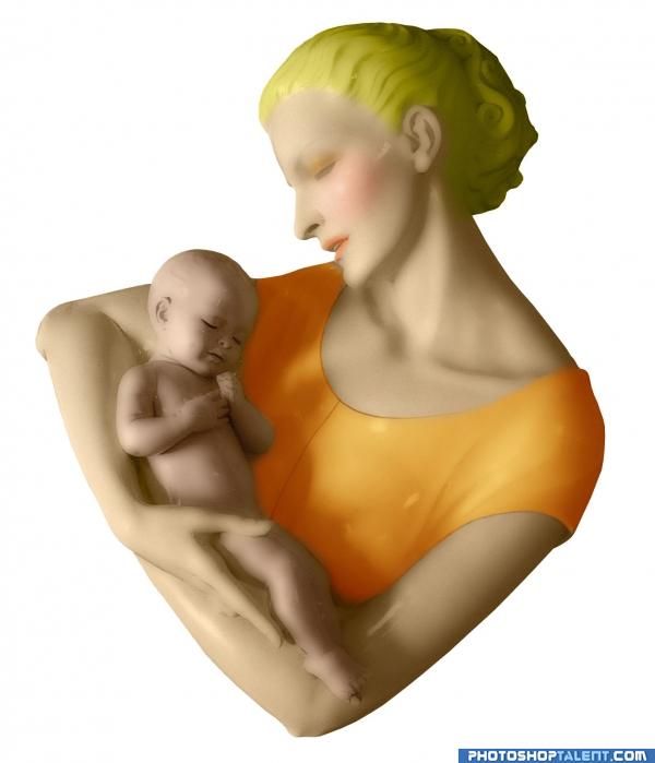
Just the source. Cut the hair and dress out with the pen tool and then expanded the selection by 2 pxl to have some extra image to mask out to blend between the layers. Each layer was adjusted with a hue & Saturation layer mask and a layer mask to adjust the edges (5 years and 3945 days ago)
Nice job, good work 
Great work 

Almost real.....jst hairs need some more wrk....
i remember this one great job
very nice, but if u remove the highlights from the image, u may get 3D animation movie like effect.. But u are probably happy with the colourful statue.. 

Nice job.
good
good work authur
you forgot to color the eyes.
I remember this too... great job!
Howdie stranger!
If you want to rate this picture or participate in this contest, just:
LOGIN HERE or REGISTER FOR FREE
(5 years and 3946 days ago)
Nice Job 
good onee i like blurry effect but a little artistic cllour effect iin backgrounnd will poliish its beauty
very nice smoothing of image....
Very nice, and I like the matte finish.
coloring need to improve
gl
nice blush.GL
Howdie stranger!
If you want to rate this picture or participate in this contest, just:
LOGIN HERE or REGISTER FOR FREE
Photography and photoshop contests
We are a community of people with
a passion for photography, graphics and art in general.
Every day new photoshop
and photography contests are posted to compete in. We also have one weekly drawing contest
and one weekly 3D contest!
Participation is 100% free!
Just
register and get
started!
Good luck!
© 2015 Pxleyes.com. All rights reserved.

hehehe.. i was wondering if someone was going to do this.. the result is very fun.. good luck
yep very cute
Rofl... Nice hahaha...
gl
good work
LOL very funny

coooool
The heartbreak of Alzheimers!
gl
Haha, but it would be nice if you could fix the shadows (you flipped the heads and with that also the shadows). Good luck!
I knew this one was coming---GL
nice work and fun
this entry made me laugh last time.....but still it has same impact on me.....
lol thats so funny
thats almost creepy. very nice job.
Howdie stranger!
If you want to rate this picture or participate in this contest, just:
LOGIN HERE or REGISTER FOR FREE