(5 years and 4017 days ago)
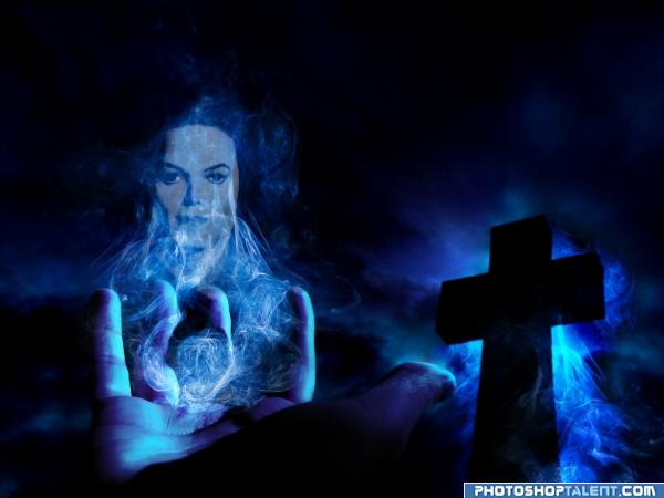
To remember the king of pop...
[*] Rest In Peace Mikel... (5 years and 4018 days ago)
good mistycal work
scary
you cant use that photo of michael jackson sorry.
Nice work - as much as I like it I would suggest checking with a mod to make sure its legal? Just because you have found the image on a stock site, does not always mean its useable.. It a photo from a book - I would think it copyright? Check to be sure. Maybe even find an impersonators image and rework? See what happens anyway..
Author.. hand draw a picture of Michael.. it doesn't matter if you can't draw either.. if you put your heart into it, it will be recognizable.. a tribute is most powerful when drawn from the heart.. .think of John Lennon's self Portraits and you will create a more magical personal piece.. IMHO
King of creepy looking child molesters is more like it...
Dont call him king of creepy looking child molesters, please respect the dead...anyway good mystical work
okay people, I've changed the image of mikel...I wanted remember the king of pop and not Michael Jackson in his private life...
Good rework.. 
good feel
nice
Nice work 
Howdie stranger!
If you want to rate this picture or participate in this contest, just:
LOGIN HERE or REGISTER FOR FREE

(5 years and 4016 days ago)
nice idea. In high res view sharp edges are visible(building). correct it.
very nice, looks good!  gl
gl
nice entry
i like the gold-ish color of the buildings. but fix the edges and sharpen the city a bit
nice idea, good luck 
cool
Howdie stranger!
If you want to rate this picture or participate in this contest, just:
LOGIN HERE or REGISTER FOR FREE
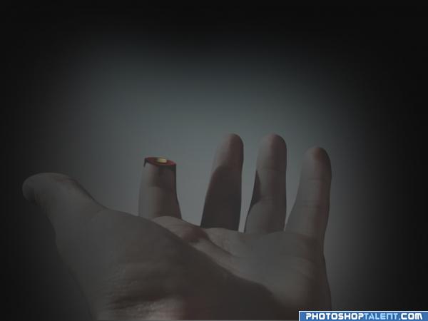
all source, (5 years and 4015 days ago)
woah... even though it's a chop, sends me the shiver...
ouch...
i like it!
nice
is too dark and maybe u can another finger :P but nice idea
i'd brighten up the image a little bit, you can't see the wound too well.
Not quite understanding the darkness of the shot...I think it would be better if it weren't so dark. 
made lighter
Clever idea author: but the shadow remains? You could probably use either the ring or little finger and not have the shadow issue. Reminds me of a Stephen King story.. Or Yakuza.. Hahaha. 
ooh nasty, why so dark and cloudly though? I think it would look better with more light.
haha funny
Howdie stranger!
If you want to rate this picture or participate in this contest, just:
LOGIN HERE or REGISTER FOR FREE
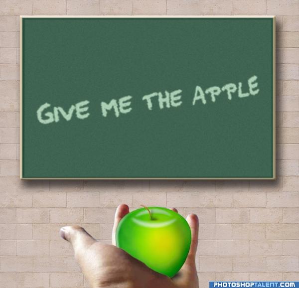
used brightness/contrast to lighten up the apple (5 years and 4018 days ago)
my sbs is on the way
The selection on the hand is a bit sloppy, but i like this image!! Well done!
nice but need more work
the apple still looks a little 'fake' need to play with it a bit more  goodluck.
Maybe move the highlights on the apple to match your light source?
the apple makes me think of those jolly rancher candies.. yowch sour sweet to the nth power.. polish this a little and I'm sure this will be an even greater piece.. lots of peeps are rootin for ya !!!
took some advise and lightened the apple up a little hope you like it please comment


wow...pretty glowing apple...
nice
That apple looks cool, great job on the self made stuff
use a real apple
good
lol, good old apple tutorial 
Howdie stranger!
If you want to rate this picture or participate in this contest, just:
LOGIN HERE or REGISTER FOR FREE
Photography and photoshop contests
We are a community of people with
a passion for photography, graphics and art in general.
Every day new photoshop
and photography contests are posted to compete in. We also have one weekly drawing contest
and one weekly 3D contest!
Participation is 100% free!
Just
register and get
started!
Good luck!
© 2015 Pxleyes.com. All rights reserved.

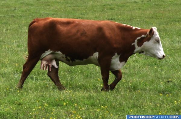
a little disturbing, but very funny. Nice image author, very original
very nice idea! i'd just play with the contrast and maybe curves a bit cause it would blend in better, i think
Thanks Elficho, but I wasn't going for subtlety here...
lol sick dude!
good one author, that one might milk you
Sweet! The lighting is a bit off. Maybe burn it a bit to blend it better. Good Luck.
LMAO this one is hilarious!! IMO the hand has a highlight on it..where is the light coming from? Soften it a little and it's perfect...Good Luck
Hahaha - yes the highlights kill it a bit - funny though.. Good blend to the udder!
very funny and creative, nice imagination good luck
creative!!
good idea
nice
LOL. clever
lol at your title, good work
eh heh...heh heh heh....ahem, i probably shouldn't say what i'm thinking (: Great job, kudos on creativity.
Howdie stranger!
If you want to rate this picture or participate in this contest, just:
LOGIN HERE or REGISTER FOR FREE