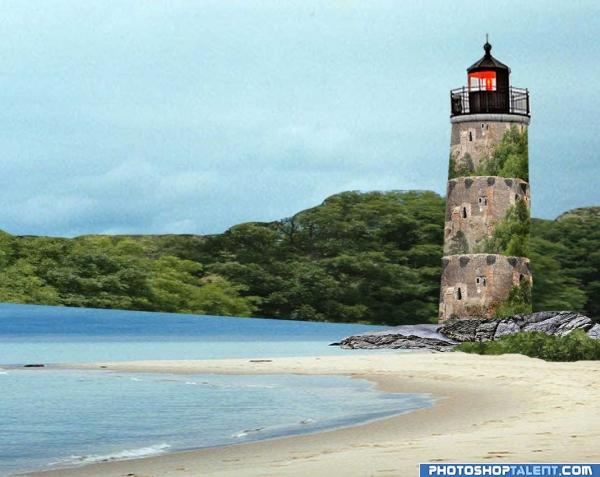
My seaside watch tower created with the help of 2 external images. (5 years and 3926 days ago)

thank to emjvincente for the fine photo (5 years and 3926 days ago)
I've been staring at this one for a little while now and i honestly don't get it! xD No worries, it's a nice image so you shouldn't have any problems :p.
Excellent work..
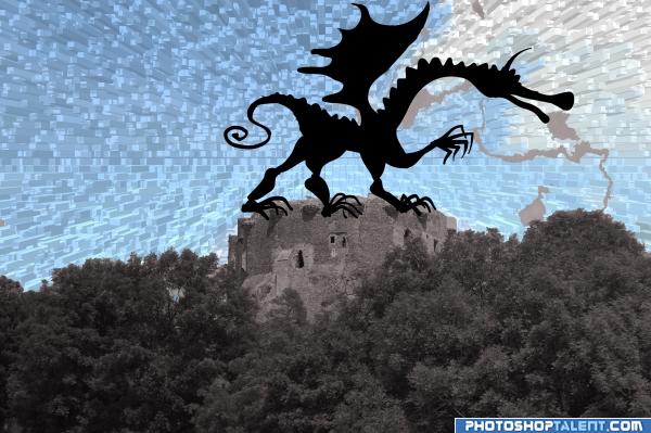
ahhh.. the good old extrude filter. neat effect... I like the silhouette of the dragon.. maybe tuck in his toes in here and there so he looks more ON TOP of the castle, not just in front of it.. and the smoke trails need a bit of work.. they are looking a bit like torn paper..but if that was your goal.. good luck.. very different approach (Shaping the lines around the cut out of the dragon couldn't hurt either... there's some little bobbles here and there)
:0
clipart feel is there.
good idea
you burned everything out...where is the fire?
Howdie stranger!
If you want to rate this picture or participate in this contest, just:
LOGIN HERE or REGISTER FOR FREE
Photography and photoshop contests
We are a community of people with
a passion for photography, graphics and art in general.
Every day new photoshop
and photography contests are posted to compete in. We also have one weekly drawing contest
and one weekly 3D contest!
Participation is 100% free!
Just
register and get
started!
Good luck!
© 2015 Pxleyes.com. All rights reserved.

good work
Really good use of the image, but i think you should follow one particular tree throughout the entire length of the tower, it doesn't look too real if they stop and start so harshly.
what a great idea... you might want to add the high res so peeps can see your image better... I really like the concept, but I can't really sea the detail work.. good luck though
Creative work, does the top of the building looks like its leaning, or is it me
love it!!
why trees on the light house? and light house shape....some problem
nice idea
reminds me of a layered cake...where are the candles?
the tower is too repetitive. also, the forrest line is too clean.
Howdie stranger!
If you want to rate this picture or participate in this contest, just:
LOGIN HERE or REGISTER FOR FREE