SBS will be posted asap.
No outside sources were used.
Still a work in progress...Open to suggestions. Thanks! (5 years and 4011 days ago)

(5 years and 4010 days ago)
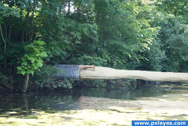
haha, try making that water go into the swamp and not just shoot above it
Levitating water...ummm, okaaaaaay...
I kinda like the water shooting out so.. it would mean the pressure was like a Zillion pounds per square inch.. LOL.. and that guy would be shredded .. LOL.. good luck author.. and great that you used your own photo.. I Love that
nice idea, force is too much, but ok
Is that a human leg??? xD Nice job, but i do agree with elficho, try making the water flow into the swamp, it just looks like it's flying somewhere else
nice
i dont get it...what is this?
 i like use of sources!
Howdie stranger!
If you want to rate this picture or participate in this contest, just:
LOGIN HERE or REGISTER FOR FREE

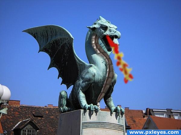
used the warp tool for the neck armour plates and the smudge tool for the water / inferno, hear rest in sbs, sbs coming soon (5 years and 4007 days ago)
I like the idea of added scales to the dragon statue. You were very creative in your implementation of the faucet when you set out to do this. I would, however, recolor and shade your scales a bit more so that they blend better with the statue (right now they appear to be floating above the picture as opposed to being a part of it). Also, I would give consideration to losing the fire. It seems a bit too cartoony, and to be honest it doesn't heighten the image in my opinion. Still, nice work! Keep it up and you'll have something amazing in no time!
It's a very good idea, i'm not denying that, but it looks like too much of a copy and paste job if you know what i mean. Good luck with this anyway, but tehre isn;t much more to say Magicsteve pretty much covered it all. Good luck!!
yikes author.. I think magicsteve and ponti have put you through the ringer  .. I'll just skiddaddle out of here before they come after me LOL
Nice start on your image here taking into account that this site is for all lvls of P/S skills, I am gonna say nice job and keep up up the good work. I would try and do a wee bit more with the image. But good luck all the same  .
.
usage of source image is very little, and the fire looks unreal or unfinished.
Just keep practising, and learn from others.
blurry
it's alive! 
Howdie stranger!
If you want to rate this picture or participate in this contest, just:
LOGIN HERE or REGISTER FOR FREE
Photography and photoshop contests
We are a community of people with
a passion for photography, graphics and art in general.
Every day new photoshop
and photography contests are posted to compete in. We also have one weekly drawing contest
and one weekly 3D contest!
Participation is 100% free!
Just
register and get
started!
Good luck!
© 2015 Pxleyes.com. All rights reserved.

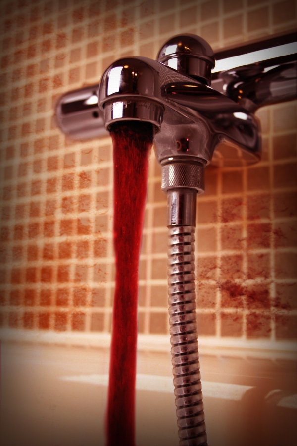
nice! try blending the stains better.. just play with the perspective a bit
Edit: actually, blur the stains.
You could always thicken the blood with pictures of wax drippings.. just an Idea.. good luck author.. I'm not good with blood work I get queezy
The phlebotomist dream! Good work author! Love it!
sick
Blood spatters don't look like they're on the wall, just floating in front of it...and why no spatters on the tub?
good
creepy.. and neato.
nice work and creepy
nice coloring....love the idea....GL
This is GREAT! It's fantastically imaginative.. Ultra mega high marks from me
Sorry, i had to come and look at it again. Really, really good job
Not to repeat cmyk46's comment regarding the spatters - but really, pay attention to that. If you could "add body" to the blood it would look more realistic - blood is much much thicker than water, so in case u do see running blood, it would not have "splashes" in it -in fact it would resemble lava more than water. Oh, long comment again. Well I actually started writing to say that I like the mood
red wine
Howdie stranger!
If you want to rate this picture or participate in this contest, just:
LOGIN HERE or REGISTER FOR FREE